Pistachios OR One simple method to have a pretty weird grocery shopping experience

So for a long time I had been under the impression that I didn’t really like pistachios.  Once – years ago – I had a bunch and then didn’t feel great later on that evening.  The human mind has some great methods to create strong linkages between foods and feelin’ bad, as back in a hunter gatherer stage such linkages would have been exceptionally useful.

In any case, I didn’t really think much of it and just didn’t really eat pistachios again.  It doesn’t seem like I really came across them that much in day to day life, so it wasn’t something that I really had to avoid.  
Recently, I was hanging out with some friends and they put out some pistachios, and I figured I’d give them a try.  Long story short, they’re delicious.  Take that, hunter gatherer part of my brain.  
This was a few months ago, and I finally saw some bulk pistachios at the store last week.  I bought some, and realized that they’re one of the few nuts that you can’t buy without the shell (there are actually some good reasons for it, apparently).  You can certainly buy other nuts with their shells, but few of them really require it (with the exception of some of the more novel nuts, like hazelnuts).
Examining what I got from the store led to the conclusion that in any given scoop of pistachios you’re getting mostly whole pistachios.  Aside from this, you’re also getting some nuts that have come out of the shell and some shells that don’t have nuts in them.  
I was curious about this, initially, and a cursory pass does seem to suggest this is noise that basically cancels out – you get about the same number of empty shells as you get shell-free nuts in any given pull.  In the aggregate, then, you’re still basically getting whole nuts.
Continuing to think about this a little bit – while sitting around eating pistachios – a thought crossed my mind.  
What if you were really careful at the bulk bin?  Instead of taking indiscriminate scoops, why not try to be a bit more calculating?  If you could aim for already shelled nuts and avoid nut-free shells, you might save a little change (which you could use to buy more pistachios, duh).  
Now, the short answer to the longer question is that you don’t do this because it would look really weird if you sat at the bulk bin picking out shells and shell-less nuts.  People would probably start to stare.  The extension would also be that at a certain point you should stop searching and just start shelling – take the good stuff to the scale and leave the shells behind.  
But how much is this really going to impact your total?  How much does a pistachio nut weigh in relation to a pistachio shell?
Easy enough – I have a kitchen scale for just these sorts of questions.  
The weight of one whole pistachio is…0 ounces.  
The weight of one pistachio shell is…presumably less than that.  
You see, my kitchen scale doesn’t have the resolution to specify things at the level of a single pistachio, let alone a single shell.  This is not a problem only unique to my kitchen scale (or to pistachios).  
How to fix it?  Well, averages based on larger samples.  
10 pistachios give a measure on my scale, though the resolution is still not there to pick up small differences. In fact, 10 pistachios generally fluctuates between 1/8 and 1/4 of an ounce, meaning that the actual average weight it likely somewhere between those numbers.  My kitchen scale does not give values between those two numbers. 
Where between does that actual number fall?  Well, my scale can’t tell me that, at least not exactly.  But if I take enough samples I can get a proportion that shows what amount of time the scale comes up 1/8 vs 1/4.
If we treat these as the likely bounds of the weight for 10 pistachios, then the proportion of the time the higher number comes up is the percent distance we have to travel between those two numbers.  
Put another way, we can take the average of those measures and find a point between them that is a best guess for the true weight of 10 pistachios.  
We can do the same for some sets of 20, even 40, and see if those help to give us a better picture of the scale (they do).  
At a certain point, it’s simply time to eat some pistachios.  
I didn’t weight the nuts themselves, as with the weight of the whole pistachio all we really need is the weight of the shell – the average weight of the nut should be what’s missing.  It’s also much harder to shell a pistachio and then just set the nut and shell aside, especially when you only need to set one aside to be able to figure out the weight of whatever you eat. 
The same idea of needing to use multiple shells on each measure holds, as the shells are lighter than the whole nut before shelling (obviously).  
All said and done, the weights come out as follows:
Whole nut: 0.042 ounces
Just shell: 0.019 ounces
Thus, just nut should be: 0.23 ounces
Interestingly, the weights of just the shell and just the nut are pretty close to each other.  This is a good sign – for every five empty shells you leave in the bin you should be able to take four shelled nuts away at basically an even weight trade.  
It really only makes sense to make the trade, as if you’re just leaving shells to save money you’d have to do a lot to make a dent.  At $7.99 a pound, a single shell (without nut) is worth a little less than…1 cent?  What’s a few cents going to buy you?
Since the nut and shell weigh about the same, it means that (at these prices) a full pistachio should run you just over 2 cents.  A pistachio nut runs just a bit over a cent.  So, the question of what a few cents will buy you is one or two whole pistachios (or roughly twice as many shelled pistachios). 
A single penny might not seem like much, but given the fact that the whole thing is only twice the price of the nut means you’re looking at somewhere in the ballpark of 40-50% savings by removing the shell.  
For a single nut, this might not make much sense.  But remember, we’re doing this in aggregate!  Who goes to the store and buys a single pistachio?  
The logical conclusion is that you should – just as some people do with sweet corn – stand at the store and peel back those pennies from your pistachios.  
Just don’t blame me if you get kindly (or unkindly) escorted out of the store. 

Games of the Price is Right: The Wheel (Part III)

The last few times I’ve discussed The Wheel on The Price is Right I’ve talked about some of the odds that you face as the first or second contestant.  A lot of the discussion has been based simply on how The Wheel is designed and played, and not necessarily on actual data.  

For today’s post, I’d like to talk about what it actually takes to win at The Wheel.  
I’ve watched and coded a bunch of episodes at this point, and have a good deal of information on what people spin at The Wheel.  There’s a lot we can look at that might take a bit more data, but for now I thought it would be the most interesting to just put together a chart like this:
What this chart is showing is the distribution of contestants’ winning totals at The Wheel.  What is quickly evident is that a lot of people who win at The Wheel win by walking away with a dollar total.  That’s not to say that they hit a dollar on their first spin, but just that they totaled a dollar by some combination of one or two spins.  95 cents is also a bit winner – almost accounting for as many winners as a dollar itself.  
If any of the contestants hits a dollar total, the other contestants only have a 1 in 20 (5%) of forcing a tie and spin-off each time they spin.  Those aren’t great odds.  95 cents isn’t much better – there’s a 1 in 20 (5%) chance of forcing a tie and spin-off, and a 1 in 20 (5%) chance of simply winning.  
The odds of straight out winning against any given score actually double from 95 down to 90.  While the odds of forcing a tie and spin-off stay constant (5%), the chances of winning straight out go from 1 in 20 (5%) to 2 in 20 (10%).  This might account for the larger gap between 90 and 95 cents on this graph.  
What should also be evident is that not many contestants make it as a winner at The Wheel with scores much below 70 cents.  Two contestants managed to eke out that win at 65 cents, but the singular winner with 40 cents is actually an interesting fluke.  
It was a situation where the first and second contestants had gone over a dollar and lost – the third contestant had a single spin at the wheel to see if they could hit a dollar in one spin.  Good trivia for The Price is Right – in such a situation the third contestant does not get another spin at the wheel no matter how they do on their first.  It is the only realistic situation where someone could win at the wheel with a spin of 5 cents.  The value they come up with is completely random, as it is based on just one spin.  
This brings up an important point, though.  How do things look if we break them down by contestant?  
Of the 72 events at The Wheel (36 episodes with 2 events per episode), the breakdown of wins by placement is actually starting to look fairly interesting.  I looked at it after the last post with a smaller sample, and things seemed to be a bit more biased toward later spins.  The numbers as they break down now are:
Contestant 1:  23 wins
Contestant 2:  23 wins
Contestant 3:  26 wins
Those wins are distributed as follows:
I was initially expecting the wins for contestant 1 to come a bit higher up the scale – perhaps a disproportionate number of wins from the 95 to a dollar range.  Interestingly enough, contestant 1 as a place in line seems to be taking home a lot of wins right around the 70-75 cent region.  
Now, this is still a small sample (so I’m going to keep coding), but 70-75 does seem to be the area where contestant 1 generally starts to feel safe enough to stay.  If a first spin is below 70 the odds are that they are either: going to stay and get beat, use a second spin to fail to get to 70 and get beat, use a second spin to get into the 70+ region, or spin big and go over a dollar.  I’d like to see how this continues to play out with more examples, but if this effect sticks around that might be a start of what’s going on.  
In terms of dollar wins, everyone seems to be pretty close to equal footing.  If you spin a dollar you pretty much have things wrapped up, no matter where you are in line.  The best someone can do is also spin a dollar and take you to a spin-off.  
Speaking of, we can also take a look and see how many of these wins resulted in a spin-off win.  The way I have things coded is which contestant won (overall), what value they won with (enough to make the last chart), but also if there was a tie and what happened during the tie.  The winner of the tie is who made it into these charts, so if contestant 2 and contestant 3 tied at 75, went to a spin-off, and contestant 2 won, then contestant 2 gets credited with the win and the winning value is logged as 75.
[To be fair I also have information on every spin that occurred, not just who won, so there’s a lot of things I can look at in future posts.]
Basically, we can simply add this information to the counts from earlier:
Contestant 1:  23 wins (6 through spin-offs)
Contestant 2:  23 wins (2 through spin-offs)
Contestant 3:  26 wins (4 through spin-offs)
The first contestant is relying a bit more on winning in spin-offs, but hardly enough in comparison to really make any strong claims about it.  If we simply negated wins from spin-offs the ordering would still stay similar, though contestant 1 would take a bit of a hit, with:
Contestant 1:  17 wins
Contestant 2:  21 wins
Contestant 3:  22 wins
In any case, the small sample still seems to be limiting things a bit, but we’re also starting to get into the range where some potential trends could be emerging.  If there’s one takeaway, it seems that your chances of winning with a spin below 70 – for any contestant – are fairly low.  Your odds at winning with a spin below 65 are virtually nonexistent.       

The Monty Hall Problem OR the Omniscient Lawful Neutral Companion Problem

Today we’re going to talk about a classic game show that isn’t The Price is Right.  That show is Let’s Make a Deal.

Let’s Make a Deal is famous in part for having within it a very curious game element.  That element has come to be known as the Monty Hall Problem after the name of the host of the show.

The basic idea is that you’re presented with three doors, Door A, Door B, and Door C.  Behind one of those doors is something pretty cool.  It could be some money, or a car, or whatever.  Behind the other two doors there is something less cool, like a goat.

Unless you really like goats, in which case the goat is the prize and the other doors have something that you find less cool.  Like less cool goats.

By the way, thanks as usual to wikipedia for having a pretty sweet totally public domain image to put things into perspective.  

So the host brings you up to these doors, and tells you there is something great behind one of them.  Without anything but dumb luck to guide you, he tells you that you’re allowed to pick a door and receive the prize behind it. 

Pretty straightforward, right?  You have a 1 in 3 (1/3) chance of picking the good prize, and a 2 in 3 (2/3) chance of walking home with a goat (assuming from this point forward that you’re one of the people who is trying to not win a goat).

This should make sense to you – this is the easy part.  Don’t forget this part, though, as the rest turns out to be about that easy. 

You pick a door.  So, pick a door.  Take a deep breath, and wonder if you’ve won.  You look at the host, and he’s smiling.  You start to get the feeling he knows something that you don’t.

Well, it turns out that he does.  In fact – for all intents and purposes – he knows EVERYTHING.  Sure, he can be easily blinded to the situation by receiving information in an earpiece, but it’s so much more fun if he’s really just trying to have some fun with his all-knowingness.

The host informs you that you have two options.  You can either stick with the door you just picked, or switch to one of the others.  You think about it for a moment and realize that either of the other two doors has the same odds of a prize as the one you just picked.  No reason to switch or not switch, as you may as well have flipped a coin in the first place.

Wait – the host says – that’s not all.  He points at a door that you haven’t picked, and it opens.  Hey, there’s a goat behind it!  He has just revealed one of the losing choices.  The only rule is that he has to pick a door that you didn’t pick.

For example, if you picked Door A, he may open and reveal a goat behind Door B or Door C.  If you picked B he may open and reveal a goat behind Door A or Door C.  If you picked Door C he may open and reveal a goat behind Door A or Door B.

It’s not his choice which door gets opened in all situations – no matter what is behind the door you picked there is still at least one goat remaining behind one of the other doors.  If you picked the winner right away he has a choice of two goats, but if there is a goat behind your door then there’s still a goat remaining on the board that he can reveal.

This is where it gets interesting. 

The host asks if you want to stay with the door you picked first, or switch to the last remaining door.  You ponder it for a moment.  What’s the benefit of switching?  You already decided that all of the doors are a coin flip anyway, right?  Right?  Right…?

Let’s walk through a possible scenario.

Let’s say the correct door is Door C.  The host knows it, but you don’t, and you can’t learn it.  Here’s how things play out if you stay:

You initially pick door A. The host reveals door B, but you stay with A. You lose.
You initially pick door B. The host reveals door A, but you stay with B. You lose.
You initially pick door C. The host reveals door A, but you stay with C. You win.

In the case of staying, you have to correctly guess the right door out of three on your initial try. You have a 1 in 3 chance of winning, because you pass on the second step.  You already figured this out as the easy part earlier in the post.  Now what happens if you switch?

Here’s how things play out if you switch:

You initially pick door A. The host reveals door B, and you switch to the door remaining, C. You win.
You initially pick door B. The host reveals door A, and you switch to the door remaining, C. You win.
You initially pick door C. The host reveals door A, and you switch to the door remaining, B. You lose.

You see, when switching, you’re actually hoping that you chose poorly on your first guess.

If you picked wrong to start, you’ll have the correct door when you switch.  Do you see that part?  That’s the trick.

When you get to the second choice – when you have an opportunity to switch – you’re playing a slightly different game.  There’s something cool behind one door, and a goat behind the other.  One of the doors (the one opened) is out of play.  The door that’s out of play was part of the pair involving the door that you can switch to – in essence you’re not switching to one door, you’re switching to both of the doors you didn’t pick initially.  It’s just that one of those doors has already been opened. 

Think of it this way.  Instead of opening a door and then asking you if you want the remaining, the host is actually asking you if you want to stay with your initial door choice or switch to both of the other doors.

One of those doors has a goat, and the host knows it.  He actually likes goats, so he’ll simply open that door and take the goat off your hands.  He’ll never steal the cool prize, because he’s not like that.  You get whatever is in the door that he didn’t choose.    

He may leave you a goat (if you picked right and have the cool prize behind your door), or leave you the cool prize (if you picked wrong and have a goat behind your door). 

Since there are three doors you have a 2 out of 3 chance of picking incorrectly to start. If you stay, you need to have picked the right door out of three – and there you have your 1 in three chance.

On the surface people assume you always have a coin flip choice (or overweight their initial guess), while the best bet is to always switch.  Over time, you’ll win more prizes (and less goats).

Amazon, Tax Structure Misconceptions, and Giant Candy

How many of you have ever eaten a five pound Hershey Bar?

How many of you have ever eaten 3,131 five pound Hershey Bars?  
Don’t worry, we’ll get there.  
Today I mostly wanted to talk about Amazon’s affiliate reward system, but it actually also gives us a good vehicle to talk about some misconceptions of how the tax structure works.  We also get to talk about giant candy.
http://www.amazon.com/gp/product/B004AH0MLG/ref=as_li_ss_tl?ie=UTF8&camp=1789&creative=390957&creativeASIN=B004AH0MLG&linkCode=as2&tag=48808-2
http://www.amazon.com/gp/product/B004LJYDXG/ref=as_li_ss_tl?ie=UTF8&camp=1789&creative=390957&creativeASIN=B004LJYDXG&linkCode=as2&tag=48808-20
http://www.amazon.com/gp/product/B00315HJ8C/ref=as_li_ss_tl?ie=UTF8&camp=1789&creative=390957&creativeASIN=B00315HJ8C&linkCode=as2&tag=48808-20

Oddly, my thought after finding all of those is mostly disappointment that the Reese’s Peanut Butter Cups aren’t bigger.  Seems like ‘World’s Largest’ should actually mean something.

I want to use giant candy to talk about Amazon’s affiliate programs due to the sheer absurdity of the numbers I’m going to be talking about.  It should also make things nice and simple when we have a nice five pound block of chocolate to think about every time we need to talk about an item sold.

Some of you are probably asking what Amazon’s affiliate program is.  Well, it was discovered in the early days of the internets that one of the best ways to get people to buy things is to get other people who know those people to tell those people to buy things.  Depending on how well those people know each other, this covers all behavior from word of mouth to banner ads.

Amazon has a pretty interesting setup, but a fairly complicated one.

The short rundown is this.  If I send you a link (or put it on a page where you see it), and you click on it, go to Amazon, and buy any product, I would get some cut of the cost of that product.  That’s the easy part.

The more complex part is what cut I’m getting in any given situation.

[As a brief promotional aside, Amazon is willing to give me money at no cost to you any time you buy any product on Amazon, as long as you got there through one of my links.  If you feel like helping out the blog you can simply bookmark Amazon as this link: ( http://www.amazon.com/?_encoding=UTF8&camp=1789&creative=390957&linkCode=ur2&tag=48808-20 ) .  If you do that – and every time you’re going to search for and buy something on Amazon do it through that link – then every time you buy something on Amazon I’ll get a small share of it.  Not going to force you, but any little bit helps keep this blog running.  The biggest impact by far is cell phones with wireless plans, which is a flat rate $25 a shot.  I’d buy you a drink for that sort of contribution.]

Amazon has some tables (accurate as of April 10, 2013):

Now, the first table is pretty boring, aside from the fact that any of you looking to buy ‘magazine products’ on Amazon should let me know.  We’re also going to look the other way and pretend that giant chocolate bars don’t fall into the ‘grocery’ category.  We’re doing this because anything that doesn’t fall into one of those first categories (or other categories they specify elsewhere) falls into ‘general products’ and the much more interesting second chart.

It’s even more interesting if we start to use it to make some graphs.

Let’s assume that one of my readers really likes Hershey bars.  They read this post, then click on this link:

http://www.amazon.com/gp/product/B000IW68YC/ref=as_li_ss_tl?ie=UTF8&camp=1789&creative=390957&creativeASIN=B000IW68YC&linkCode=as2&tag=48808-20

which takes them to the Amazon page for five pound Hershey bars.  If that same person were to buy one of those bars, Amazon tosses me a  Jefferson and some change ($2.08) at the end of the month because I sent them there.  That $2.08 is (from the above chart) 4% of the $52.00 current price of a giant Hershey bar.

Now, let’s say that same person REALLY likes Hershey bars, and goes back after putting down the first one to pick up five more giant Hershey bars.  How much do I get for each of those?  Well, it’s still under seven items, so I still just get $2.08 a bar.

A few days later, the same person decides that six giant Hershey bars are great, but they’d really be happier with just one more.  They pick up one more – how much do I make on that one?

Well, more than $2.08, because I’ve now helped Amazon sell seven items in a given month.  At that point I would get bumped up into the 6% range for that month, and start bringing home $3.12 for every bar.

But what about the six bars I had already helped sell previously?

Well, it’s not the end of the month yet, and Amazon has yet to cut a check.  They were going to give me $2.08 for every bar, but now I’ve found my way into a better part of the scale.  Pretty soon Amazon will start comping me drinks, I would imagine.  At the end of the month, I get $3.12 for every one of those seven bars.

When six bars had been sold, I was going to get $12.48.  On the purchase of the seventh I didn’t just make the $3.12 for that bar, but made up a bunch of money on bars that had already been bought.  In fact, the money earned after the seventh bar is $21.84 – by convincing my chocolate-loving reader to pick up that seventh bar I actually earned $9.36, or a full 18% of the cost of a bar.

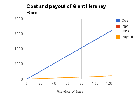
Let’s say I was really persuasive, and convinced this (apparently pretty well off) reader to drop some cash on stockpiling for the winter by buying 125 giant Hershey bars.  Here’s what that looks like in a graph.

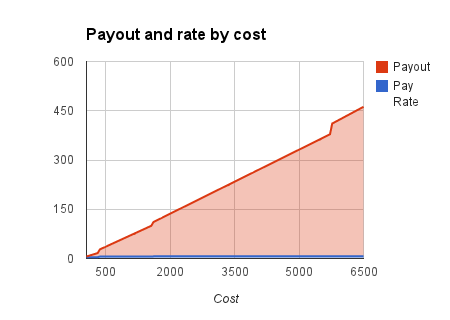
You can see that the cost is starting to become pretty decent, but with three things on the same graph it’s hard to make sense of it (or even name the y-axis).  If we remove cost we get this:

And you can start to see some of the jumps in payout that match up with changes in this scale.  Like I said, when the seventh item gets bought I get paid more on all the items before.  Amazon doesn’t make their tallies until the end of the month, so the place you end up in terms of number sold is the rate you get on everything.

At least on everything that falls into table 2 – remember we’re basically forgetting about the much more boring table 1.

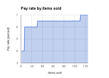
We can even make a graph that illustrates this a bit better by plotting out how the percentage changes based on number of items sold.

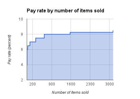
We by no means have to stop at 125 bars sold.  We can take it out to the full range of Amazon’s structure, and assume our friend hit the lottery and decided to spend some of that on building a chocolate house somewhere in a cool enough climate.

That’s right, I get one final bump way out there when this reader buys his 3,131st giant Hershey bar.  That jump is from 8.25% to 8.5%.  Not much, right?  Well, it’s the difference between $4.29 a bar and $4.42 on any given bar, so that is right…partly.

When the 3,130th bar is bought I’d be making 8.25% ($4.29) on it, and all others before it.  When the 3,131st bar is bought I’d be making 8.5% ($4.42) on it, and all others before it.

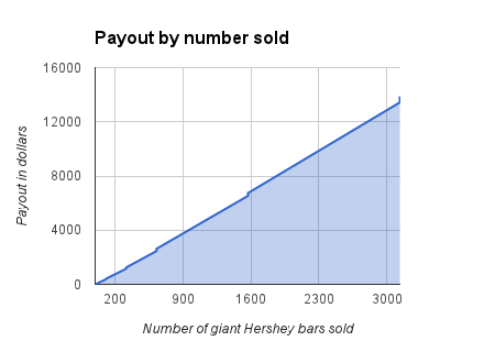
We can graph the actual payout per number of Hershey bars, and that looks like this:

You’ll notice the upticks in the graph at several points – these are the points where the payout rate changes for all products bought that month.  At the first jump it nets me a few extra dollars, but as things continue to escalate these jumps get bigger and bigger.

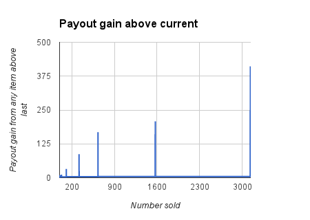
Now, I’m not going to force you to do calculus here (we’re really close, though), but we can take a look at the incremental gain of adding one more Hershey bar to the pile at any point.

We are again faced with a graph whose immensity of scale wipes out some of the (less important) effect.  The main point of this graph are the peaks – while the rest of the line does have variability it is negligible in this case.

Let’s walk through it, because there’s a really important point here.

When the seventh bar was purchased, I mentioned that I’d be pulling down not just the payout for that bar, but the retroactively applied greater payout for all those earlier bars.  The sixth bar makes me $2.08, and the eighth bar makes me $3.12, but the seventh bar makes me $9.36, because the seventh bar triggered a change in the underlying payment structure.

Now, $9.36 is enough to make me happy, but not enough for me to pressure someone who has just bought six bars into buying their seventh.  That $9.36 is only one of the peaks on this graph, though.  Let’s cut to the chase.

When our poor reader buys their 3,130th giant Hershey bar (IN A MONTH), I mimic a cash register noise and earn 8.25% of it ($4.29).  When the same reader buys their 3,131st bar, I break open the bubbly – Amazon just bumped my total by $411.32.  The 3,132nd bar again simply gets a fairly weak cash register noise (for the comparatively paltry sum of $4.42).  

In fact, there’d be no reason for me to wait for this chocolate magnate to buy the 3,131st bar – I could do it myself and still net $359.32.  I’D ALSO HAVE A GIANT CHOCOLATE BAR.

The point is that it’s actually quite foolish to finish the month at 3,130 sales, as I’m simply leaving money on the table.  If I’m smart enough to trick someone into buying this much chocolate I should have the good numerical sense to never stop when so close to such a payout.

Take a quick pause for a moment – do you get that?  Because it’s about to stop being about fifteen thousand pounds of chocolate.

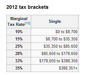
Some of you might think this whole example looks vaguely familiar, as if you interact with systems like this occasionally.  I kind of gave away the spoilers in the title, but this second chart from Amazon does look vaguely like a series of tax brackets:

I don’t want to talk too much about taxes, because it’s really a secondary part of this post and I’ve already talked about taxes quite a bit before.

The main sticking point that I think most people have with taxes is that they assume them to play out one way, when they really play out quite differently.

You may think they play out the same way that Amazon hands out checks in exchange for chocolate (and I guess other stuff too).  You make $5,000, you get taxed at 10%; you make $400,000, you get taxed at 35%.  You can see that this introduces the same (but in the opposite direction) sort of argument as buying the 3,131st Hershey bar yourself.  If you are making $178,000 it would seem stupid to make another thousand and have all your money taxed at a higher rate.  Just stop making money, right?

Well, that thought process comes out of a complete misunderstanding of the process of taxation.  Unlike Amazon – who waits until the end of the month when everything is all set – taxes are paid on every dollar as you earn them.  You never have to go back and retroactively pay a higher rate on money that’s already been earned.  When you move to a higher tax bracket you only pay that higher rate on the money you make from that point onward.

If you’re thinking that you kind of get it, I’d suggest reading this earlier post.  I’d also suggest that post if you are simply lost but want to try to make sense of it.

If you’re one of the people who feels like they now understand taxes better (or had already understood them pretty well before), you should feel proud of yourself.  Proud enough that perhaps you’ve earned yourself the right to treat yourself to something nice?

http://www.amazon.com/gp/product/B000IW68YC/ref=as_li_ss_tl?ie=UTF8&camp=1789&creative=390957&creativeASIN=B000IW68YC&linkCode=as2&tag=48808-20

CNN, statistical-minded proofreading, and percentages of percentages of percentages (of percentages)

This week’s post should be a quick one – it has to do the media.  The poor, poor media.

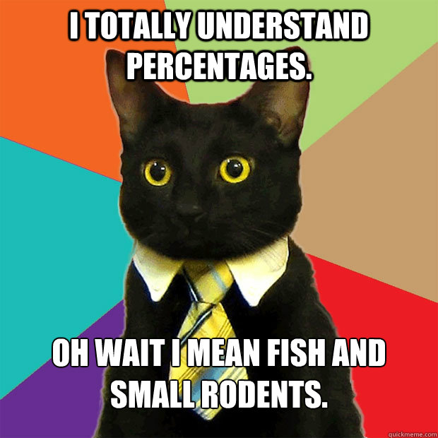
Don’t worry, business cat will make sense by the end of all of this.

Specifically my problem this week is with CNN, though they’re by no means the only ones guilty of poor statistical reporting.  They’re simply the one that I have most recently noticed.  Once you start looking, though, it’s no real trick to catch any of the major news outlets in the same kind of gaffe.

The story in question is here:

http://schoolsofthought.blogs.cnn.com/2013/03/11/when-teachers-are-the-bullys-target/?hpt=hp_bn11

Please take note, this is not a discussion of content.  Obviously I was at least a little interested in the content to be reading the article, but this particular discussion should be completely free of content.  The main content of the article could be written in Latin – what’s important today are simply the numbers and how they report them.

Now, to drill down into it as quickly as possible, the only paragraph we need concern ourselves with is a little past the halfway point of the article.  For your sake, here it is, copied from the article as originally seen several weeks ago but accessed today, April 3rd, 2013:

MetLife’s 2012 Survey of the American Teacher revealed that job satisfaction is the lowest in more than 20 years. The survey reported that 29% of teachers said they are likely to leave the profession. That’s 12% higher than the number of teachers who said they would leave in 2009.”

I’m sure I’m not the only one that starts to get a fight or flight response when I see any media outlet reporting statistics or percentages, but this paragraph throws up some pretty obvious flags that make a little anxious.

First off, they say that in 2012, x% of teachers are likely to something.  They tell you that this is a z% increase from 2009, but fail to provide you with y, or rather y%, the percent of teachers that were likely to do this same thing back in 2009.  

Some of you are getting a flight or flight response (I can feel it, even over the internets) because I just used letters instead of numbers.  I feel for you, I really do.  But this is grade school algebra I’m dropping on you.  If you have no idea how to do grade school algebra it shouldn’t make you feel sad or angry or anxious, it should make you feel motivated to take a few hours and just learn grade school algebra.  If you know me, and want me to teach you, I will.  Honestly.  Just ask.  It will be quick and painless.

In any case, y is not given, but inferred.  We have an equation:

(y + (z/100)*y) = x

This equation has three variables, but only one unknown.  That means it’s solvable for y.

To clarify – for those that are looking at that equation like it is Latin – all that’s happening in it is that we’re taking a 2009 number (y), and increasing it (+) by a percent (z).  Percents are given as numbers from 0 to 100, but to do math in terms of incrementing we actually want a proportion, which ranges from 0 to 1.  We can easily change a percentage to a proportion by dividing by 100 (/100).

This proportion is the part of the first number that increases.  If there is some percentage growth (z), we take the original number (y), and add on to it the share of itself that it is growing by ((z/100)*y).

To make it concrete for you, if y is 10, and it grew by 50%, then the way we figure out what the new value (x) should be is to start with 10, and add on half (or .50*10 = 5).  Thus, a 50% increase to the number 10 results in the number 15.

Are we all on board with that?

Some of you might be saying, ‘hey, this is different because you just did it on 10 and not on 10%’

You, good readers, have just hit on the teachable moment.

I used the number 10, but it doesn’t matter.  For your sake I’m going to copy paste the same explanation but add in the % symbols.

To make it concrete for you, if y is 10%, and it grew by 50%, then the way we figure out what the new value (x) should be is to start with 10%, and add on half (or .50*10 = 5).  Thus, a 50% increase to the number 10% results in the number 15%.

Still following?  Because it’s somewhere in there that CNN stopped following.  Business cat has also moved on to chasing a laser pointer across the floor.

I said we can use the equation up above to figure out the number that CNN isn’t reporting (y).  I won’t hold you in suspense much longer – or make you do the math – the value from the given x and z should be y = 25.892…

You see, if you start with just shy of 26%, and take 12% of that (it’s around 3%) to add on, you end up at around 29%.  If the percents are confusing you, take the % signs off the 26, 3, and 29.

If you start with just shy of 26, and take 12% of that (it’s around 3) to add on, you end up at around 29.

The % signs don’t matter on any of those except for eventual interpretation in context of the content, and I’ve already told you I don’t care one bit about interpretation of the content here.

Where calling something a percent does matter is on the 12.  You may also notice it’s the only one I didn’t remove the % sign from.  I start to worry when I read something like this because an increase of 12% is a lot different than an increase of 12 percentage points.

Let’s walk through this a little more.  The equation we talked about above deals with an increase in percent:

(y + (z/100)*y) = x 

But if we’re talking about percentage point increases it’s a bit simpler:

y + z = x

In that case, you would be saying that the 2012 number is 29%, and since 2009 it has not grown 12%, but rather moved up 12 points on a percentage scale.  It’s a lot easier to figure out the 2009 number, as it’s simple subtraction.  y = 17%

The fact that this is a lot cleaner and simpler (and doesn’t give a solution with a non-simplifying decimal) makes me wonder if this is in fact what they might have been doing there.

OH WAIT WE CAN FIGURE THIS OUT.

You see, despite their poor understanding of statistics and percents, CNN does at least take the time to link you to things they are citing (so they are actually doing a little better than some of the news outlets in that regard).  In this case, the link in that paragraph is actually a live link (at the moment) to the pdf research report from which they are drawing their numbers.  For those that want it as a separate link, here you go:

https://www.metlife.com/assets/cao/contributions/foundation/american-teacher/MetLife-Teacher-Survey-2011.pdf

It’s not a small document, but we’re looking for a very particular piece of information.  A quick search pulls it up, and reveals that CNN didn’t even have to read the actual report – they’re citing information from the executive summary.  Think of the executive summary like http://simple.wikipedia.org

You’ve never been to simple.wikipedia.org?  Stop wasting your time here, and start wasting (making use of?) your time here:

http://simple.wikipedia.org/wiki/Large_Hadron_Collider

or here:

http://simple.wikipedia.org/wiki/Special_relativity

or here:

http://simple.wikipedia.org/wiki/Love

or here:

http://simple.wikipedia.org/wiki/Candy

The last one containing what may be my favorite pair of sentences ever written in conjunction on the internets:

“Many people like candy and think it tastes good. Other people do not like it.”

Anyway, back to the stats.

Finding the Executive Summary TL:DR, CNN appears to have conveniently found the ‘Major Findings’ bullet point list of the Executive Summary to be the place to go for numbers.  I don’t even have a good comparison for a Major Findings bullet point list in an Executive Summary – simple.wikipedia.org is about as simple as my comparisons get.  

Maybe, uh, quickmeme?

http://www.quickmeme.com/make/

Well NOW I’ve killed your day.  That’s also where business cat came from.  Quickly, in fact.

The place I’m trying to get us to is this bullet point in the report:

“The percentage of teachers who say they are very or fairly likely to leave the profession has increased by 12 points since 2009, from 17% to 29%.”

Bam.

Hopefully at this point – if you’ve been following – you can see that the people who were paid to put together a statistical report actually put it together correctly.  They used the correct terminology, and left a % symbol off of the number 12.  They did this as it is not a percent.  It is a growth in percent, not a percent growth.  These two things are very, very, very different.

If you’ve been reading the blog for a while you might recognize that this is the same thing that a of companies use to trick you into thinking things are much larger or smaller than they appear.  The way CNN reworded things actually translated into only about 3 percentage points growth – not very impressive.  12 percentage points is…well, larger.

The same way that Jimmy Fallon can change something on the order of half of a percentage point increase into a drastically different 50% increase (or as we noted, much smaller increases into much larger percent increases), so too can poor statistical reporting change any effect into something that it is obviously not (in either direction).

Look for sources, and don’t just read through numbers without thinking.  The person feeding you the information might be actively trying to deceive you to prey on your weaknesses (like Jimmy Fallon), or might simply be negligently ignorant about those statistics (like reporters at every major news outlet).

Facebook statistics and a mid-season clip-show OR Obligatory self-promotional ramblings

Given that we just passed the point that I’ve been doing this weekly for seven months, I thought this was as good a time as any to look back on some of the statistics that get tossed out of the behind the scenes end of this whole process.  Particularly, some of the statistics that blogger and facebook give me.

I know that some of you follow the updates of this blog on facebook (by the way, I don’t ever capitalize facebook – the fact that it’s capitalized in the title is because of title formatting, nothing else), as I’ve had several of you mention that you missed a post because you didn’t see it pop up in your news feed (or live feed, or news live feed, or timeline, or timeline feed, or timeline news feed, or livetime news feed, or linetime livefeed news ticker, or wall).  
If you’ve never had a ‘non-regular’ page on facebook, you might not have a good feel for the statistics that get put out on my end when I go and look at it. 
By the way, before we go too much further I should say that the page in question is here:
https://www.facebook.com/TheSkepticalStatistician
though even in a post specifically about it I’m remiss not to mention that I actually hate the facebook ‘like’ pages process and a lot of how it’s utilized.  That said, if you want to use facebook as a means of keeping up with things, then go for it.  If you have your own qualms about it – as I do – well, there are other (potentially better) ways.  I don’t ‘dislike’ you for not ‘like’ing the page. 
I’m sorry, this post isn’t supposed to be facebook bashing, it’s supposed to be talking about the stats that facebook gives me about your actions.  So let’s start with a picture and go from there:
  
So one of the big things that I can see whenever I post something through the facebook page is how many people have ‘seen’ that post.  You can ‘see’ it in this image, though don’t stare at it too long waiting for it to go up – it’s just a picture.  See, you’re not really ‘seeing’ it.  Facebook knows when you ‘see’ things, unless you’re ‘seeing’ it some other way.  Well, at least at the moment.  They’re probably ‘working’ on that.
I’m not sure exactly what facebook means by ‘see’ (or rather ‘saw’), but I would imagine that they’re assuming that if it comes across your screen then you’ve looked at it.  There are some parts of the internets that I’d advise browsing with your eyes closed, but facebook isn’t part of it (if you’re doing it right, at least).  
The number of people who ‘see’ any given post on facebook are actually quite interesting.  It’s fairly consistent with the number of people who ‘like’ the page, but it can be lower if the post doesn’t come across your wall, or higher if something happens that facebook measures with ‘virality’.  Unfortunately I don’t have an easy way to map the number of people who ‘like’d the page at any given time (I said easy), so it’s hard to show how those change over time.

Time of day of posting seems to have some impact, though I’m also not really going to sit around and do the math on that – and you know the kinds of things that I sit around doing math on.  I’m not looking to take advantage of you to that degree.

There are some other ‘admin’ tools that facebook gives me to look at things, which give a picture of some of the demographics of the people who like the page, etc.  Most of them are actually pretty stupid, but if you’re curious here’s what some of them look like:

The thing that should really stand out to you is the way that facebook markets to the people who are one step up the ‘commoditizing people’ scale (e.g. me).  You can see that there are 56 people who ‘like’ the facebook page, but the number that facebook wants to shove in my face is 22,835 – the number of friends that all of you have.  Fifty-eight to some factor. 

You may have noticed the ‘promote’ thing in earlier pictures – it’s because by throwing a little bit of money at facebook you can actually buy access to those 22,835 people.  That’s what facebook is trying to commoditize – and they’re doing it really well.

Yes, by liking this page you give me access to buy rights to your friends.  Re-read that.  Seriously, re-read that.  I’ll wait.

Now, I’m not a total jerk (and I’m also cheap) so I’m not going to do that.  But all of facebook’s stats make you feel bad if you don’t.  All of facebook’s methods are set up so that you do.

One of the ways they do this, (if all of you haven’t immediately un’like’d the page now that you’ve ‘seen’ how the sausage is made, so to speak) is through another thing you’ll notice that facebook talks about, which is ‘virality.’  This is how things are spreading away from just your ‘likes’ into other areas – friends of ‘friends’ and beyond.  Now, I’ve just told you that you can buy access to this network, and that I don’t.  So, how do I rely on ‘achieving’ ‘virality’?

Well, by ‘you’ telling other people about posts, and especially by you guys ‘sharing’ the posts that you like with your friends (so I don’t have to pay to just do it myself and actually share the posts that everyone hates).
The idea would be that your friends would then ‘share’ things with their friends, etc, etc.  Your friends are one step more away from me, and especially if you’re talking about their friends, well, I don’t know them, right? Let’s talk about your friends’ friends’ friends.  And after we’re done talking about them, let’s commoditize them.  Yeeeeeeeeeeeees.  Too early?  Okay, let’s continue.

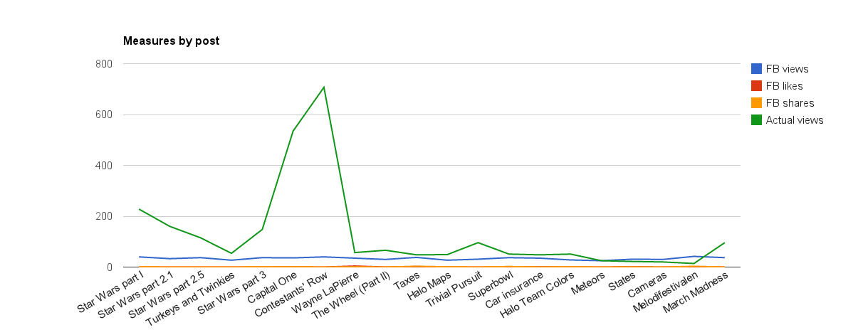
In any case, I think the best information comes out of the number of views of posts and the actual page views from Blogger relating to any given post (which don’t take into account people who simply check the main page when it contains new content).  We can toss actual views of specific posts on a graph along with facebook ‘sees’ as well as more specific facebook ‘likes’ and ‘shares’ – this is what it looks like:

You can see that the Star Wars posts seemed to drive a somewhat lagged boost in views, and before you ask, yes I am working on the final post on the Star Wars stuff.

You can also see that the facebook stuff is pretty robustly indifferent to actual change.  No matter how many people ‘see’ or ‘like’ or ‘share’ or ‘view’ or ‘whatever’, it doesn’t seem to have much bearing on how many people actually view the post itself.  Throughput, if you will. 

There are other ways that people keep up with the blog, from what I’m told.  Some people have talked about RSS, and some have complained about it.  I think it works?  Blogger also lets you subscribe by email, but I’ve also never done it.  I guess it would be pretty nice, though.

Twitter is also always an option, as they seem to care a whole lot less about money than facebook does.  If you happen to have an account feel free to follow @skepticalstats – I’d talk more about it but twitter gives me a ton fewer (i.e. none) stats than facebook does.  Again, probably because I’m not elevated to a separate Twitter tier the same way I am in facebook. 

Before I started using facebook (and thus before I have stats on the above graph), I was using Twitter for this stuff and having some pretty good results – the fact that the graph is starting a little higher and trending down is because it was up pretty high from some of the The Price is Right posts that got spread a bit around Twitter.

But if you start using Twitter – whatever you do – don’t get @skepticalstats confused with @ellipticalcats.

Oh, and tell your friends, so that I don’t have to.

The Madness of March

Love it or hate it, March Madness is here.  Whether you’ve filled out a bracket (or five), or have no intention of ever bracketing anything (or have no idea what March Madness is), the annual college basketball tournament showdown that takes place every March gives us an interesting opportunity to talk about the probabilities at play.

Let’s run through it really quick for those who are scratching their heads.  College basketball is a thing.  Play up to this point in the season has pointed out that some teams are doing better than others.  Teams can thus be rank ordered.  Best teams play worst teams, middle teams play middle teams, teams that win move to the next level of a bracket.  Teams that lose are out.  The winner of the whole thing wins college basketball (basically).
You like the idea of brackets but still hate college basketball.  I get it.  Maybe you wish I was just talking about Star Wars again?  PROBLEM SOLVED:
By the way, is anyone but Vader ever going to win something like that?  Prove me wrong, Internets, prove me wrong.  
Basketball.  For what it’s worth, a lot more people are going to fill out basketball brackets than Star Wars brackets this year.  How many more people?  Well, it’s hard to find accurate numbers, but it seems that it is a pretty safe claim from the numbers I’ve seen that the low end is that several million to tens of millions of brackets each year.
Has anyone ever filled out a perfect bracket?  Nope.  The odds are pretty rough against you, as the cascading contingencies get fairly complex.  We could spend the rest of this week just talking about calculating the odds of a perfect bracket (1 in like a lot), but that’s not what I want to focus on. 
I’m also not going to tell you how to pick a perfect bracket (if I knew I probably wouldn’t tell you, and I’d be a lot richer), nor which team is going to be the best upset, etc.  
What I want to take a look at is as what the system of brackets is really manifesting.  In fact, when we get down to the base of it, it’s a lot like a lottery, or horse racing (which I’ve already talked about here).  Sorry is this is starting to feel like a clip-show.
What makes it more like horse racing than a lottery (at least a random lottery) is the odds that are present in each match-up.  Until you get to the final four (and even then if you count certain ranking groups) every team that plays against every other team is ranked by the tournament as either a favorite or an underdog.  If you know anything about statistics (and nothing about basketball), that means that the safe bet is always the more probable outcome.  
At the horse races, there is a favorite in every race.  The problem is that your odds are not good for betting on the favorite.  In theory, those odds could sometimes drop below 1:1 – for every dollar bet you might get less than a dollar back for a winning bet.
Some of you might not follow horse racing, so let’s go back to a lottery and just fix it (figuratively and literally) so that it’s a little less random.  
For a game like pick 3, there are three boxes full of balls with numbers from 0-9 on them.  A ball is drawn from three of these pools in order, resulting in a real three digit number that is the winner (i.e. any number between 000 and 999).  Every number (e.g. 333, 148, 042, 611, 500, 007, 554) has an equal odds of being drawn, despite (incorrect) perceptions of dependence between draws (e.g. thinking something like 444 is less likely than something like 435).  
So, let’s rig this lotto.  Let’s rig it good.  
Instead of there being 10 balls in these draws, let’s make things a bit more interesting.  Let’s put in as many balls of each number in each draw as…well, that number.  That means 3 balls that say ‘3’, 5 balls that say ‘5’, 9 balls that say ‘9’.  We’ve just made a draw of ‘999’ a lot more likely than a draw of ‘111’.  We’ve also made a draw of ‘000’ or ‘990’ impossible, oddly enough.  
So, this is simple, right?  Go out and buy a ticket for ‘999’ and sit back and wait for fat sacks of cash. Problem solved?
Well, not quite.  Remember, even a rigged lottery really isn’t statistically fair.  Betting on every horse might get you a cool story, but in the end still costs you money.  
Why, you ask?  Well, you might have the (relatively) genius idea to go out and buy a ‘999’ ticket, but I’m betting (a good bet, not a lotto bet) that you’d not be the only person with the same idea.  
The way the lotto works is conceptually similar to the way horse racing works (which again was covered in that horse racing post).  Everyone buys a chance at winning, and it is that cash input that is used as a take after the house takes its share (the rake).  If the house didn’t take a rake you’d be in a situation where acting on the odds could potentially just help you break even a whole bunch.  With the rake in place you’re going to end up tending toward a slow drain (again, just like the horse racing charts in that much earlier post).  
This is because the take is divided between all the people who shared in the winning of it.  If a million people buy dollar tickets, but they all buy a ‘999’ ticket – and that ticket ends up being drawn – then what they are walking away with is a millionth share of a million dollars, less the rake.  If the rake is 10% they’re walking away with a millionth share of 900,000 dollars, or about 90 cents for every dollar in.  That’s not a great place to be.
The problem is simply that a lot of people are going to make the smartest bet (and not play the lotto? – okay, the second smartest bet) and play in line with the odds.  The way to win is to somehow figure out how to get outside of the main pack and still end up with a winning ticket.  You can buy ‘111’ tickets over and over until that hits (and you’re the only person silly enough to be holding one), but the numbers would suggest that on average you’re going to spend more money on all those tickets while waiting for your number to come up.  You can also go to Vegas and just slam down Lincolns (I’m assuming none of you are going to Vegas and dropping Benjamins) on the green spot(s) on a roulette wheel (or any spot, really).
You might hit early and get super lucky on the first draw.  The moral of that – for hopefully obviously reasons – would be to stop playing the lotto and be happy that you capitalized on noise instead of having the odds capitalizing on you.  
Enough with these pretend, odd lotteries, you say?  You’re here for basketball (or Star Wars)?  How does this relate?
It relates because there is a bracket that corresponds to a lotto ticket of ‘999’.  I have filled out that bracket in the past – it makes it a lot easier to watch games and remember who to cheer for.  Always cheer for the favorite, and hope they’re the favorite for a reason.  When you get to the final four make your picks based on records as well as strength of conference.  It’s…pretty simple.  
The problem is that it’s simple enough that you can be assured you’re not the only one that’s through about it. Picking a safe favorites bracket will not make you stand out among the crowd – if you do happen to pick a perfect bracket you’re now sharing that prestige with a whole bunch of others (as well as any prize money – several places like Yahoo offer big prizes for registering a perfect bracket).  
Let’s look at the extreme opposite for a moment.  What if instead of picking every favorite you misinterpret the numbering system (biggest number is best number, right?) and instead pick every underdog?
This would be similar to the ‘111’ ticket, but in practicality might closer to a ‘000’ ticket.  Such a situation seems so unlikely that in order for it to pay out you might have to do something crazy, like play March Madness longer than the lifetime of the universe.  Some of you might be fine with that.
It’s also the case that a ‘111’ ticket is easy prey, so you can be assured you’d also not be alone in your strategy.  As dumb as you might feel picking that bracket, you can be sure that the law of large numbers gave you at least a handful of partners in stupidity.  
So you want to be somewhere in that happy middle ground.  A bracket that’s not too obvious, but one that is still unique.  Not too hard to hit the unique part – estimates of the number of possible brackets are well into the 10+ digits.  Again, cascading choices produce exponential growth (well, I got it right that James Madison made it to the final four, and everything else right, but I totally missed that Missouri upset Colorado State! Missouri!)  
You can start, then, with a totally safe bracket – the statistician in me would advise it.  From there, it’s time to add your own pieces of flair to make it yours.  Who do you think stands the best chance of being upset? Flip that one for the underdog and you’d just reduced the number of people who have done the same thing. Pick another underdog and the pool has probably again diminished.  Now, figure out how far those upsets are going to go along the path to the finals.  Figure out what upsets might occur in the Sweet 16 or Elite 8.  Pick those.  
You’re walking a fine line here – it’s conceptually similar to the trade-off of type I and type II error.  The farther you push away from the most likely bracket the farther you also push away from the group of people playing it safe.  The more risks you take the more likely you’d be standing alone with a perfect bracket if you ever hit one.  Make sense?  Makes sense. 
In any case, go and get filling out those brackets!  ESPECIALLY THE STAR WARS ONE.
If – though – all this talk about the way brackets are really working has you totally disillusioned on the idea of March Madness, then bracket-less brackets might be fore you.  Bracket-less brackets are another cool take on this that actually makes it a lot harder to play it ‘safe’.  Instead of filling out a bracket you pick a team for each seed that you think will go the fartherst, and get points when they move on.  I’m not going to get much deeper into it, because the guys over at Stuff Smart People Like already do a good job at it – they also have a bracket-less bracket contest you can easily take part in here:
Cheers to cross-promotion!  Now fill out some brackets!  

Melodifestivalen: Swedish singing competitions and those silly Brits

I’m suspecting that only a small fraction of my readers happen to be up on the most recent developments in Swedish-based musical competition programs as preliminary selection to the Eurovision song contest.

Well, that’s a thing.  And it’s actually quite a bit more interesting than any American musical competition show that I’ve ever seen.  So there’s that.

Anyway, after initial selection, eight musical acts perform each week for four weeks.  Based on Swedish call-in vote, two of the competitors from each week go to the final.  In addition, two from each week go to a second chance round.  During this second chance round eight competitors are first cut down to four, who then face off in pairs until the two remaining go to the final.

The final thus consists of 10 competitors, and voting is a mix of international juries and Swedish call-in vote. 

It turns out some really interesting acts, like this:

and this:

and this:

and this:

Overall, though, it also puts a whole bunch of acts through multiple rounds of voting from multiple sources.  This produces some pretty interesting data, and gives us some interesting statistical options.

I hate to keep saying it, but once again Wikipedia provides (collects!) some pretty great data on how everything went down.  The results of all four rounds, the andra chansen round, and the final can be found here:

http://en.wikipedia.org/wiki/Melodifestivalen_2013

There are six big picture instances where the Swedish people were able to call in and express their vote.  These six times are the four main rounds, the second chance round, and part of the final.  I mentioned that part of the final was points from international juries.  In fact, there are 11 international juries: Cyprus, Spain, Italy, Iceland, Malta, the Ukraine, Israel, France, the UK, Croatia, and Germany.

Because only a certain portion of contestants move on to the final (and because there is no distinction before the final between first and second, or between third and forth) there’s actually not much variance in scoring from those first few rounds.  The most useful information comes from the final – 11 international juries and the Swedish people rate each of the 10 final contestants.

What can we learn from this?  Well, what I started thinking about was finding which countries scored the contestants in similar ways.  After a little more thinking I got to wondering if we could treat each country as a item by which each contestant is measured.  In such a case we could examine how well each country was measuring the same thing through a reliability analysis.

Now, I recognize that this is not without pitfalls – the fact that this is rank data means first that cases aren’t independent.  It also means that reliability based on continuous measurements might not be the most applicable, but I’m going to look the other way for now.

A straight-up reliability analysis of the 11 country votes and the final Swedish phone vote gives us some numbers that are almost respectable – including a Cronbach’s alpha of .695.  If this is a means of gathering consensus, though, which countries are simply coming out of left field?

We can take a look at the inter-item and item-total correlations, and what we find is that the UK seems to be the country acting the most strange (this is also backed up by individual item-total(ish) Spearman’s rho rank order correlation for the UK).  The inter-item total correlation for the UK is actually negative (-.11), implying that they are measuring something reasonably different than the rest of the countries.

So what happens if we pretend that the UK forgot to show up last weekend?

First off, our Cronbach’s alpha jumps up to .734.

Here are the rankings and point totals as they played out in reality:

Competitor      Final    
    Points
       Rank
Robin Stjernberg 166 1
Yohio 133 2
Ulrik Munther 126 3
Anton Ewald 108 4
Louise Hoffsten 85 5
Sean Banan 78 6
Ralf Gyllenhammar 73 7
David Lindgren 69 8
State of Drama 68 9
Ravaillacz 40 10

And here are the rankings and point totals as they would have played out without the UK:

Competitor      Final
    Points
       Rank
Robin Stjernberg 166 1
Yohio 131 2
Ulrik Munther 114 3
Anton Ewald 104 4
Louise Hoffsten 85 5
Sean Banan 68 7
Ralf Gyllenhammar 65 8
David Lindgren 69 6
State of Drama 62 9
Ravaillacz 39 10

You can see that not much has changed, as the only change seems to be David Lindgren jumping up two places above Sean Banan (boooooooo).

Cyprus also had a negative item-total correlation (albeit smaller), which is still has after the removal of UK.  Removing Cyprus in addition to the UK bumps our Cronbach’s alpha up to .775.  It also continues to move Sean Banan down the ranks:

Competitor      Final    
    Points
      Rank
Robin Stjernberg 165 1
Yohio 121 2
Ulrik Munther 108 3
Anton Ewald 96 4
Louise Hoffsten 83 5
Sean Banan 56 9
Ralf Gyllenhammar 65 6
David Lindgren 65 6
State of Drama 62 8
Ravaillacz 39 10

We could keep at it, but given the pretty sizable gap between first and second place it seems like the removal of particular countries isn’t going to swing things much in any substantial way (the rest of the countries are also considerably more consistent).  It also pains me to begin to question if Sean Banan doing even as well as he did was simply due to noise in the data.

However painful, let’s take a look.

We’ve been looking so far at the consistency of any given country, but we can also take a look at how stable the individual competitors were in terms of rank.  How to do this?  Well, let’s see if means and standard deviations can help to paint a picture.

The idea here would be that if countries can’t agree on how to rank a contestant then that contestant should have a higher standard deviation (error) around their mean rank.  Hand-waving again around some of the ceiling and floor suppression effects on SD from this kind of scale, here you go:

Competitor Mean rank SD rank
Robin Stjernberg 2.916666667 2.274696
Yohio 5.583333333 2.314316
Ulrik Munther 3.5 2.153222
Anton Ewald 4.916666667 2.466441
Louise Hoffsten 5.666666667 2.348436
Sean Banan 5.833333333 2.552479
Ralf Gyllenhammar 6.166666667 2.480225
David Lindgren 5.083333333 2.84312
State of Drama 5.25 2.261335
Ravaillacz 7.333333333 0.887625

Interestingly, the only competitor that really stands out is Ravaillacz (almost universally ranked toward the bottom of every country’s list).  David Lindgren is also a bit high, though Sean Banan doesn’t seem to be standing out as I expected.  Most ranks stay pretty consistent.

[You also may notice that Yohio drops quite a bit if we just look at mean ranks.  It is because he did really well with the Swedish phone vote, which is weighted higher than any of the other individual countries.]

Overall, it seems that Robin Stjernberg was pretty safe in his win, though perhaps in the future the British shouldn’t get to vote on anything relating to music.  At least if that music is crazy Swedish music.

Sing us out, Mr. Stjernberg!

Cameras and the nature of noise

I’m pretty happy here – today we get to talk about two things that I really enjoy: cameras, and randomness.

With the proliferation of digital cameras and digital images it is very likely that at least some of you have an incorrect image or concept in your head when you hear the word ‘noise’ in the context of pictures.  That incorrect image may not be one of noise, but of pixelization. 

For example, let’s start with a standard picture to which we can compare all others we talk about.  That picture will be this:

For reference, this is 3456×2304 pixels (8 megapixels), tripod-mounted, 200mm, 1.3 sec at F6.3, ISO100.

There’s a lot of information there, and one of the things I’m looking forward to today is explaining the majority of it to you.  

Pictures – be they analog or digital – are made when light is focused onto a surface by a lens for a specified amount of time.  In traditional photography that surface is a frame of film.  In digital photography that surface is a charge-coupled device, or CCD (or something like it). 

It’s easier to talk about resolution when it comes to digital images, so we’ll start there.  The first number I tossed out (3456×2304) are the number of pixels in the above image.  The first number is by width, and the second is by height.  The multiplication of the two clocks in just below 8 million, which is how the concept of 8 megapixels (MP) is derived – it’s how many pixels make up the total image.  

If you zoom in on the above image you’re going to see some pretty true lines – this number of pixels give a very good resolution for defining objects.  Pixelization occurs when there aren’t enough pixels to adequately define a line.  We can demonstrate this by taking the exact same image and reducing its size.  First, let’s take it down to 200×133.  That’s not even quite 1 megapixel:

If you look at the hard edges of some of the dice (especially the white one in the center with a 2 showing), you can start to see how the edges are beginning to look more like steps than hard lines.  This is because there aren’t enough pixels spread across the image to ‘smooth’ that line.  This will be less apparent on true horizontal or vertical lines and worst on lines angled 45 degrees to the sides. 

We can make this worse to really illustrate the point – here’s the same image taken down to 20×13

When you cut the number of pixels – in any given horizontal or vertical line – in half, the new pixels are created by averaging two pixels into one.  You can see that happening here, to large effect.  Each pixel no longer describes a really small area of the photo (think grains of sand in the first image), but a wide section of it.  This is pixelization.  It is not noise – it is lack of resolution.  When you see little staircases in your pictures (granted you’re not taking pictures of little staircases), your problem is image size.  For most of us, something like 8MP is more than enough.

One of the other things you might recognize in this picture is that the only lines that can be defined in any reasonable way are those that are horizontal or vertical.  At this degree of pixelization the ability to meaningfully describe 45 degree angles is practically non-existent.

I mentioned above that a picture is made when light is focused onto a surface for a specified amount of time.  This takes us to the next point – the lens. 

If you’re reading this article you’re using some lenses – your eyes.  Some of you might be using some extra lenses in addition to your eyes in the form of glasses or contact lenses.  The notion is that these lenses are taking light from a wide area and focusing it down to a point or area.  If you want to learn more about lenses you can start here:

http://en.wikipedia.org/wiki/Lens_%28optics%29

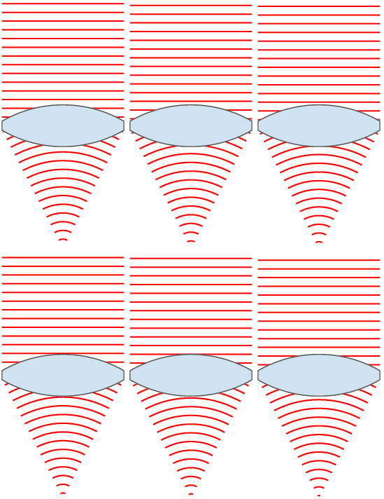
Or just spend some time staring at this totally public domain image from the same article:

The number I quoted above (200mm) relates to the length of the lens.  Most people (I did for a long time) think that this relates to how long the actual lens you put on your camera is.  While that is somewhat true, it’s not the actual measurement.  A ‘mm’ measurement on a camera lens is actually fairly complicated, but for our purposes is most directly related to how far the back element of the lens (the last piece of glass in the lens) is from the surface that you’re focusing on.

If you have a zoom lens sitting around (okay, so not everyone does), you can check this by taking it off your camera and zooming it.  While the whole lens gets longer this is actually being done to move the last lens element away from the body of the camera. 

This measure of a lens isn’t really important to our discussion, but now you know a little more about cameras, right? 

The last three numbers above are actually pretty important – they’re the heart of exposure in photography. 

To remind you, they were “1.3 sec at F6.3, ISO100.” 

Remember that a picture is made when a lens focuses light on a surface for a specified amount of time. 

The three things that drive exposure are shutter speed, aperture, and film/sensor sensitivity.  They are a balancing act – as you increase or decrease one you have to account for that change in some change in one or both of the other two.   

When you take a picture you’re opening the shutter behind the lens to let light hit the sensor for as long as the shutter is open.  In the above example this was 1.3 seconds (one of the reasons I did this tripod mounted).  This is fairly simple.

Also behind (or often in) the lens is the aperture – a series of panels that close down to let less light back into the camera.  To demonstrate this, hold up your hand with your thumb closest to your and the rest of your fingers in a line behind it.  Now touch the tip of your index finger to the inside tip of your thumb, to form a circle – think of giving someone a gesture of ‘okay’.

That circle is a decent size, at least the largest you’re going to be able to make with those two fingers.  Slowly move the tip of your index finger down the side of your thumb and into the crease between them.  As you do this you should notice that the circle formed by them is (more or less) staying a circle, but slowly getting smaller.

This is more or less what the aperture is doing inside your camera.

The measure for aperture is usually represented as F’something’ – in the above example it’s F6.3.  This number is actually a ratio – it’s the ratio of the mm length of the lens to the mm opening of the aperture.  Thus, as the size of the aperture opening gets smaller and smaller the F number actually gets bigger.  This is because the numerator of the fraction is staying the same and the denominator is getting smaller – the outcome is a larger number (think 1/4 vs 1/2, or 4/4 vs 4/2).

With some quick math, we can thus figure out (no one ever figures this out, ever) how wide open the aperture was for this shot.  6.3 = 200mm/x    ->    x ~ 31mm  

The higher the aperture (F) number, the less light is getting into the camera.  This means that the shutter has to be open longer.  Exposure is balanced in this way – the more light the aperture lets in the shorter the shutter is open, and vice versa.  That’s not the whole story, though.

We’re almost to the punchline, by the way.  The last number is ISO100, and it translates to the sensitivity of the medium.  In traditional photography this is the sensitivity of the film surface to light – achieved by packing more light sensitive chemicals in the film frame.  Each roll of film is a particular sensitivity and can’t be changed on the fly.  In digital photography this is the sensitivity of the CCD to light – achieved by…well, turning up the sensitivity of the CCD to light.  One of the advantages of digital imagery is that this can be easily changed on the fly at any time. 

Most digital cameras range from an ISO of around 100 to somewhere around 1600 or 3200.  Some make it up to 6400, but the scale follows doubling rules – that is the jump from 100 to 200 is the same as from 400 to 800 or 3200 to 6400.  

Like I said, if you want to know a whole lot more about CCDs you can start on that wikipedia page.  They’re pretty cool, but complicated enough that I’m not going to get into them too deeply here.

What we’re going to consider them as are electronic devices with a number of holes that photons can fall into.  What are photons?  For our purposes…uh, pieces of light.

If you think of the first image we looked at we know that there are something like 8 million pixels in the image.  As long as the lens is focusing things adequately, that means that the picture can account for light coming from (being reflected by in this case) around 8 million sources.

Electronics are imperfect.  Many are designed to operate in particular tolerances.  My camera’s CCD may very well be rated for use at ISO100.  Pushing it higher than that – again for our purposes – can be thought of as a way of overclocking it.  More specifically, sacrificing accuracy for power.  

You see, there are error rates at play here.  If we’re treating the CCD as a photon collector then its job is to tell the onboard computer every time a photon passes through the gates at any pixel.  If you want this to be pretty accurate you need to make sure you’re letting in what you are actually looking for.  This means setting higher thresholds for what is considered a photon. 

Think of it a different way.  At the lowest ISO settings you’re setting pretty high standards in terms of letting things through.  Imagine 8 million tiny bouncers – complete with velvet ropes – each standing next to one of the pixels on the CCD.  They are responsible for making sure that what’s getting through the gates is actually a photon, and not just a false positive.  At low ISO they are pretty thorough – they have a list and you had best be on it.  They’re so thorough that they may stop some actual photons from getting in.  They’re willing to sacrifice some false negatives to make sure that false positives are near zero.  

If you’re in a situation with a lot of light this isn’t a problem.  This might be because there’s a lot of light in the scene, or because you’re allowing a lot of light to get into the camera (long shutter speed, tripod). 

If you’re in a situation with not much light (and no tripod), you might be willing to relax your draconian stance on false positives to make sure you’re catching more of those photons you turned away as false negatives.  An ISO200 bouncer is twice as relaxed as an ISO100 bouncer, an ISO400 bouncer is twice as relaxed as that, etc.

At a certain point, the bouncer is barely doing his job at all.  For my camera that’s around ISO1600.  He’s letting in photons, but he’s also letting in his friends and any rift-raft that happen to wander along.  It is a party, and everyone is invited.

Here’s how it begins to play out:

ISO100:

ISO400:

ISO1600:  

FYI, all of these are now at a fixed aperture of F8 (which is about the sweet spot on my lens), so shutter speed varies (goes down) as the sensitivity increases.

If you have a keen eye you might start to notice a bit more noise in some of the areas of the picture as the sensitivity goes up.  This brings us to an actual conversation of what that noise represents. 

There’s some ‘true’ image here that represents what was actually sitting on the table in front of me while I took these pictures.  Each pixel should have a value relating to the number of pixels that made it past each gate (I’m simplifying the fact that this is a color photo), and the lower the ISO the closer to ‘truth’ this should be.  Put another way, the observed values should cluster more closely around the actual values at lower ISO values. 

When you turn up the sensitivity by raising the ISO you start getting measurements of things that aren’t actually true – this is noise.  You begin to see it as a sort of ‘digital grain’ – if you weren’t able to pick up on it above we can zoom in a bit to really make it clear:

ISO100:

ISO400:

ISO1600:

At this point you should be able to see the pixel-level noise that starts to manifest itself at higher sensitivity.  Things look fairly ‘real’ at ISO100, even at this level of zoom.  At ISO400 you start to see a bit of that ‘digital grain’, and at ISO1600 it is very pronounced.

What is it, though?

Well, it’s noise, and it’s (presumably) random.  If this image was gray-scale each pixel would be establishing a level between black and white, represented by a number.  We can think the same way for each pixel in a color image, except there are actually a few color channels being measured.

Let’s say, though, that any given pixel in the scene is actually reflecting x quantity of light.  If that pixel is being measured by the sensor as x, then you’re getting a highly accurate representation of the scene.  It’s more likely that there’s some error present in your measurement, that is:  observed = true + error

That error can be positive or negative by pixel, and again should be fairly random.  The less you are trying to push the sensitivity the more accurate each pixel can be – the closer observed will be to true.  That’s why the image at ISO100 looks fairly ‘true’ – the bouncer at this level is providing a good deal of scrutiny and making sure things are what they seem.

The reason the image at ISO1600 looks ‘grainy’ is because these error bars increase with increased sensitivity.  If the magnitude of error is higher, then your observation (the CCD’s observation) of any given pixel is going to tend to be less ‘true’ – farther away from x on average. 

If you’re particularly inclined, you can imagine a normal distribution around this true value x.  The higher the sensitivity, the flatter and wider this distribution.  You’re much more likely to pull a number that’s highly incorrect at ISO1600 than you are at ISO100.

When you look at the ISO1600 image, you’re seeing individual pixels because there’s a contrast emerging between adjacent pixels.  Contrast is simply the magnitude of the difference between two areas – if you’re looking to define a difference between black and white, or lighter or darker, contrast is great.  Flat-screen TVs often let you know what their contrast is, something displayed like 10,000:1 – this means that the whites that the TV is capable of producing are 10,000 times brighter than the blacks it is capable of producing. 

The contrast you’re achieving at a pixel level in the ISO1600 image is partly false contrast, however.  The color and luminosity of one of the dice at any given location is actually pretty similar to the area (pixels) directly adjacent.  The reason that you’re seeing a difference is because noise is being distributed randomly and making some pixels lighter and some pixels darker.  When a pixel is randomly made lighter than those around it you notice it much more than if it was similar to those pixels around it.  It looks like a small bit of light surrounded by darker area.   

This is why you’re seeing ‘grain’ – what you’re seeing is deviations from ‘true’ at the pixel level.  
 
All said, there’s still an assumption there that this error and noise is randomly distributed.  Because of this, there’s a way that you can have the best of both worlds – high sensitivity but accurate observation.

It may be a fun thought experiment to stop reading here for a second to see if you can use the information provided to independently come up with a way to remove noise in images like those at ISO1600.

It has to do with averaging.

If we assume that the noise at each pixel is randomly distributed then the best guess for the actual ‘true’ value for any pixel should be the average information for that pixel across multiple images.  This is also where a tripod is necessary – if you take a number of pictures of the same thing (in this case I did around 70, but that’s way overkill) you can average them to find a best guess for the ‘true’ value of that pixel.
   
There are actually some good tools available to do this – the one I use is called ImageStacker.  An image is really just a lot of information relating to the value of each pixel in the image.  In a grayscale image that has to do with gradients of black and white, and in a color image it relates to the gradients of a few different colors. 

Basically, though, you can conceptualize an 8MP digital image as 8 million numbers telling you the state of each pixel (again, more if you want to consider color).  It’s easy enough to take 8 million averages using today’s computers, and that’s what programs that do this are doing.

Perhaps the result would speak best for itself.

Here’s the full single image at ISO1600:

 
And here’s 70 images at ISO1600, averaged into one image:

Again, the best picture is probably painted at a high zoom where noise would be the most apparent.  Here’s the zoom on a single image at ISO1600:

And here’s the zoom on 70 images at ISO1600, averaged:

For comparison, here’s also again the zoomed image at ISO100:

Obviously, the average is quite a bit closer to the single ISO100 image.

Keep in mind as well that the image averaged from 70 images is NOT 70 times larger as a file.  It’s still just one image, and is the same size as any one of the images that were used to produce it.  What’s being thrown away in the process isn’t image information, but redundancy and noise.  The ‘true’ information that exists in every picture is that which is shared – the redundancy across those images is used (in effect) to determine what is ‘true’.  That – again – is done through simple averaging.

The fact that it works demonstrates that this noise is in fact randomly distributed – if there was a bias one way or another the averaged image would have a luminosity or color shift when compared to the single image at ISO100.  It does not.  In fact, they’re fairly indistinguishable to the eye.  What I’m noticing when I really look is that the ISO100 image actually has a bit more noise than the average.  For instance, take a closer look at the green d6 in the lower right corner.    

Hopefully – if you’re still with me – you understand a whole lot more about how cameras work.  Oh, and maybe you have a better understanding of random error.  Or maybe you just want to roll some dice.  I’d be happy with any of those outcomes.

And for those that are just wondering if they can have a full size example of all these dice, here you go:

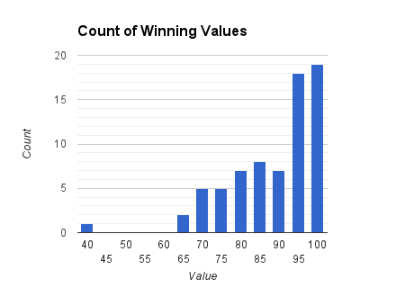
OCD of National Proportions: Or How I Learned to Stop Worrying and Love Big Round Numbers

I’m going to make an assumption today that the majority of you reading this have spent their entire lives in a world where the United States of America consisted of 50 states.  I have, and it’s always been one of those things that stands out in the back of my mind.

It just seems too convenient -50 is just such a nice number, and graphical representations of the states (e.g. the fifty stars on the flag) are just so nicely symmetrical. 
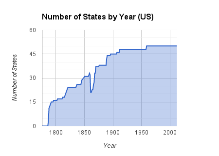
I’ve always wondered what it would take for the US to add more states from the very adequate list of territories (e.g. Puerto Rico, Guam, The Virgin Islands, American Samoa…Guam, etc), as this would potentially disrupt some pretty important stuff (like having to make a new flag!). 

It does seem a bit suspicious that it’s been so long since we’ve changed off of a nice round number, though.  It got me to wondering about if there were other numbers that the United States stayed with for a while during the slow growth of the nation.  Let’s take a quick look:

You can see that the United States has stuck with 50 states for a while now (about a quarter of the time there have been states), and they had been at 48 for a while as well.  If we’re looking at numbers that end in 5 or 0 as those that fit the criteria of big and round, you can see that the US also spent a brief time (around 1900) at the 45 mark. 

Other than that, though, things seem to be pretty random.  There’s some periods of time where the number of states was constant for a while, but none of those numbers seem to be big or round. 

Bit of trivia, by the way – all states except two have a well-established order in which they were admitted into the United States.  States admitted on the same day are often ordered by what sequence the president officially signed them into statehood.  President Harrison intentionally shuffled up the paperwork for two states, signed them in a thereby random order, and took the secret of the order to his grave.  Which two states?

Anyone?

North and South Dakota.

Before we move on to thinking outside of the states, I have another graph that I made to see what it would look like, and figured it was worth sharing.  It’s the same graph as above, but takes into account that a number of states removed themselves from the US roster during the Civil War.  They weren’t all readmitted immediately following the end of the war – they were readmitted over a period of a few years.

Anyway, here’s what it looks like if we take the Civil War into account:

Beyond this, I started to wonder if other countries naturally settled into nice round numbers that help out with building their flags, etc.

Before we move on, let’s have a quick quiz.  How many provinces does Canada have?  Does Mexico call their state-like things states or provinces?  How many of them do they have?

Let’s start with Canada.  If you totally blanked on your quiz, they have 10 provinces.  Here’s how that has played out historically:

    
You can see from this that Canada has actually spent more time at 10 provinces than the US has spent at 50 states.  Provinces have been added fairly slowly, but Canada has also only added only a fifth as many as the US.  The bottom line would seem to be that they haven’t made any changes in quite a while.  Right?

Well, no.  Some of you might be clever enough (or Canadian enough) to point out the fact that Canada has some territories that are much more like provinces than US territories are like states.  They’re also contiguous, which helps to create an overall ‘picture’ of Canada that includes them.

Putting them on the graph as well produces this:

So Canada did spent a decent amount of time with 12 province-like things, but none of these numbers look as nice and round as 10 does.  They’ve also settled in – fairly recently – to a 13 province-like thing system. 

By the way, if you live in the US and have no idea of what Canada did to change things up in 1999 you should spend a bit of time on the Googles.

Which brings us to Mexico.  Mexico has 31 states.  If you had no idea of that – or have no idea of what any of them might even be named – maybe you should head over to wikipedia for a bit. 

Here’s the historical punchline:

Mexico spent a decent amount of time with 20 states (a nice round number), but only a little with 25, and jumped past 30 altogether!  Like Canada, they’ve also made more recent changes to their state makeup when compared to the US. 

I kind of feel that these graphs are interesting enough in and of themselves, but I just had to push myself a little farther.  What other countries are large and have a number of internal divisions? 

Who else is wondering how the graph for the People’s Republic of China (PRC) would look? 

Well…messy.

If you know as much about China as you know about Mexico or Canada you may be unaware (as I will admit I was) of the number of different divisional concepts that the PRC has moved through in 60 or so years.

First off, the PRC started with some provinces already established from the prior several thousand years of civilization.  Most proximal are those that were in place in the preceding Republic of China (the remnants of which are now confined to Taiwan).

The PRC calls all of their divisional concepts (like states, etc) provinces, but one of the things on that list of provinces is also province – the kind that’s most like states.  If we only look at things that the PRC call ‘provinces’ within the larger concept of provinces, we can start by making something like this:

  
If you’re thinking about things too much from a US perspective you might be wondering if some provinces seceded or something.  Nope.  The PRC is simply a lot more likely than the US to shift things around and redraw – or divide or combine – provinces as they see the need. 

This might make things look as if not much goes on in terms of China adding/removing provinces, but things couldn’t be further from the truth.  In fact, a ton of shuffling has gone on over the last half century. 

Let’s add in all the other things that are in that big category of provinces.  This includes ‘Greater Administrative Areas’, ‘Provinces’, ‘Autonomous Regions’, ‘Municipalities’, ‘Special Administrative Regions’, ‘Regions’, ‘Territories’, and ‘Administrative Territories’. 

If you’re interested, the best source of information that I could find was actually on wikipedia (yes, yes, sources, etc), and specifically the article here:

http://en.wikipedia.org/wiki/History_of_the_political_divisions_of_China#List_of_all_provincial-level_divisions_since_the_proclamation_of_the_People.27s_Republic

It’s also the first time on this blog that I’ve been unable to get all my numbers to match up.  The numbers work out against source for that last graph, but they don’t for the next two.  They’re close, but all the double-checking I’ve done has not revealed the small mistake I may have in there. 

That said, if you check out that wikipedia page you can see how difficult it is to systematically track the progression of  these state-like things through all the different terminologies, as well as through all the mergers, dissolutions, and reinstatements.  At the end of the day, my take is that if I have any Chinese readers I would absolutely love to sit down and get some input on the last 60 years of your history.

You’re waiting for the chart, so here it is:

   
You can see that there were a lot of changes to things in the 50s, as there seemed to be a drive to simplify some of the naming and state-like things.  To really paint this picture I think it’s more interesting to look at the same graph set up like this:

The blue line, then, is really the difference between the red and yellow/orange lines.  You might be tempted to say that the PRC hasn’t changed anything in a while, but keep note of the different scale of time we’re talking about.  Like Canada, they were doing things up into the 90s.

It’s hard to imagine a US where this much shuffling took place, but it’s a good example of a country not getting stuck on one number or another.  Mexico is similar with their 31 states.  Canada is interesting, as they seem to be pretty stuck on 10 provinces but willing to toss around territories all willy-nilly.  Perhaps my many Canadian readers can illuminate me on what makes their territories different from their provinces.

Perhaps someday the US will follow Mexico’s lead and head on up to 51 states.  My advice?  Start working on 51 through 55 star flags right now so you can win the new flag competition post-haste when it’s introduced.  Because seriously, isn’t that the important part of all of this?