Halloween Candy: Children and the Hunter/Gatherer Ideal

Today happens to be Halloween, and the fact that it fell on a Wednesday this year convinced me to take a try at putting together a special Halloween post.  It will be 6 years before that happens again (remind me to do a post on the regression of dates and days of the week), so it seemed like the right time.

I’d like to say that I spent a lot of time thinking about a really good idea, but I have to say that I’ve found the most interesting ideas are often those that come to mind fairly quickly.  There’s a subtle quality to simplicity.

There’s a good chance you might be reading this after Halloween is over, knee deep in the spoils of war: Halloween candy.

That got me thinking – what if we didn’t look at trick or treating as a modern method of gluttony and endulgence, but of a viable hunter/gatherer method of procuring a food source?  Another way to think about it is: What if the movie Encino Man had taken place in late October and Pauly Shore and Samwise Gamgee hadn’t been around to help him out?

Well, Brendan Frasier might have started foraging in a world where every house was handing out some of the most calorically dense food he’d ever encountered.  What does that mean to Paleolithic Man or a young child?  HOARD FOOD.

Just how good of a strategy is this, if you were in fact a child of the Paleolithic Age?  A child of the modern age on Halloween will no doubt tell you that biggest bag of candy is best bag of candy.  A child of the modern age two weeks later will tell you that the candy is still good and of course they will still (begrudgingly) eat it. 

So what sort of net caloric gain can we expect from trick or treating?  The easier part is our caloric deficit by actually getting up and going outdoors to walk around and collect things.  The problem is that calories burned while walking is exceptionally dependent on a lot of different factors that are going to vary a lot, not only in the overall population but even in the child population.

I’m going to make some reasonable guesses here, and say that on average the pace is fairly slow – there’s a lot of walking, but also a lot of waiting at doors.  The best bet for a kid is suburbia, where houses are pretty close together, so that the time spent waiting and the time spent walking is probably pretty well balanced.  Given that there’s a mix of walking, (child) running, and dead stop, I’m going to assume that the average pace is somewhere around 2mph, which means that a child should be burning somewhere around 100-150 calories an hour.

There’s an interesting classical mechanics reverse rocket fuel problem here, as children are also collecting mass in the form of candy that they have to carry through the rest of the evening.  If anyone wants to tackle that one it would be a great physics problem, but for the purposes of this post the noise already inherent in estimates is more than enough to wash out any extra precision that would be gained from such an exercise.

So, let’s say kids are burning around 125 calories an hour through the process of trick or treating.  Earn and eat one Reese’s Peanut Butter Pumpkin (90 calories) every 45 minutes and you’re now just about calorie neutral.

You’re not going to spend all that time just collecting and eating one peanut butter pumpkin, though – what else should you reasonably expect to get?

Here’s there the real guesswork begins.  I have a brief aside about the dangers of relying on information found on the internet without going to source.  A search of ‘most popular halloween candy’ brings up a lot of hits, and it’s easy to find websites that claim to have just that.  They don’t put any context on it, and it’s easy to believe that these lists represent the most likely candy to be given out to children.

The usual top of those lists?  Reese’s Peanut Butter Cups.  I was once a kid, and I am immediately skeptical of this.  I never once poured out my bag of candy to find a overwhelming pile of peanut butter cups.  Well, let’s dig to source.

Most websites with this same list don’t mention where it came from at all, but I eventually found one that did.  The list of ‘Most Popular Halloween Candy’ could eventually be tracked back to a site that presented the same list as Voted Most Popular Halloween Candy, from a poll that they had held.

It seems like most leads I was able to find eventually get down to something like this.  There are several articles whose titles are things like “Best Selling Halloween Candy”, but then immediately talk about popularity and just which candy is best.  I don’t know what I was really expecting when it came to Halloween-centric candy articles, but it’s pretty disheartening.

Given this lack of information, the best way to really figure this out would be to simply have kids, send them out trick or treating, and then catalog what was in the bag at the end of the night.  I’m going to consider that a little too much work for one post, so instead I’m going to try to work with some averages.

I’m also going to try to work from memory and think back to the things that I remember getting back in the day.  I think this list pretty much covers it, complete with the most accurate calorie information I could find:

100 Grand – 95
3 Musketeers – 63
Almond Joy – 91
Baby Ruth – 85
Butterfinger – 100
Candy Corn (11 pieces) – 70
Caramels (2 pieces) – 80
Dots – 70
Heath Bar – 77
Hershey’s Chocolate Bar – 67
Hershey’s Kisses (3 pieces) – 78
Junior Mints – 50
Kit Kats – 73
Laffy Taffy – 32
M&M’s – 90
M&M’s Peanut – 93
Mike & Ike – 50
Milk Duds – 40
Milky Way – 76
Mounds – 92
Mr Goodbar – 90
Nerds – 50
Nestle Crunch – 51
Pay Day – 90
Pixie Stix (3 sticks) – 25
Reese’s Peanut Butter Cup (medium) – 88
Reese’s Peanut Butter Pumpkin -90
Skittles – 80
Snickers – 72
Sweet Tarts – 10
Tootsie Rolls (3 pieces) – 70
Twix Carmel – 50
Twix Peanut Butter – 50
Twizzlers – 64
Whoppers – 100

All the calories are for ‘fun size’ or ‘snack size’ bars.  In terms of bar candy, these are the ones that are actually rectangular, not the square ones – I’m assuming if someone is giving out the smaller square ones you’d get two of them, which adds up to the larger bar.  Some of the items on the list also have notes for those that are unlikely to just receive one of (like Hershey’s Kisses).

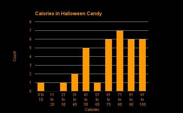
A histogram of these candies reveals that things are generally all in the same area.

Sweet Tarts are the oddity, with only 10 calories in the Halloween sized portion.  That said, the mean and median are almost identical (70 and 73), so I’m just going to go with those.  If I doubled things for Sweet Tarts on the assumption you probably wouldn’t just get one thing of Sweet Tarts then the mean would be a touch closer to the median anyway.  Some of these candies might be more represented in a standard take, but hopefully most of that should wash out.  I’m going to assume that the majority of houses give out one of these things from the list (60%), some houses give out double (30%), and a small number give out triple (10%).

If we weight houses based on these numbers we come up with an average take per house of just about 110 calories. 

This means that we now know how many calories you will burn per unit time, how many calories you will collect per house (on average), and all that remains is how many houses you can trick or treat at per unit time.

This is the place that things should vary the most.  If you live in a neighborhood where the houses are closer together (or farther apart), you might be able to change this number around a bit.  The type of neighborhood I’m going to work from gives me about a house every minute, taking into account walking, waiting, and getting the candy.

We now have enough data to do some math – if you’re able to get to 60 houses an hour, and each house gives you an average of 110 calories of candy, and every hour you spend 125 calories in work, then you’re coming up with a net gain of about 6,475 calories worth of candy per hour.

Not too bad.  Considering that kids usually trick or treat for 2-3 hours, that means that you have the potential to be pulling down just a little more than 500 calories short of 20K: 19,425 calories.  If you ate nothing but candy, and every day ate your daily allotment of 2,000 calories, you’d still be set for over a week.  It’s likely you wouldn’t be feeling that great by then, but if we go back to Brendon Frasier I’m betting he wouldn’t care as much.  Food is food.

So, how much could our hunter/gatherer ancestors pull down if they were really stockpiling for the winter?

The candy they get at each house shouldn’t change, so the things they have the ability to change are pace and total time.

In the above example we assumed that little kids can only move so fast, and are also burdened by slowest members of the group, whether those are even younger children or parents who want to walk at a more casual pace.

Living in a hunter/gatherer society would likely create individuals who were much more willing and capable to pick up the pace.  An all out sprint is probably unsustainable, but it’s a lot easier to believe that our trick-or-treaters could maintain a light jog of about 6mph.  That’s only a 10-minute mile and there are plenty of opportunities for rest while waiting at the door, so I don’t think it’s too unreasonable.

If you’ve never watched an analog clock tick away 30 seconds, I suggest you do it now.  It’s actually a pretty long time, for what it’s worth.  I’m going to assume that a job of 6mph between houses in the above scenario will cut time per house in half, or double the number of houses that you can trick or treat at in any given time frame.

It also comes at a cost – a jog is going to burn considerably more calories than our casual stroll.  How many?  Well, if we’re also assuming that we’re now talking about full grown adults, and they’re still spending half the time waiting and half the time jogging, then they’re going to burn somewhere around 300 calories per hour (three small butterfingers).

That said, they’re also collecting double the calories per hour by getting to twice as many houses.  The net result?  12,900 calories earned per hour.

If such an individual is motivated, they might also find a town that has longer trick or treating hours – let’s say a 4 hour window.  During that four hour window they could net over fifty thousand calories – 51,600 to be exact.

That’s almost a month of 2,000 calorie candy days.  If you were willing to ration and only eat 1,000 calories per day you could eke out seven weeks of sustenance (if it could be called that).

Anyway, Hollywood, that’s my pitch for Encino Man 2: Brendon Frasier Saves Halloween. 

Happy Halloween, everyone!
On the Volatility of Distal Prediction or: Why I Get Speeding Tickets

Like cicadas emerging from a deep sleep, so appear pollsters in autumn of every election year.  Unlike cicadas – whose period of hibernation has tended to prime numbers as an evolutionary tactic of starving all but the most persistent predators (fun fact of the day!) – pollsters and their critics seem tightly bound in a Sisyphean struggle that we all must endure.

So why can’t they just give us an answer?  Why can’t the weatherman tell us with certainty if it’s going to rain tomorrow?  Why can’t Yahoo just tell me how many points my lackluster running backs are going to fail to score this week?  Why can’t Blizzard or Valve tell us when their next game is going to hit stores?
Well, the short answer is that small deviations in a complex process can cause drastic and cascading fluctuations which themselves can cause drastic and cascading fluctuations.  That’s kind of the easy way out, though, so let’s talk about things in a way that makes this a bit more clear and simple.  
Speeding tickets.  
It’s been a few years since I’ve picked up a speeding ticket (I think there’s a very good possibility that I dodged one last week), but the place I seem to get them is on long trips.  Now, you could say that you get more tickets on longer trips because they’re longer, but unless you have a 4 hour daily commute I would argue that the ‘most car accidents happen within X minutes of your house’ logic holds here.  While long trips are longer, most of us don’t take them that often, and daily short trips add up quick.
So what makes my foot heavier on long trips?  Well, I can (for whatever reason) still remember the logic that was passing through my head on the trip where I received my first ticket, back in the summer of ’99.  
I tend to do a lot of math in my head when I’m driving.  It’s a good way to pass the time – I would highly recommend it.  The easiest and most pertinent math is estimates of travel time based on current and average speed.
The logic was somewhat like this.  I am currently traveling at 65 miles per hour.  This is a 5 hour trip.  If I go 5 miles per hour faster, that means that in the same time I’d go an extra 25 miles.  I don’t need to go an extra 25 miles, and since I’m doing a little better than a mile a minute that means that I would instead cut just under 25 minutes off the trip.  That’s worth it.  
Now, if it were to stop there, no problem.  As a math-hungry teenager you might easily see that it did not.  I am currently traveling at 70 miles per hour…
Anyway, I learned my lesson – to some degree – on that first ticket, and looking back at it it’s hard to believe how shocked I was that a cop would bother to stop me at my eventual speed.
That was long before GPS units and navigational capable phones were ubiquitous, so all the math had to be done in my head.  That probably slowed me down a bit, and if I had a GPS unit back then I wonder how fast I might have convinced myself was reasonable. 
You are almost certainly familiar with what I’m about to talk about if you’ve ever used constantly updating GPS navigation on a medium to long trip.  You put in the address, have it make up the route, and it pops up an estimated time of travel – often also an estimated time of arrival.  If you’re anything like me you look at that estimated arrival and round it down a little bit.  Most of the roads I travel on (i.e. every road I’ve ever traveled on) you tend to get run off the road if you’re simply doing the speed limit (which is usually what is used to calculate this estimate).  
I was on a drive last week that was actually somewhat similar in distance to the one I’ve described above from 13 years ago.  This time, though, I had GPS going throughout.  Boredom set in fast, and I started to do some math.  
The estimated time of arrival was longer than I knew the trip would take.  How much longer, though?  Could I figure out what my actual estimated arrival would be based on how fast I was changing it?
Without thinking about it too much I started paying attention to how many minutes of driving it took to drop the arrival estimate by a minute (e.g. from 6:30pm to 6:29pm).  My plan was to figure out how many minutes I saved with every minute of driving and then extrapolate out how many minutes I’d save over the minutes I had remaining in the trip.  I had done this for a while before I realized that the magnitude of the changes I was seeing was too tricky when measured at the minute level.  I either needed to go down to seconds and be more precise, or go up to hours to wash out some of that noise.

Let’s step back again for a second.  Why does your estimated arrival continue to change throughout the course of a trip?
   

Perhaps the best answer is that GPS navigation has yet to merge with Skynet, and doesn’t know how to learn.  Even after I’ve been driving a certain speed for several hours it still calculates time remaining based on the speed it thinks everyone is driving on any given road.  Maybe you’re asking yourself “if it doesn’t take into account your speed then how does the estimated arrival change at all?”
The calculation of time of arrival is based on a few things: distance, speed, and start time.  Imagine that your GPS only updated once during your trip, at the halfway point.  If you were going faster than expected in the first half of your trip, your estimated arrival will drop.  It’s not because the distance remaining or estimated speed has changed, but rather that you got to the halfway point earlier than you should have.  In effect, the start time for the second half of your trip has changed, and that’s what is changing your estimated arrival time.

GPS navigation (at least the ones I’m using) does not extrapolate from trends in data to prediction about future trends.  If it did, then the estimate of arrival time would be jumping around all over the place every time I sped up or slowed down.  Those of you with cars that do on-the-fly estimates of miles per gallon gas mileage know what this would look like.  In the case of estimated arrival time it’s probably prudent to make bets on a safe number (like estimated speed for the road) rather than current speed.  Imagine slowing down or stopping for road construction zone and having your estimated arrival suddenly jump to three weeks from now.     

Anyway, maybe it’s time to just make things a bit more concrete, right?

Let’s say that you were driving from Chicago to Orlando.  Google maps lets us know that it’s right around a 20 hour trip, and based on the distance and time it seems that the average speed that they’re estimating is right around 60 miles per hour.   How much time would you save if you drove the whole trip at 60mph?  Well, none.  It would take you around 20 hours.  How much time would you save by driving 61mph for that whole 20 hours?

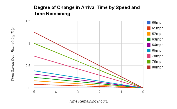
Well, a single mph doesn’t buy you too much.  The gain per hour is only on the order of minutes.  It’s not until around 63mph over the course of the trip that you get yourself an hour back.  Still, driving 63mph instead of 60mph isn’t that bad, right?  To go back to my original example, 5mph over (65mph) gets you around an hour and a half back in your total trip.

Maybe you think 20 hours is too long of a trip – what does this look like on a shorter trip.  Well, pretty similar:

This actually matches with what I described before – on a five hour trip, going five miles an hour faster saves you a little less than 25 minutes.

Let’s just cut to the chase – how about going 20mph over the speed limit for the whole trip?  Well, on a five hour trip that saves you around an hour and 15 minutes.  On the 20 hour trip?  About 5 hours.  Crazy.

Now, I don’t want to just come out as if I’m saying that you should be doing 80mph on every 60mph road you come across.  What I’m saying is that the longer you have to cause a change, the larger change you can make with the same effort.

I’m also talking about average speeds.  These graphs take into account that you’re picking a speed and then sticking with it the rest of the trip.  If you start driving 80mph but then pull back a bit to 70mph or 60mph, or even something less than estimated (e.g. 55mph), the trend will work back toward the original estimate.

If you think about each of these lines as an estimate of error in the original 60mph based estimate you can also see that making estimates of your arrival time based on a 20 hour trip has a much wider range than if that trip was only an hour.

You can also see that the earlier you start making a change the larger impact it has.  If you want to save an hour on your 20 hour trip you simply need to drive around 63mph the whole time.  If you want to save that same hour from the last 5 hours of the same trip you need to do 75mph the whole time.  

There’s another way to look at it, as well.  Imagine that you wanted to average 65mph on your trip, and for simplicity’s sake there was no traffic.  If you’re just starting the 20 hour trip, you simply need to drive 65mph for every hour of the trip.

Say you forget to speed up in the beginning, though, and start the trip driving 60mph.  If you only drive 60mph for the first hour it doesn’t take much extra speed to compensate and get back to a 65mph average in the remaining 19 hours.  If you forget your plan for half the trip you’re in a little more trouble.  How much trouble?  Here’s a graph:

Halfway through, not that much trouble.  You simply need to drive 70mph for the rest of the trip.  Things really start to ramp up at the end – if you’ve made it to the last hour before realizing that you needed to average 65mph you need to do 160mph during that last hour of your trip.

There’s a Zeno’s paradox element to this in that you can see that this line is asymptotic.  The closer you get to your destination, the faster you need to go.  At a certain point this would break down from a practical standpoint given that a) your car (even assuming it’s really fast) can only accelerate so quickly in any given space, and b) the speed of light is a thing (even if skydivers regularly break it).   

How likely is it that you’re going to be able to pull off 160mph for that last hour?  Not very likely.  At the same time, how likely is it that you’d be able to pull of exactly 65mph for all 20 hours?  While more likely, it still has some problems.  At the start of that trip it’s really hard to say how fast you’ll be able to go, or even how fast you’ll want to go in a few hours.

Let’s step back for a second again.  Remember how GPS units calculate arrival estimates – the only thing that really changes is how fast you get to the next point that estimation occurs.  The closer and closer you get to the destination (in the above graphs the closer you get to the zero point on the right side), the narrower the error on the estimate of your arrival.  The reason is that imparting the same impact that you might have been able to make 19 hours prior with a speed change of 5mph now comes at a much greater cost.

The closer you get to an event the easier it is to predict because you have less time for error in prediction to accumulate.  

If we know that you’re likely to have an average speed somewhere between 60mph and 80mph we can now look at these above graphs as ranges of estimation.  If there is 5 hours left in the trip, the best you can do is really pick out a 75 minute window that you know you’ll arrive in.  At four hours your window closes a bit to an hour, and with only an hour remaining you should be able to estimate a 15 minute window in which you’ll arrive.

As a sidebar, this is also a good illustration of confidence intervals, but we’ll talk about that some other time.

Instead, imagine that someone else started the trip from the same place at the same time, that you each have a dozen or so different and differently reliable GPS units in each car and each of them only updates every week or so, and now you have a presidential race complete with polls.

That was supposed to be the punchline, but as I think about that last graph I think there’s actually another message there.  Imagine the difference between studying over the course of a week for a test, or pulling an all nighter.  Seems the message is pretty clear on that one, so I won’t belabor the point.

Of course, none of this should be used as an excuse for speeding unless you feel like explaining all of it to a cop to see if he buys it.  But – by all means – next time you’re in the car feel free to use this as an excuse to do a little math. 
 

NHL Lockouts: Do They Matter?

I’m a hockey fan.  I like a lot of other sports, but when it comes to watching professional sports hockey is right up there for me.  So, while I suffered some frustration with the whole NFL replacement refs fiasco I couldn’t help but always reference it to the fact that, well, at least they have a season.

The NHL is unfortunately not at all hesitant to throw away partial or entire seasons.  It’s too easy to imagine a future where the NHL has become something more like the World Cup, showing up once every four years or so.

Perhaps that’s a bit too much hyperbole, but the case is that we are not lacking in reduced or postponed seasons in the last 20 years.  In fact, since 1992 there have been four labor disputes that have caused disruption of the season:

1992 Strike: 30 games postponed
1994-95 Lockout: Partial cancellation of season and shortening of schedule
2004-05 Lockout: Full cancellation of entire season
2012 Lockout: Pre-season canceled. Currently no plans to begin season

Now, I apologize in advance this week if things are a bit more on the side of descriptive statistics, but what we have here are only a handful of data points.  My question is: can we notice anything in NHL trends that appears to be a consequence of these labor disputes?

For today more specifically, do fans care?  Perhaps even more than that, do they care enough to change their actual behavior?

The most readily available data that seems to be archived on fan behavior is game attendance.  While I was only able to find it back to 1993 that’s a lot better than any other statistics I tried to find.  Unfortunately this means that we can’t tell a whole lot about the 1992 lockout.  What we can gain from the ’94 dispute is also likely limited due to the lack of trend leading up to that season.  Our biggest bet then is looking at the impact of the ’04 season – we have a decent amount of data leading up to it as well as a few years now after the fact.  It’s also the largest of these events, as it was the only situation where the entire season was scrapped. 

I hope you like graphs.

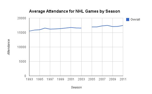
The two ways I first thought of looking at this are actually opposite extremes.  The first is over all teams:


And the second is team by team:

The first graph is looking at the average attendance, per game, over all teams.  The second is still average attendance per game, just aggregated to team instead of league.   

Now, with 30 teams the aggregation to league washes out a lot of the variance.  That would be good if this variance was simply noise, but bad if it was the something we were interested in.  Truth be told I’m not sure if we’re going to be able to make that distinction today, so I think it’s worth looking at the noisier picture with the caveat that we should be a bit more skeptical about anything we ‘find’ in the data.

Let’s be honest – 30 teams on the same graph is just a mess.  Luckily, someone at the NHL has a penchant for symmetry, and there are two equally sized conferences, each with three equal size divisions.  Awesome.

Well, let’s start big picture and work our way into it, shall we?  Here’s what things look like if we break down the overall graph into the Eastern and Western conferences:

It looks as though the Eastern Conference had been slightly trailing the Western Conference leading up to the 2004 season, but by the time things restarted in 2005 they were pretty much caught up.  Again, this looks like a very small difference, and I’m hesitant to make too much of it at the conference level.  If there’s anything to take away from this graph it might be that the slow rise in attendance that we see in the overall graph is being driven more by the Eastern Conference than the Western Conference, but it’s not a huge effect.

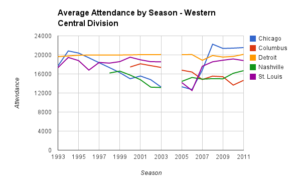
Let’s look at how things work out at the Division level.

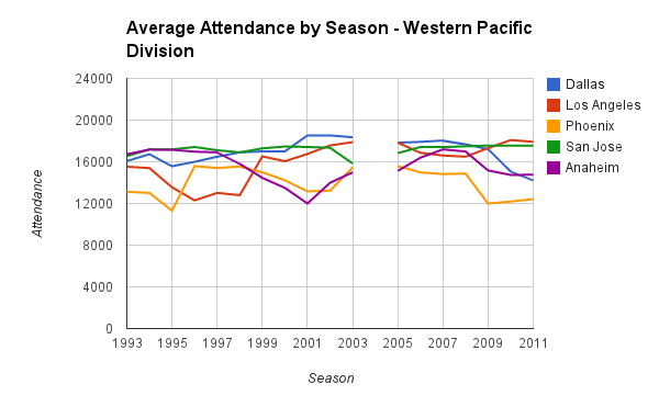
Well, this is better than that graph with every team, but now we’re getting into the level of aggregation where we’re likely to see a lot of noise.  There are a number of things going on here, but it looks like Western Central is the only division that took a hit coming off of the 2004 lockout, but had recovered by 2008.

If there’s something big here, I’m still not really seeing it at this level.  Remember how I said I hope you like graphs?  Here we go:

We’re entering the realm of cherry-picking effects of interest here, and while you could make the case for a team here or there (Phoenix, Columbus, Colorado, the Islanders) that looks like they may have suffered on the attendance numbers following the 2004 season, it’s hardly widespread.  For each of those teams you can find a team like Chicago (go Blackhawks!) that was in steady decline through the 90s only to come back in 2005 and 2006 to start a climb to the largest attendance in over a decade by 2009.

Those flat lines you see in some graphs are also not errors of the data, but ceiling effects.  They represent situations where the stadium might be getting a little small – the average attendance is all about the same because they’re close to or actually selling out every home game of the season.  Montreal and Calgary stand out as teams who came back from the 2004 lockout only to sell out their stadiums every year following.  Calgary, especially, took a decent jump from 2003 to 2005.

On the flip side of post-lockout sellouts is a team like Detroit that had a pretty good pre-lockout sellout trend going, only to return in 2005 to slightly weakening numbers. 

So, how much of that is related to the lockout, and how much is noise?  Montreal and Calgary are pretty big hockey towns (the NHL was founded in Montreal, and the Canadiens hold the record for most championships at 25), and Chicago 2005 to 2009 was building a great team that would win the Stanley Cup at the end of the 2009-10 season.  The Detroit team that headed into the lockout had just won 3 of the last 8 Stanley Cups, and post-lockout has been fielding a good but aging team that isn’t the same juggernaut of those years (even though they’ve still won yet another Stanley Cup).

Is it possible that all the trends in these graphs can be explained away with similar facts?  Certainly not.  That said, it does seem that the largest effects might be able to be explained away with simple facts about the teams and their records.  Based on attendance it doesn’t seem like the 2004 lockout hurt the NHL (aside from having vacant arenas for a year), and if anything it made more people show up the years following.

Whether that happens next year is hard to say, as so much of this year is still up in the air.  It’s possible play will start sometime soon, but it’s also possible we’ll have a repeat of 2004.  Even with a repeat of 2004 it’s hard to say that fans would act anything like they did in 2005, as that was the first full lockout and this would be the second.  Fool me once, etc.  Dealing with such rare instances makes for tricky prediction. 

Unfortunately for the impatient among us, the best way to figure out what a 2012-13 lockout would do to NHL attendance would really just be to have the full lockout and wait for the 2013 season.  Hopefully that doesn’t happen.

Games of the Price is Right: The Wheel (Part I)

If you read my earlier post on Plinko you know that I’m a fan of The Price is Right.  If you haven’t read it, maybe you should check it out.  Maybe you’re just here for The Wheel, though, in which case read on. 

The Price is Right was prime mid-morning TV when I was a child, and I’m not sure I even remember a time before I was watching it.  It’s mixed right in there with memories of Sesame Street and Mr. Rogers.

The Wheel (the prime focus of the Showcase Showdown), is not original to The Price is Right – it was added in 1975.  It is used twice during each show, once for the first three contestants after the third game and once for the last three contestants after the sixth game.  It determines who from each of those groups of three will meet up in The Showcase at the end of the show.

The Wheel has 20 segments that represent dollar (well, change) amounts ranging from 5 cents to 100 cents (a dollar) in increments of 5 cents.  The goal is to get closest to 1 dollar without going over (busting).  Each contestant gets two spins (the second only if needed/wanted), and contestants take their spins in ascending order of prize value won in their respective games.

Ties produce spin-offs in which each contestant gets one spin and the highest moves on.  Ending up in a spin-off produces even odds for each player due to the fact that they each only get one spin.

A lot of what happens at the Wheel is chance.  Excepting someone who is especially gifted at aiming for particular areas (something I hold as fairly unlikely), the general purpose of the wheel is a human controlled random number generator.  What isn’t left to chance is player option to take a second spin.

Well, that’s not entirely true.  If the first spin of the second or third contestant does not match the current leading score of the first (or second, in the case of the third) contestant, they are forced to spin again.  The most consistent point of choice rests with the first contestant.  The only situation in which the first contestant does not make a decision is when they spin a dollar on their first spin – any further spin would cause them to bust, and so the choice is removed.

Dependent on the value of their first spin the first contestant has a certain probability of going over a dollar and busting on their second spin.  Unlike the second and third contestants, they do not have the benefit of knowing what the other contestants are going to do. Thus they must decide how much risk to take weighed against the strength of their current spin value.

Well, just how strong is any given spin on the wheel for that first contestant?  That question has been in the back of my head for years if not decades, and it’s something we can take a look at today.

There are a lot of factors that go into the strength of any value on the wheel.  Both the second and third contestants are going to get two chances to try to beat you, so you have to put up a decent number if you’re going to move on.

While you don’t know what the second and third contestants are going to spin, you do know (and can guess at) some of the things they’re going to do.

The third contestant, for any advantages going third gets them (something to look at in another post), has the least personal choice in the matter.  By the time it gets to them they have a number on the board they have to beat.  If their first spin is higher than that number they do not get a second spin.  In rare cases, the first two contestants have both busted, and their single spin is simply to see if they can earn a bonus by spinning a dollar (effectively, the number on the board they have to beat is 0).

The second contestant gets a little more choice.  If they spin higher than the first contestant they can still take their second spin, as they still need to hedge against the third contestant.  While that should slightly increase the low end odds (the second contestant is more likely to spin if they just beat your 5 cents with 10 cents than if they beat your 90 cents with 95 cents), my initial pass at this will argue that the balance between odds of spinning and odds of busting produce a fairly negligible effect for the first contestant to be worrying about.

Therefore, I’ll assume that the second and third contestants will act according to some rules and assumptions, somewhat similar to a dealer in blackjack (well, without the assumptions).

Contestants must spin again if they are below the current leading score.  This is a rule.

Contestants will spin again in a tie based on their likelihood of not busting with a second spin, which is indirectly proportional to the value of the tie.  That is, if the second player ties the first at 5 cents, there is only a 5% chance of the second busting on a second spin (by spinning a dollar), and a 95% chance of winning.  If players tie at 75 cents there is a 75% chance of busting (by spinning any value over 25 cents), and only a 25% chance of winning (by spinning 25 cents or less).  Thus, I will assume that a player in a tie at 5 cents will spin again 95% of the time, and a player in a tie at 75 cents will spin again 25% of the time.  This is a guess that is almost certainly inaccurate – it would be a lot of fun to check out how this holds on actual human data.

Like I said, the third contestant does not have a choice to spin again if they’ve just beat you with one spin.  This is a rule.

The second player *may* take a second spin to hedge against the third player.  If they’ve beat you with a low value (10 cents beating 5 cents), the chance that they are going to stay safe in a second spin and still beat you is high, as is the likelihood that they are going to take that second spin.  The higher the value they beat you by – and the higher the chance that they are going to bust – the less likely they are to spin anyway.  Accounting for this adds a significant level of complexity for what I’m going to argue is a negligible gain, and a gain only in situations where the second contestant has beat you with their first spin.  This is a guess as well.

Since we’re putting ourselves in the shoes of the first contestant, it doesn’t matter if the third contestant beats the second contestant if the second contestant has already beat you.  You’re still off the stage at the point the second contestant puts in their higher spin.  This isn’t really a rule or assumption, but just something to point out to simplify the math we’re going to do.

With these rules and assumptions we can take a look at how this works in a particular case while building the model for the general case that we can apply to the rest of the possible scores.  Let’s start with the case of 50 cents.

Now, before we get too deep in this I’d like you to sit back for a minute and try to think about your odds if you are the first contestant on stage who just made that spin.  If you just hit 50 cents on your first spin and stay with it, what is the probability that you’ll move on to The Showcase at the end of the show?  Got that number?  Good.  Remember it, or better yet write it down.

You’re now standing off to the side of The Wheel with a big sign over your head that says .50 in big block letters.  The second contestant walks up to The Wheel and spins, and:

50% of the time they just straight up beat you.  Sorry.

45% of the time they spin less than your score and are forced to take a second spin.  An interesting thing happens with the probabilities on that second spin.  We’ll look at that next.  

5% of the time they spin the same as you, and tie.  We’ll look at that breakdown in a bit.

Let’s take a look at what happens if they spin less than you and are forced to take a second spin.  Let’s start with a concrete example.

If they spin, for example, 5 cents on their first spin, there are 8 spots on The Wheel (5 through 40) that will still come up short on their second, and they will lose.  There is also 1 spot (the dollar) which will cause them to bust, and they will lose.  That means that 45% of the time they will lose to you on their second spin.  5% of the time they will tie, and 50% of the time (45 through 95) they will beat you.

This is a cool fact of The Wheel: it does not matter if that contestant spins 5 cents or 45 cents on their first spin, just that they are lower than your score.  If you have 50 cents they have the same odds of beating you on their second spin, regardless of what they have.  There is a moving window of winning numbers and all that shifts is that the odds of coming up short start shifting into odds of busting.  The person who has 5 cents has low chance of busting but high chance of coming up short.  The person who has 10 cents has slightly higher (but still low) chance of busting but slightly lower (but still high) chance of coming up short.  They both have the same chance of losing.

That chance, if you haven’t noticed, is also tied to where you are on the wheel.  If you think about the numbers the second contestant needs to hit as a window moving up and down across certain ranges of the scale (a lot like the game The Range Game, actually), then you can see that as your score gets higher that window closes to a smaller and smaller range.  The lower your score, the larger that window.

I know I complain about percents of percents, but it’s necessary here.  50% of the time you’ve lost.  45% of the time you’ve found a temporary reprieve.  Within that 45%, 50% of the time you’ve still lost (which works out to be 22.5% of the time, overall).  45% of that 45% they’ll actually lose to you, and 5% of that 45% they’ll bring it to a tie.

Which brings us to the point where we talk about ties.

At any given point that the second or third contestant is spinning to beat the current leader (first or second spin), there is a 5% chance (one space on The Wheel) that they will produce a tie.  It’s a simple fact – if you’re at 35 cents and need to beat 65 then 30 is your tie.  If you’re at 10 cents and need to beat 90 then 80 is your tie.  If you end up in a tie (as your second spin or accepted first spin), you will go to a spin-off.  In a spin-off you are on completely equal footing with your fellow contestants due to the fact that you’re limited to one spin.  Ties in spin-offs simply produce more spin-offs, with the same odds.  That makes it nice and easy to do the math, as 50% of 5% (or 2.5%) of the time you will win a tie, and 50% of the time you will lose a tie.  

So, we can now do the math on all the contingent percentages and sum up the situations where you are safe for now and the situations in which the second contestant has beat you.  Remember the number you came up with earlier?  The probability of making it to The Showcase with a value of 50 cents?  Well, we can now figure out the probability that you’ve made it past the second contestant.  That probability?  About 23%.  Yeah, not looking so great.

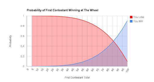
We can do the same math on all the starting values by hand, but that would be silly.  If you’ve been setting things up as the general case this whole time by using variables instead of numbers we can just plot it for the range of values on the wheel.  What we come up with is this:

A little surprising to me is the fact that odds don’t shift into the favor of the first contestant until they get around 75 cents.  Putting up a score of 50 cents as the first contestant means you’re 3 times as likely to lose than you are to win, and that’s only to the second contestant.  Now let’s look at the third contestant.

The math from here on out is fairly easy now that we’ve figured out all the probabilities.  The third contestant – as we’ve talked about – actually has less choice, so we’re making less assumptions.

The only reason that the first contestant should care about the third contestant is if the first is still up on stage – that is, when the second contestant has lost.  Therefore, we’re looking at percentages of percentages again, but this time the main percentage we’re working from is that in which the second has lost and you’ve moved on to worrying about the third.  The numbers actually work out the same for the third contestant as the second, it’s simply accounting for the fact that you’ve made it there.

With that in mind we can cut to the chase and graph it all:

What are your odds of winning with 50 cents now?  Unfortunately, right around 5%.  Even at 80 cents you’re still slightly behind (second contestant still has 39% to your 37%), and it’s not until 85 cents that the odds tip in your favor (at that point you have a 47% compared to 31% and 22%, respectively).  Even then it’s still less than a coin flip, and while you have the best odds of winning among the three contestants you should keep in mind that you don’t care who else wins – in both cases you lose.

We can change around the graph to reflect that fact:

With that in mind, it’s not until 90 cents that you break away and finally have better odds of winning than of losing (59% vs 22% and 18%, respectively).

Kind of sad, really.  Maybe you should have done better during your pricing game, and not gotten stuck being the first contestant to spin.  Next time I visit this I’ll check in on how much better your odds are if you’re the second or third contestant.