On the things that fall out of the sky

If you’ve been following the news of the last week you might have heard about the recent meteor that was seen (and paparazzied to death) over Russia.  While it’s only somewhat statistical (okay, minimally statistical), I figured it would be a fun topic to talk about this week. 

On second though, let’s get some stats out of the way up front.  You may have heard reporters talking/writing about this meteor impact as a one in one hundred year event.  Despite the difficulty of determining these sorts of meteor impacts over oceans (70% of the globe) before we had a satellite network, or of determining these impacts over non-explored portions of the globe before, say, the 1500s (90%?), let’s say that this number is correct based on our 100 years or so of good global record-keeping.  I have literally read articles that paint this recent strike as a positive thing due to the fact that something like this shouldn’t happen for another hundred years now that we’ve had our strike during this hundred years.

If you’ve been reading this blog for a while I’m not even going to insult you by explaining how much is wrong with that sort of assumption.  Let’s get back to the fun stuff – meteors.  (If you’re still wondering why there’s so much wrong with such a claim just google ‘statistical independence’)    

There are a few reasons that I find it fun to talk about meteors.  First, meteors are cool.  That might be enough for some of you.  Beyond that, though, I think there’s a lot of great points to learn about meteors and the atmosphere and speeds of things, etc.  Did I mention that meteors are cool?

Before we get to deep into it, if you haven’t seen much footage of the actual impact, you can find a whole bunch of videos of it here:

http://say26.com/meteorite-in-russia-all-videos-in-one-place

There’s a lot of information to take away from these videos, actually.  It’s pretty fantastic that so many Russians have dash cameras on their cars or trucks – apparently a big part of it is simply the fact that having a documentation of your driving helps out if you find yourself in an accident or pulled over for something you may or may not have done.  Makes fighting that traffic ticket in court a whole lot easier.

A pretty good view of what’s happening can be found in the first video on that page, or on YouTube here:

http://www.youtube.com/watch?feature=player_embedded&v=tkzIQ6JlZVw

One of the first things you should take note of is the fact that you see what looks like to be a pretty energetic reentry, but that you don’t hear anything.  Are you thinking it’s because the camera is in a car?  Well, no.

This is something that has been misrepresented for the better part of the last century – basically as long as we’ve been matching sound to video.  Have you ever seen video of an atomic bomb blast from back in the 40s or 50s?

You might be able to picture in your mind what this even looks like – the bright flash and then the rising mushroom cloud.  Along with the bright flash you probably also remember a pretty loud explosion.

If you’ve been to a track event started with a pistol and sat way up in the stands, been to a fireworks display from a distance, or watched a thunderstorm for a while, you might understand that this doesn’t really make a lot of sense.  In fact, there are exceptionally few surviving clips of atomic tests with correctly matched audio – most footage uses stock explosion noises with the sight and sound of the explosion matched.  If you’re interested, more information on the topic can be found here:

http://www.dailymail.co.uk/sciencetech/article-2174289/Ever-heard-sound-nuclear-bomb-going-Historian-unveils-surviving-audio-recordings-blast-1950s-Nevada-tests.html

The reason that you hear thunder some time after you see lightning is due to the differential speeds of light and sound.  Light is…pretty fast.  It’s usually expressed in meters per second, and every second it actually goes a whole lot of meters.  With some rounding for simplicity (don’t worry I’ll use actual numbers for calculations), it’s around 300,000,000 meters.  Every second.

Sound, on the other hand, is actually pretty slow.  In the same second that light can travel around the Earth seven or so times, sound doesn’t even make it down to the corner store.  It takes over four seconds for sound to make it a mile – if sound was running a 5K it would put in a time of just under 15 seconds.

In that same time, light could run over 100,000 marathons.

[One important aside before we continue – the speed of light is usually given as the speed of light in a vacuum.  Light does travel slightly slower in atmosphere, but the difference is small enough to be negligible in most cases.  The speed of sound in most cases is given at sea level – these are the numbers I’ve used above.  The speed of sound does decrease as you travel up through the atmosphere, but – despite the fact it could be applicable here – I’m not going to go into that sort of detail.  This will be left up to the ambitious reader.]

This might have been a lot of setup for something you’re already pretty aware of.  If something that produces noise happens a distance away from you, the light from the event will reach you before the sound does.  That means that you’ll see the event before you hear it.  How much earlier?  Well, it depends on how far away the event is.

If you’re sitting a dozen or so feet away from your television, the difference between the light and sound coming at you is small enough that you don’t notice any difference.  That is, the sound seems to match the image.

If you were watching a drive-in movie screen through binoculars from a mile away and relying on sound produced at the screen itself you’d start to notice that things weren’t matching up.  How far off would the audio be at that distance? 

In the extreme, if we set off an atomic bomb on the moon, how out of synch would the sound be at that distance? 

Well, the first question can be answered, and we’ll do it below.  The second is a trick question because sound (unlike light) needs a medium to propagate through; like air or water.  There’s no air (or water) between us and the moon (or on the moon), and so no sound waves would propagate from the explosion.    

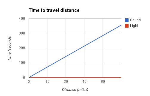
To answer the first question we can start by taking a look at the time it takes sound and light to travel a range of distances. 

It’s possible that you’re asking: where’s the line for light?  It’s at the bottom – the red line isn’t an axis, it’s the time it takes light to travel these distances.  Compared to sound, the difference between light traveling 1 mile and light traveling 75 miles is fairly negligible.  Light can travel both of these distances in a fraction of a second.

It takes sound a little over 4 seconds to travel 1 mile.  If you’ve ever heard the old rule that you can count the seconds between seeing lightning and hearing thunder then divide by four to figure how many miles away the strike was you now see why that makes sense.  For the distances you see and hear lightning the rounding doesn’t really cause any major problems. 

Why am I going on about all this when we should be talking about meteors?  Well, the fact that so many Russians have dash cameras means that we have a huge supply of data available to us.  We can even find a few examples where the incoming meteor is pretty close to directly overhead.  Here’s a good example:

http://www.youtube.com/watch?feature=player_embedded&v=odKjwrjIM-k

Since we’re looking at a dash camera we also have a second-by-second time stamp, which is great.  You can see that the person who uploaded this clip cut out a part of the middle – the time between seeing the meteor and actually feeling the shock wave.  We can figure out the difference here by taking note of when two events occur.

The first is the place in the video where the meteor seems to be directly overhead and most energetic – right around 43:05.  The second is when the shock wave hits and knocks some snow off the surrounding buildings.  It’s seconds later in the clip as edited, but the time stamp reveals that it was just about a minute and a half later, at 44:35.

Imagine you were watching a thunderstorm and saw some lightning.  A minute and a half later you heard the accompanying thunder.  You might not even link these two events in your mind – you might associate the thunder with more recent lightning strikes that you may have missed.

Well, unless the thunder sounded like this:

http://www.youtube.com/watch?feature=player_embedded&v=w6uOzFo2MQg#!

From the numbers behind the above graph we can figure out what a minute and a half lag time means – turns out it’s around 19 miles.

I can hear some of you yelling already, even through the internets.  You’re using the speed of sound at sea level!  Yes, yes I am.  I told you that the speed of sound slows as you travel up in the atmosphere, and this meteor was obviously not at sea level.  This means that our estimate of 19 miles will be off, though we at least have a decent ballpark estimation. 

I can also hear a much smaller contingent of you yelling that things are a lot more complex than that and shock waves have different profiles than sound waves.  Well, yes.  I was hoping to keep this pretty simple to get across a point, but if you’re so inclined you can learn a bit more here:

http://www.fas.org/sgp/othergov/doe/lanl/pubs/00326956.pdf

and here:

http://en.wikipedia.org/wiki/Shock_wave

19 miles is a bit of a distance.  The fact that damage was produced even at this distance is a testament to the amount of energy released from this particular meteor.  Current estimates have placed the energy released on the scale of nearly half a megaton of TNT (just under 500 kilotons).  Everyone is comparing that to the explosion of “Little Boy”, the atomic bomb dropped on Hiroshima, which checked in at 16 kilotons. 

This brings us to some facts about meteors and the atmosphere that are a little less stats-y (not that we’ve been stats heavy to this point).   

Let’s start with some simple stuff.  We’ve been using the term meteor here, and the use of that term actually carries with it some useful information. 

A piece of debris that’s simply floating around in space isn’t a meteor – it’s a meteoroid if it’s fairly small (roughly up to the size of a small car), an asteroid if it’s a bit larger (up to the size of a small moon), and a planetoid if it’s much larger (that’s no moon!).

If any of these things is composed of ice – enough that it grows a tail – it is a comet.

Once one of these things comes in contact with the Earth’s atmosphere (or any atmosphere, really) it becomes a meteor.  Thus, what was seen in the Russian sky was a meteor.  There are reports that some fragments of the meteor may have been found – if any parts of a meteor survive to the ground those fragments become meteorites.

You’ve also clearly seen the trail left in the sky by the meteor – a trail that persisted for some time.  I want you to think about two questions for a moment.  The first is why a meteor (or a space shuttle) heats up when it enters Earth’s atmosphere.  The second is what causes a trail to be left in the sky behind a meteor such as the one filmed over Russia.  Think about both of these for a minute or so.

Okay, so what are you thinking?

Your ideas on this are probably again a bit polluted by a few sources.  Mainly movies and TV, I’d bet.

The first question is quite a bit easier, but also one of those that seems to be fairly misunderstood.  You might be thinking that meteors (or the space shuttle, etc) heats up on entry (or reentry) due to friction with the air.  Friction is actually a very small part of this process – what’s really happening is that the air in front of whatever is entering the atmosphere is being compressed.  This is simply due to the fact that air can’t move out of the way of an object fast enough once an object reaches certain speeds.  Since it can’t get out of the way it becomes compressed.

If you’ve ever sat around and figured out how your refrigerator works (I would suggest it as a fun thought experiment as well) you might recognize what’s happening as a bit of a reverse of that process.  As air is compressed it becomes hotter.  When a lot of air is compressed really quickly it becomes really hot.  This is what’s heating meteors and space shuttles, etc. 

Looking to kill a bit more time?  Randall Munroe of XKCD has a really cool post on what would happen to a diamond meteor upon entry at different speeds here:

http://what-if.xkcd.com/20/

The space shuttle doesn’t burn up on reentry due to some pretty sophisticated heat shielding, but meteors aren’t so lucky.  This heat causes differential stress on parts of the meteor and it begins to burn up and break up.  This is why many meteors never become meteorites.

This leads to the second question, which I’m going admit I’m not sure that I have a solid answer on – the internets don’t seem to address it.  I’m suspecting that many of you are thinking that the trail behind a meteor is a smoke trail.  I can see how this idea would get planted in our minds – movies and television have given us plenty of examples of things on fire plummeting toward the ground with smoke trailing behind them.  Nicolas Cage’s stellar performance in Con Air, anyone?

Like I said, I’m having trouble figuring this out with any actual sources, but it doesn’t seem that a meteor streaking through the sky is the best place for normal combustion to take place.  Moreover, you’ll notice that trails behind meteors are (from what I’ve found) universally white – combustion of different components of different meteors would presumably lead to smoke at least occasionally displaying darker shades.  You know, different shades like you’re probably familiar with from movies like Deep Impact where you see a plume of dark smoke trailing the meteor as it streaks through the atmosphere.  Example here:

http://www.top10films.co.uk/img/deep-impact-disaster-movie.jpg

What is the alternative?  Well, cloud formation.

If you remember your grade school science fairs you might be familiar with the old ‘make a cloud in a bottle’ experiment.’  If not, a good example is here:

http://weather.about.com/od/under10minutes/ht/cloudbottle.htm

Much of cloud formation relies on the compression and decompression of air with at least some water vapor content and dust particles.  We’ve already discussed how a meteor compresses air (which is free to decompress in the immediate wake of the meteor) – as long as local humidity is above zero the meteor is also producing a reasonable share of dust through the breaking/burning up process.

Similar to how airplanes in high atmosphere form contrails it seems that meteors might be leaving a trail that’s nothing more than clouds formed by their fairly violent passage through the air.  Like I said, I can’t find this in any of the intertubes, so it’d be interesting to have a discussion if people have other thoughts.       

One other thing before we go – in all the coverage of this meteor strike I’ve only seen one or two articles that discussed the angle of entry of this meteor.  You can probably figure it out from the name, but angle of entry relates to the angle that something enters the atmosphere.  The extreme ends would be directly perpendicular to the ground (think Felix Baumgartner skydiving from space) and directly parallel to the ground (which might cause an object to even deflect off the atmosphere – think satellites that are in orbits that are allowed to decay).  

This meteor was much closer to the second – you can tell pretty clearly from the videos of it that it had a shallow entry (it has been estimated at less than 20 degrees).  The angle of entry is important because it is one of the main determinants of how long something spends in atmosphere before it reaches the ground.  The numbers that I’ve seen seem to indicate that this particular meteor spent over 30 seconds in the atmosphere before it broke up.  The fact that it had 30 seconds of time in atmosphere was only because it was traveling at such a shallow angle – imagine if it had hit the atmosphere with an angle of entry closer to Felix Baumgartner.    

Well, to do some math on this we need to decide where the edge of space is.  As you travel up in the atmosphere, air gets thinner, and eventually there’s no air.  It’s not a hard edge, though, it’s a slow gradient, so it’s tricky to decide when a small amount of air is different from no air.  Most estimates that I’ve found seem to be in the 75-100 mile range.  This is good enough for some quick estimation.  

The Russian meteor entered Earth’s atmosphere at a speed of around 11 miles per second.  If it was taking the shortest path through the atmosphere (straight on, perpendicular to the ground), it would reach the ground in somewhere around 9 seconds (if we’re calling space 100 miles up).  If we go with 75 miles to the edge of space we’re looking at closer to 7 seconds.  Sure, the air is slowing it as it descends, but this 9 seconds is a lot less than 30.  I’ll also cede the fact that traveling at a steeper angle through the atmosphere creates a quicker pass through pressure gradients and might have caused breakup faster.  

Still, if this meteor had entered at such an angle there’s a real chance that it may have impacted the ground before it broke up.  The energy released in atmosphere was enough to blow out windows and doors 19 miles away – if this energy were transferred all at once to a stationary object (like the ground), well, then we’d really have something like Hiroshima on our hands.  The fact that some portion of the population says ‘well, at least we don’t have to worry about it for another 100 years’ flies right in the face of what we should actually be taking out of this.

Anyway, that seems like as good a place as any to leave you with something to think about.  Thanks for all the dash cams, Russia.
Halo 4: Red vs Blue

A few weeks ago I looked at some of the rich stats provided by Halo 4, and wanted to follow up on some of the ideas that came out of it relating to the effects of team color on multiplayer success. 

For those who aren’t familiar, Halo 4’s main multiplayer component is highly team based.  With the exception of the relatively new playlist ‘team doubles’, teams range from 4 to eight players on a side.  There are always two teams, red and blue.  The red team always starts at the same place in any given map and game type, as does the blue team.  This leads to the possibility that team assignment may have some impact on the outcome for each team. 

Like I’ve said, playing Halo 4 produces a great deal of data that is accessible to the player.  It’s relatively easy to go into personal stats and code wins and losses by team color.  Since team assignment is assumed to be random, wins should be equivalent regardless of which color team I’m playing on.

I pulled down data from 136 games of multiplayer Halo 4 that I’ve played recently.  The assignment to teams in these cases are fairly even, with 65 instances of being on blue team and 71 instances of being on red team.  This relates to a split of 47.8% to 52.2%, which again we should hopefully consider to be at least somewhat random.

We can very easily create a contingency table from this which looks at the win/loss percentages for those instances of red and blue team membership.  This is what that looks like:
 

        Win          Loss
Blue Team 32 33 65
Red Team 42 29 71
74 62 136

We can also run some statistical tests (in this case Chi-square tests of association) on these numbers.  While there does appear to be a slightly better chance of winning on the red team overall, it turns out that this relationship of team color and outcome is not significant.

Now, the failure of an overall effect should really stop us here, but there are a lot of different game types within Halo 4 multiplayer.  Each are pretty distinct, so it’s reasonable to believe that effects could be present in one game type and not another.  While there are a lot of different game types, two are fairly well represented in these 136 games, as it reflects what I’ve been playing recently – Team Slayer and Grifball.

We could have a long discussion about what Grifball is, so for those who don’t already know I’ll simply direct you to the halo wiki here:

http://halo.wikia.com/wiki/Grifball

For those who don’t like reading, I’ll direct you to this awesome image that I found on the halo wiki:

In these last 136 games I’ve played 57 games of Team Slayer and 35 games of Grifball.  I’ve play other things (obviously), but the next most played game type only has 16 games in this set so I’m a bit (more) skeptical about the stats I’d run on it.  That said, we can take a look at Team Slayer and Grifball and see if anything comes of it. 

Let’s cut to the chase – something does.  The numbers on Grifball are still be a bit small, and while numbers do seem to be trending with a slight advantage for blue team we fail to find a significant relationship between team color and wins.  Here’s the breakdown:

         Win         Loss
Blue Team 10 6 16
Red Team 8 11 19
18 17 35

For Team Slayer, there is a significant relationship between team color and winning – it’s also the opposite of how Grifball is trending (though keep in mind a trend is not an effect).  In Team Slayer matches it turns out I tend to win significantly more when I’m on red team than on blue team.  Here’s the breakdown:

         Win         Loss
Blue Team 9 17 26
Red Team 21 10 31
30 27 57

I wasn’t intending things to come down to Team Slayer and Grifball (potential reviewer comment: needs more theory), but it actually presents a very interesting dichotomy that I wish I actually had come up with on my own (and not just because I play a lot of Grifball). 

This dichotomy relates to the possible advantages that can be given to either team based on team color. 

Let’s take a step back and explain some things about these two types of Halo 4 multiplayer.

In most of Halo 4 multiplayer the maps – and thus the team placement on maps – are asymmetric.  In this way the maps themselves may actually be able to provide some advantage to one team or another.  It might be the case in a Team Slayer match that the red team starts a little closer to better weapons or better vehicles.  This might give them the sort of starting advantage that could turn the tide of a game early on and impact wins and losses.  It’s possible that this is what may be driving the effect we found above. 

Let’s imagine that for some reason you didn’t go read all about Grifball.  Here’s the important part. 

Grifball is played in a perfectly symmetric (nearly if not perfectly square) arena in which each team starts in symmetric positions with the Grifball itself in the center of the room.  Neither team should be able to gain any advantage due to starting position, nearby weapons/vehicles, etc.  In fact, all players start with the same weapons (hammers and swords – I’m telling you that Grifball is pretty fun), and there are no additional weapons or vehicles on the map. 

Because of this, if we were to find a decisive and replicable relationship between team color and winning in the Grifball game type we could only attribute it to a) error or b) psychological differences of being placed on different teams. 

Like I said, I wish I had thought of it instead of stumbled onto it. 

Unfortunately, I simply don’t have enough data at the moment to make any strong statements one way or the other.  Statistically, it does seem that I have an advantage in Team Slayer when playing on red team, though I’d also like to run some more numbers on it.  I have more games I can code, though it’s only recently that I’ve been playing Grifball. 

So, I guess that instead of writing this post I should actually be playing some more Grifball…I mean collecting some more data.  See you in the arena!

Customers who switched to Zeno’s car insurance saved up to 50%

I apologize in advance to anyone who is really hoping that the title of today’s blog implies that I’m going to talk about some of Zeno’s paradoxes.  I usually write the title first – in haste – to get it out of the way, then revise it accordingly later.  There’s just something about this one that I find myself unable to revise.  Perhaps I could start by revising half of it?

See, there you go, we got that out of the way. The focus is actually on car insurance commercials, though to be fair what you find inside is really more about what you take with you.

Good to get those Empire quotes out of the way early on as well, right?

I’m sure that almost all of you have seen the kind of commercials that I’m going to talk about.  I spent some time on Google pulling some of them up, and it seems that almost every company has one (or two).  I could have spent plenty of more time, but here are a few:  

People who switched to Allstate saved an average of $348 per year.

Drivers who switched to Allstate saved an average of $396 a year. $473 if they dumped GEICO.

21st Century’s customers saved an average of $474 a year by dumping their current carrier.

Drivers who switched to Progressive saved an average of $550. 

15 minutes could save you 15% or more on car insurance (Geico)

I’m betting that you as a reader might have one of two predominant thoughts.  The first would be the thought that for this to hold true some of the companies must be lying.  The second would be the thought that these companies know how to pick their wording well.

The key wording here is that people who are saving (or can save) are those people who switched.  Well, of course you’d only switch if you were going to save, you might say.  Exactly.  This is another pretty nice example of commercials that are really talking to a small segment of the audience while making it sound like they’re talking to everyone.

Let’s walk through it, shall we?

I wanted to put together some data to illustrate some of what’s happening here, and figured that a good way to do it was to come up with some random variables that give a potential picture of what people might be paying (or could be paying) across a number of car insurance companies.

I created a random variable, then created some random variables that correlate a decent level with the first (~.70).  By virtue of the nature of these correlations these other variables also correlate a bit with each other.  The lowest correlation among any of these variables is around .45.

We could just use these random variables to illustrate our point, but we can also make things a bit more concrete by finding some actual numbers.  Numbers seem to be a bit tricky to find on the average annual cost of car insurance, and finding something like standard deviations on that average is that much more unlikely.

The broad average I’ve been able to find for annual car insurance costs is somewhere right around $1000, which is a reasonable place to start.  Standard deviations might be more important if we were looking to replicate the exact amounts that people are saving, but for these purposes I’m going to just use a SD of $100 to keep things pretty straightforward.

Using all this information it’s easy enough to create a matrix of people and the insurance quotes they’d likely get at a number of different companies.  These are simply transformations of the random numbers that were generated.  I’ve used the base numbers as the ‘middle of the road’ company, which is closest to the actual mean of $1000.  Two companies are a bit cheaper (around $950 average), and two are a bit more expensive (around $1050 average).

Again, we can argue all day about how accurate these numbers are, but you can also translate things to a different level but simply scaling all these numbers a little differently.  The intent is to illustrate a general concept, not to replicate the actual situation.  There are also more than five car insurance companies out there, so this by no means would cover the entire market. 

I’ve created 100 cases to work with, and each of those cases represents a person who can select from one of five car insurance companies.  If we look at the overall average of what things would be like if people were randomly assigned to a car insurance company the average cost of car insurance for this group (not surprisingly) is right around $1000.  I’ve heard there’s certainly some money to be made by switching companies, though?

It’s easy enough to examine – what’s the average difference in cost between the company you’re currently assigned to and each of the others?  Well, averaged across all companies it should be near zero, but if we look at each individual company we should see a pretty clear pattern.

Switching away from the two cheaper companies will – on average – cost you around $15.  Switching away from the more expensive companies will actually save on average around $50, and switching away from the middle of the road company for a random sample of those people will also save a little money (around $20).  Such is the nature of random noise and low sample size.

Looking at the reverse actually gives us a picture of how much customers can potentially save by switching to that company.  In this case there is a small benefit to switching to one of the two cheaper companies, but that’s it.  On average the savings is right around $15.  Let’s see if we can’t make that number a little larger.

As was pointed out earlier there’s no reason to switch to a company that’s going to charge you more money (assuming that coverage stays constant).  If we look at this first cheap company there’s some people who will save money by switching and some people who won’t.  If you go back to the lines from commercials above you might now – if you haven’t already – be picking up the language that lets us start to work these numbers.

$13 is the average savings for anyone to switch to the first cheap company.  But why switch if you’re not going to save money?  There are plenty of people for which this isn’t the cheapest company.  If we look at just the people who have a reason to switch (i.e. those who would save money by doing so), we come up with a much different number.  Now we’re talking about a savings of $119 dollars – over $100 more.

Now that’s something you can put in a commercial.

The reason is that all the people who wouldn’t save money (in this metric people who would save negative dollars) are being removed from the calculation.  These sorts of numbers do little to give us an ordering or magnitude of how cheap or expensive a company is, but rather how much noise there is in the market.

I’m sure we can do better, though.  There’s plenty of small values – $2, $0.74, etc.  If you wanted the numbers to look a little better you might even tell your sales staff to discourage individuals from switching if they weren’t going to save much money at all – it might not be worth the hassle.  If we cut out the people who would save less than $10 annually we can move that average savings up to $129.  Not too shabby.  

This should only hold up for the cheapest companies, though, right?  Nope, the same should be true for the expensive ones (in a reasonable market).  There will be fewer people who save money by switching, but taking the average of those who have a reason to switch will always produce a savings (unless you’re really doing something wrong/right).  The savings for those who switch to expensive company 1?  Right around $66.  We can make the same <$10 cut here and raise that number to an average savings of $75 for those who switched.

That’s not the only trick, either.  If that $75 doesn’t seem impressive enough we could also look at the ‘up to’ sorts of numbers.  It’s rare, but a few people can actually save over $300 a year by switching to expensive company 1.  From this data I could make the statement that ‘customers who switched to expensive company 1 can save up to $348 a year on their car insurance’.  Run the percent on that and you’re looking at something even harder for the average person to wrap their head around.  

Before we go, there’s another way we can look at this.  We have five companies, and without assigning customers to any of them we can simply compare the numbers and see what percent of the time each of these companies actually has the lowest rate of all five companies.  Here’s how that breaks down:

Cheap company 1 = 30%
Cheap company 2 = 33%
Middle of the road company =  37%
Expensive company 1 = 0%
Expensive company 2 = 0%

Certainly interesting.  The easy question from this set of information is how the middle of the road company is able to provide 37% of people with the lowest rate while still having a higher average price overall.  Well, as all of this was derived randomly it does turn out that the middle of the road company has a slightly higher standard deviation than the cheaper companies.  Also, the difference in means is not very large, so it doesn’t take too much to undercut the cheaper companies.  They end up making more money by – I’m sure some of you already have this figured out – charging a different segment of the population more than their average.

It’s actually quite interesting in and of itself.  A market such as this – with fixed but correlated rates – would eventually settle out (over some period of time) such that everyone ended up with the insurance company that was the best for them.  The market does not have fixed rates, however, and those expensive companies need to find some way to stop the slow flux of customers away from them to the cheaper companies.  Left alone, they would eventually stabilize to zero market share.

We can do this by strategically cutting or raising rates on certain segments of the population.

While there’s no customers in this group that find expensive company 1 or expensive company 2 to be the cheapest place to go for insurance, it is occasionally close.

If we look at the 10 people who expensive company 1 find the cheapest to insure already (sorting expensive company 1’s rates over all people), we find that on average these people are about $85 more than the lowest option.  Thus, to get these 10 people on board they’d have to lower those 10 rates by at least $85 each, at least to pull them from a company that actually has a lower average rate.  Let’s say they decide to toss $90 a person at this (and now tell their sales staff that $5 is a big deal).  That’s still $900 just to get 10 customers, which doesn’t seem that great.

Or does it?  We still have 90 other people, some of which might already be customers of expensive company 1.  All you have to do is transfer this loss onto the bills of people you’ve already sold, and you’re set.  It gets more expensive as you try to get customers that would be more and more of a risk to you (exemplified by higher rates), but that problem actually solves itself.  If you bring on people with lower rates, you’re still eventually going to have to raise those same rates.  You’d need to do this to cover the new people you’re bringing on with lower rates, or to cover the original deal you gave them.  Soaking each of those new customers with an extra $90 the second year would be a very easy way to make this all work, obviously.  Things will eventually get to the point that people are either paying a lot more than they should.  At this point one of two things will happen.  They’ll either stay with you, or leave.

If they stay, great!  Keep raising their rates and hope they don’t notice.  You didn’t get a reputation of expensive company 1 for nothing.  If they leave, even better!  You now have new potential customers to win back by leveraging current customers costs into a means of undercutting other companies.  If you don’t believe that this works for insurance, might I point you to how cable companies work?  It’s actually a lot more transparent (yet still somehow effective) there.  Try calling your cable company and getting your rate lowered – you can usually make some pretty quick money and solidify that fact that you’re being overcharged.    

This concept works so well at destabilizing equilibrium that I find it very hard to believe that insurance companies *don’t* use it.  Flaunting it in commercials is merely tipping their hand.

Let’s take a step back, though.  There’s a lot of points here, and the main one that I think has the potential to get lost as I continued to expand on it is the trap of allowing others to define their own reference groups, and thus hide useful information.  Saying that customers who switched to your company saved money is a triviality.  By simple definitions this will be the case for all companies in even semi-competitive markets.

To bring it back to the start I made the point that some of you would assume that every company having one of these commercials must mean that (at least) some of them are lying.  You can see now that it’s possible that none of them are lying, depending on how you define lying (it’s clear they’re all misleading).  These are exactly the sort of situations where people like to cite the old ‘lies, damned lies, and statistics’.  Statistics don’t lie to people, car insurance companies do.

Does this mean you shouldn’t have car insurance, or that you should switch companies several times a week?  No, and not necessarily, respectively.  You should get rid of cable, though.

Ranking every possible super bowl matchup (and then some)

For those of you paying attention to sports in any way whatsoever you may have noticed that the super bowl is coming up this weekend.  It’s pretty easy to find a wide array of articles and analysis about it, and a week or two ago I came across an article at the bleacher report with the title:

Ranking Every Possible Super Bowl Matchup
(http://bleacherreport.com/articles/1483126-power-ranking-every-possible-super-bowl-matchup?hpt=hp_t3 )

I was excited by the title because I thought this was going to be a ranking of *EVERY* super bowl matchup between every team to figure out which team would actually be the strongest, and not just a simple rundown of what the situation was from this point onward.

Since that was a disappointment, I figured I’d just do it myself.  Right?

Well, it’s easy enough (if not a touch tedious) to pull down the scores from every game of this season.  Luckily, the NFL plays a relatively small number of games so it’s a fairly reasonable set of data.  At most a team will play another team twice, so we can produce a somewhat odd 32×64 partially filled matrix containing all the win information in one direction and the loss information in the other direction.

The important thing that this allows us to do is to calculate some means and standard deviations.  Specifically, we can check out the mean score of each team both from an offensive and defensive standpoint.  The offensive score is the score that team was able to produce, and a higher score should indicate a better offense.  The defensive score is the score that the team allowed the other team to produce, and a lower score should indicate a better defense.

Right off the start this gives us some good numbers to check out – what teams performed the best and worst throughout the season as well as how consistent given teams were.

The Patriots showed the best offense this year, coming in just over 34 points a game on average.   

The worst team?  Sorry, Kansas City Chiefs fans.  Do I have any readers who are Kansas City Chiefs fans?  Sorry, your offense only produced a little over 13 points on average.

The best defense goes to the Seattle Seahawks, only right around 15 and a quarter points per game allowed on average, and the worst defense goes to the New Orleans Saints, allowing on average just over 28 and a quarter points per game.

If we compare the average points of every team against every other team we can get a feel for what their records would have been if a) every team played every other team once and b) every team had the same defense.  Obviously one of those is a bit larger of a jump, but let’s keep an open mind for the moment.  This is how things would work out:

Team (offense) Count wins Count losses
New England Patriots  31 0
Denver Broncos  30 1
New Orleans Saints  29 2
New York Giants  28 3
Washington Redskins  27 4
Green Bay Packers  26 5
Atlanta Falcons  25 6
Houston Texans  24 7
Seattle Seahawks  23 8
Cincinnati Bengals  22 9
Baltimore Ravens  21 10
San Francisco 49ers  20 11
Tampa Bay Buccaneers  19 12
Minnesota Vikings  18 13
Dallas Cowboys  17 14
Detroit Lions  16 15
Chicago Bears  15 16
Carolina Panthers  13 17
Indianapolis Colts  13 17
San Diego Chargers  12 19
Buffalo Bills  11 20
Pittsburgh Steelers  10 21
Tennessee Titans  9 22
Cleveland Browns  8 23
St. Louis Rams  7 24
Oakland Raiders  6 25
Miami Dolphins  5 26
New York Jets  4 27
Philadelphia Eagles  3 28
Jacksonville Jaguars  2 29
Arizona Cardinals  1 30
Kansas City Chiefs  0 31

Due to the way this works out through mean comparisons, this is actually a ranking of how every team would do in a super bowl against every other team.  The Patriots would beat anyone, the Broncos would beat everyone but the Patriots, etc.  

We can find the probabilities (roughly) associated with this actually being the outcome by taking into account the stability of those means via their standard deviations.  A proxy for this that I’m calling good enough for our immediate purposes is the probability associated with t-tests between these individual means.  The product of these reversed probabilities (due to the fact that a win or loss is more probable when the p-value is small; e.g. .02 should actually be .98) gives us something we can put in a table.  YES I KNOW I’M KIND OF BUTCHERING THE POINT OF P-VALUES. 

Some of these numbers are actually reasonably finite, and we can add to the above table as such:

Team (offense) Count wins Count losses Probability of occurrence
New England Patriots  31 0 0.47089515
Denver Broncos  30 1 0.019777304
New Orleans Saints  29 2 0.000572806
New York Giants  28 3 6.88355E-09
Washington Redskins  27 4 1.22143E-07
Green Bay Packers  26 5 2.99026E-08
Atlanta Falcons  25 6 7.57896E-08
Houston Texans  24 7 8.88084E-10
Seattle Seahawks  23 8 4.09893E-11
Cincinnati Bengals  22 9 1.49184E-09
Baltimore Ravens  21 10 5.36586E-12
San Francisco 49ers  20 11 1.34842E-11
Tampa Bay Buccaneers  19 12 1.50215E-10
Minnesota Vikings  18 13 1.74783E-09
Dallas Cowboys  17 14 4.93673E-10
Detroit Lions  16 15 7.0116E-10
Chicago Bears  15 16 4.6336E-12
Carolina Panthers  13 17 0
Indianapolis Colts  13 17 0
San Diego Chargers  12 19 3.8835E-10
Buffalo Bills  11 20 3.40025E-09
Pittsburgh Steelers  10 21 6.20755E-07
Tennessee Titans  9 22 1.45213E-08
Cleveland Browns  8 23 1.73087E-06
St. Louis Rams  7 24 1.08623E-06
Oakland Raiders  6 25 2.8135E-07
Miami Dolphins  5 26 1.65687E-07
New York Jets  4 27 2.73281E-08
Philadelphia Eagles  3 28 1.04094E-06
Jacksonville Jaguars  2 29 0.000267479
Arizona Cardinals  1 30 0.000383025
Kansas City Chiefs  0 31 0.137665451

You can see that things sort of follow an upside down bell curve (let’s call it a valley curve) – the most probable outcomes are those at the ends, while those in the middle have a bit more noise in them.  More of those middle games are likely to be close enough to drop the cumulative associated probabilities.

What we should keep in mind is that there are a lot of potential outcomes here.  There aren’t just 31 (31-0 down to 0-31), but every possible combination of individual wins/losses that would get you to that point.  There’s only one way to get 31-0 or 0-31, but there are 31 ways to go 30-1 or 1-30 (you could win or lose to any given team, and each of those has a probability associated with it).  If you’d like to kill a bit more time before you get back to work you can start working out the number of ways you can get to each potential outcome.  It also explains at least a little bit of the valley curve that we have going. 

Yes, the clever among you might have just realized that this table is excluding some potentially important information.  This probability isn’t the cumulative probability of all situations that would produce a given outcome, but rather the probability associated with the most likely sequence that would produce that outcome.

For example, the Broncos going 30-1 is actually the probability of the Broncos going 30-1 while losing to the Patriots.  There’s another probability that they’d go 30-1 while losing to the Giants, or the Saints, or even the Chiefs (the probability of them just losing to the Chiefs *at all* in this metric is 4.57E-07; fairly unlikely).

There’s also a strange coincidence here that you might notice – the Panthers and Colts actually produced the same mean score throughout the season.  There’s an interesting discussion to be had about how the way points are earned (in chunks) allows this, but it’s for another day.  We’ll see it happen a few more times when we get to defense.

Overall these probabilities don’t really instill a lot of confidence (except for the Chiefs – sorry again Chiefs fans).  We have to keep in mind that this is simply offense, and doesn’t consider how difficult any teams’ defense might have been.  Now that we’ve seen how this works we can also produce the same table based on the idea that a) every team plays every other team once and b) every team has the same offense.

Such a situation would mean that a team’s defense was the only way to stand out, and we can produce the same table based on how things would play out from there:

Team (defense) Count wins Count losses Probability of Occurrence
Seattle Seahawks  31 0 0.033645703
San Francisco 49ers  30 1 5.72087E-06
Chicago Bears  29 2 3.03016E-05
Atlanta Falcons  28 3 7.53205E-07
Houston Texans  27 4 0
Miami Dolphins  26 5 5.97182E-10
Denver Broncos  25 6 4.65242E-06
Cincinnati Bengals  24 7 1.68938E-11
Pittsburgh Steelers  23 8 5.27437E-11
New England Patriots  22 9 0
Green Bay Packers  21 10 3.75177E-13
St. Louis Rams  20 11 1.21268E-13
Baltimore Ravens  19 12 0
Arizona Cardinals  18 13 5.77952E-13
Minnesota Vikings  17 14 1.17577E-13
Cleveland Browns  16 15 5.5051E-11
Carolina Panthers  15 16 2.73832E-11
San Diego Chargers  14 17 1.6091E-12
New York Giants  13 18 0
New York Jets  12 19 1.07632E-10
Indianapolis Colts  11 20 9.97422E-12
Washington Redskins  10 21 2.72878E-09
Tampa Bay Buccaneers  9 22 6.3485E-09
Dallas Cowboys  8 23 3.63465E-07
Kansas City Chiefs  7 24 9.21125E-08
Buffalo Bills  6 25 7.97968E-11
Tennessee Titans  5 26 2.93401E-05
Philadelphia Eagles  4 27 0
Jacksonville Jaguars  3 28 0
Detroit Lions  2 29 8.82456E-09
Oakland Raiders  1 30 5.65719E-11
New Orleans Saints  0 31 1.93842E-07

The same things about the other charts apply to this one, though it also gives us a picture of how strong different teams’ defense was.  Unfortunately, this is also confounded with the fact that different defenses played different offenses.  We could simply look back at offenses, but those were already confounded by the fact that different offenses played different defenses.  You can see we’re in a bit of a loop here.

While we’re trying to think our way out of that one we can kill some time by taking a look at the average quality of defense that different teams faced throughout the season.  We can do this by averaging – for each team – the average points allowed by their specific list of opponents.   The more points that your list of opponents allowed, the easier it is to score points against them.

Team Opponent Defense
Atlanta Falcons  24.5025641
Pittsburgh Steelers  23.89198718
Cleveland Browns  23.5650641
Tampa Bay Buccaneers  23.50737179
Cincinnati Bengals  23.5025641
Indianapolis Colts  23.46634615
San Diego Chargers  23.40865385
Philadelphia Eagles  23.07948718
Jacksonville Jaguars  23.04807692
Houston Texans  22.96634615
Kansas City Chiefs  22.93269231
Baltimore Ravens  22.91121795
Carolina Panthers  22.88717949
Miami Dolphins  22.88461538
New Orleans Saints  22.86794872
Denver Broncos  22.81730769
Washington Redskins  22.81025641
Chicago Bears  22.76217949
New York Giants  22.67083333
Green Bay Packers  22.60576923
Oakland Raiders  22.55288462
Minnesota Vikings  22.53846154
Tennessee Titans  22.49038462
Buffalo Bills  22.46153846
New England Patriots  22.19230769
New York Jets  22.17788462
Seattle Seahawks  22.07467949
San Francisco 49ers  22.06730769
Dallas Cowboys  21.94230769
Detroit Lions  21.85576923
St. Louis Rams  21.62980769
Arizona Cardinals  21.39903846

Turns out things are actually pretty close when it gets to this level.  The Falcons faced the easiest defenses, with their average opponent allowing 24 and a half points.  The Cardinals – perhaps not enough to account for their fairly weak season – faced the most difficult defenses.

We can look at the same concept in terms of how well defenses performed against their opponents’ offenses:

Team Opponent Offense
Arizona Cardinals  23.18269231
Atlanta Falcons  22.5599359
Baltimore Ravens  23.43974359
Buffalo Bills  20.9375
Carolina Panthers  23.58397436
Chicago Bears  22.27403846
Cincinnati Bengals  21.35801282
Cleveland Browns  22.59358974
Dallas Cowboys  23.9974359
Denver Broncos  23.49519231
Detroit Lions  22.05769231
Green Bay Packers  22.73301282
Houston Texans  23.25
Indianapolis Colts  21.77403846
Jacksonville Jaguars  23.12019231
Kansas City Chiefs  23.48557692
Miami Dolphins  22.0625
Minnesota Vikings  22.62980769
New England Patriots  21.67307692
New Orleans Saints  23.35801282
New York Giants  23.96634615
New York Jets  22.07211538
Oakland Raiders  22.34615385
Philadelphia Eagles  23.73301282
Pittsburgh Steelers  21.9974359
San Diego Chargers  22.38461538
San Francisco 49ers  23.44455128
Seattle Seahawks  22.56730769
St. Louis Rams  23.55288462
Tampa Bay Buccaneers  22.97339744
Tennessee Titans  22.73557692
Washington Redskins  23.25224359

At this level of aggregation we again seem to be washing out all useful variance.  

Overall, I’m not sure there’s really enough variance here to warrant the meaningful inclusion of it unless things are really pretty close.

Speaking of close, we should at some point probably try to figure out who is going to win the *actual* super bowl.  One last combination before we get to that.  We might be able to get a little more out of offense and defense if we look at them in combination.  We can do this by combining the win/loss records for each team to produce a table like this:

Team (overall) Wins overall Losses overall
Denver Broncos  55 7
Seattle Seahawks  54 8
Atlanta Falcons  53 9
New England Patriots  53 9
Houston Texans  51 11
San Francisco 49ers  50 12
Green Bay Packers  47 15
Cincinnati Bengals  46 16
Chicago Bears  44 18
New York Giants  41 21
Baltimore Ravens  40 22
Washington Redskins  37 25
Minnesota Vikings  35 27
Pittsburgh Steelers  33 29
Miami Dolphins  31 31
New Orleans Saints  29 33
Carolina Panthers  28 33
Tampa Bay Buccaneers  28 34
St. Louis Rams  27 35
San Diego Chargers  26 36
Dallas Cowboys  25 37
Cleveland Browns  24 38
Indianapolis Colts  24 37
Arizona Cardinals  19 43
Detroit Lions  18 44
Buffalo Bills  17 45
New York Jets  16 46
Tennessee Titans  14 48
Kansas City Chiefs  7 55
Oakland Raiders  7 55
Philadelphia Eagles  7 55
Jacksonville Jaguars  5 57

      
Looks like that helps to put a bit more spread on things, though our apparent best teams aren’t the ones in the super bowl.  Not shocking, as randomness can really play havoc with things when you play so few games and leave playoffs and finals up to single elimination matches.  While I’d be a bit more excited to watch a super bowl between the Broncos and the Seahawks (or the Bears and the Jaguars), that’s not what we have this year.  
  
The Ravens and 49ers – going back to the earlier table – put up the 11th and 12th best offenses on average.  They’re actually pretty close on that metric – the Ravens averaged 24.875 points per game, while the 49ers averaged 24.8125 points per game.  Given that their pooled standard deviation on those means is 11.70 points there’s very little reason to believe that one of these teams has a substantially (or statistically) better offense.

The 49ers scored less than a tenth of a point less than the Ravens on average, though they also faced slightly more difficult opponents.  Their opponents allowed 22.0673 points on average, while the Ravens’ opponents allowed 22.9112 points on average.  While this might allow us to tip things *a little* more in favor of the 49ers I’d still be hesitant to say that anything was even close to a sure thing.  I’ve thought about it a while and don’t know if I have any meaningful way to combine points earned and points allowed by specific opponents.  

Let’s take a look at defenses – the 49ers did hold up to some of the early promise of a good defense by coming up as the 2nd best, allowing only right around 17 points on average.  The Ravens were somewhat in the middle of the pack, coming up as 13th best defense with right around 21 and a half points on average.

Remember where we got caught in a loop a while ago?  One of the problems was that we had offense and defense to worry about, though at least for this pairing it seems the offenses are pretty close.  The small point difference is also offset by the difference in opponents.

If defense is where the difference is it’s hardly enough to be impressed by – the difference in defensive strength is 4 points, while the pooled standard deviation is just under 11 points.

The slight advantage held by the 49ers is also shown in that last table, as they show up as 6th overall while the Ravens come in at 11th.  Even this spread isn’t huge, as it’s partly due to the fact that a lot of teams are actually incredibly close in terms of mean points scored or allowed.  Forcing things into wins/losses allows for sorting, but carries a lot of error in these close match-ups that could have gone either way.  Let us keep in mind that the teams that are coming up on the top of our charts didn’t have perfect seasons, but the games they lost they may have lost by very slim margins. 

All in all I was hoping that one of these teams would have meaningfully distinguished themselves on something, but it seems that these two teams in the super bowl really are pretty close – at least by the numbers.  If pushed it would seem that the 49ers have a slight edge, but what that relates to in terms of a point spread is pretty tricky.  If the 49ers are able to put up a defense that’s able to stop 4.5 more points than the Ravens, and both play basically the same offense (with perhaps a slight advantage to the 49ers), then we’re talking about less than a one possession spread.  Four to five points is right in that range of being just covered by a touchdown but not covered by a field goal.

If I had to make some guesses, then, the best things to work from are the scores we’ve seen so far – offensively 24.8125 vs 24.875 points per game, defensively 17.0625 vs 21.5 (49ers and Ravens, respectively).  Opponents of each team also gave up 22.0673 vs 22.9112 points on average, scored 23.4446 vs 23.4397 on average.

So, if team A is trying to score x points and team B is trying to hold team A to y points, the relative importance of offense vs defense would dictate the weighted average that is most accurate.  Given no reason to assume anything else I’m just going to call it an even split and take a normal average.  What that would mean is that the most likely score of this super bowl (still probably pretty unlikely) would be 23.15625 to 20.96875, 49ers.  Okay, so that score is not just unlikely, but impossible.  Silly imprecise sports. 

You might be going straight to the comments to point out that you can’t earn 0.00005 points in a game of *normal* football.  More important is the fact that even the rounded score of 23-21 might not be the most common.  If we head back over to my favorite historical archive of all football scores ever ( http://www.pro-football-reference.com/boxscores/game_scores.cgi ) we can see that there have only ever been 46 games with an outcome of 23-21.  Given the amount of error we’re playing with here I’m willing to take this prior information into account to some degree, especially given the fact that the *very* similar score of 23-20 is over three times as likely as 23-21.

In all, my best guess would be that the scores are pretty close, and somewhere in the low 20s both.  The 49ers seem to have a slight edge, but it’s football and they only get to play one game.  Repeat this super bowl 100 times and then we can talk.

More than anything, it seems that this super bowl might actually be a close game.  I say that’s always what I want, sooooooo I guess I’d better watch it.

Maybe I’ll record it so I can get rid of the stupid commercials. (<- flame baiting)

 >>>>Update:
Here are the raw numbers for points scored and points allowed as requested in the comments.

Team Points scored Points allowed
Arizona Cardinals  15.625 22.3125
Atlanta Falcons  26.1875 18.6875
Baltimore Ravens  24.875 21.5
Buffalo Bills  21.5 27.1875
Carolina Panthers  22.3125 22.6875
Chicago Bears  22.5625 17.3125
Cincinnati Bengals  25.0625 20
Cleveland Browns  18.875 23
Dallas Cowboys  23.5 25.53333333
Denver Broncos  30.0625 18.0625
Detroit Lions  23.25 27.3125
Green Bay Packers  27.0625 21
Houston Texans  26 20.6875
Indianapolis Colts  22.3125 24.1875
Jacksonville Jaguars  15.9375 27.75
Kansas City Chiefs  13.1875 26.5625
Miami Dolphins  18 19.8125
Minnesota Vikings  23.6875 20.875
New England Patriots  34.8125 20.6875
New Orleans Saints  28.8125 28.375
New York Giants  27.46666667 21.5
New York Jets  17.5625 23.4375
Oakland Raiders  18.125 27.6875
Philadelphia Eagles  17.5 27.75
Pittsburgh Steelers  21 20.25
San Diego Chargers  21.875 21.875
San Francisco 49ers  24.8125 17.0625
Seattle Seahawks  25.75 15.3125
St. Louis Rams  18.6875 21.75
Tampa Bay Buccaneers  24.3125 24.625
Tennessee Titans  20.625 29.4375
Washington Redskins  27.25 24.25

Multiple Choice Questions and Trivial Pursuit OR Sig Figs and ‘Educated’ ‘Guessing’

Over the holidays I happened to be playing Trivial Pursuit with some friends.  I don’t play Trivial Pursuit that often, and this was a different version than I’ve played before.  For reference, it was the Trivial Pursuit: Master Edition.

The edition of Trivial Pursuit I have sitting around somewhere is getting kind of old, and it’s definitely what I base my Trivial Pursuit worldview on.  Unlike this old version, this Master Edition had a decent number of multiple choice questions come up.  Some were quite easy, and some were tricky but still offered a good chance at guessing them right.

A few questions came up with numbers in them, and the idea was floated that one way to potentially tell the correct answer (if you knew nothing else) might be to look for the numeric choice that had the greatest number of significant figures.

Some of you might be right there with me, but some of you might have just stalled out, so let’s have a quick discussion of significant figures.

Put simply, significant figures are a implicit (or explicit) conveyance of a number’s precision.  From a scientific standpoint there are a number of very important rules regarding significant figures and how to treat and convey them.  For our purposes we can deal with the more perceptual nature that you might recognize in your day to day use.

The thing that’s consistent across both of these standpoints is that significant figures are all the digits of a number that are not: a) non-notated leading or trailing zeros (e.g. all the zeros in the number 10,000; none of the zeros in 1,000,001) or b) some other number that only came about through a derivation of a bunch of those leading or trailing zeros.  For example, the number 500 has one significant digit – the five.  If we divide that by 2 we would seemingly pick up another significant figure by arriving at 250.  If we divide by 3 we get seemingly infinite significant figures by arriving at 166.66666(repeating).

It doesn’t work that way, and if you’re so inclined I’d suggest reading up on scientific significant figures and calculations involving significant figures.  There’s no need to get that deep into it today, so we’ll finish this part with a perceptual example.

Imagine that you’re wondering how many people there are in the United States.  You go to a friend and ask them if they know how many people there are, and they say 300,000,000.  What does that mean to you?

Well, my read of that situation is that your friend only really has confidence in the hundred millions digit of population.  They have confidence in the precision of that 3(hundred million), but maybe not in any of the other, smaller digits.

Feeling like this friend doesn’t know their stuff you find another friend, and they say that the population of the United States is 311,000,000.  This friend might instill in you a bit more confidence, as they’ve implicitly given you a better sense of precision by giving you two more digits than your first friend.

You’re still not happy with the answer from this friend and find a third.  They’re spending more time on their smartphone than they are paying attention to you, and when you ask the question they take a moment of typing before they answer: 311,591,917.  They then go back to not paying attention to you.

This friend has – correct or not – given you much more precision in their number than either of your first two friends.  They have done this, in part, by giving you 9 significant figures instead of only 1 or 3.

The idea as it relates to Trivial Pursuit is the idea that correct answers inherently have more significant figures, as they are actual quantities, and wrong answers may have less.

Well, it’s testable, so let’s take a look.

I was able to code some data from the cards relating to every multiple choice question asked in Trivial Pursuit: Master Edition.  It turns out that there are 245 of these questions in the game.

245 is a pretty nice number, but not all those questions involve numbers.  In fact, numbers are the minority – the vast majority of questions simply involve word choices.  There are 36 multiple choice questions involving count numbers, and an additional 6 involving percentages.  This unfortunately doesn’t give us a whole lot to work with in terms of significant figures, but there’s other things we can look at in a bit.

It’s also the case that the overwhelming number of cards with numbers on them have numbers which all have the same number of significant numbers.  I mean figures, significant figures.  Overall, there are only 10 questions which have a difference we can examine.  These ten cards have answers in numeric form, and there is a difference between significant figures between the correct answer and the other answers.

These are the cards where we can test out if more significant figures mean better answers.

Well, it doesn’t seem to.  Of those 10 questions, 9 of them actually have a correct answer which has less significant figures than at least one of the other options.  In only one case does the correct answer have more significant figures than the other answers.

This might mean that the folks over at Hasbro are on to your clever tricks.  They may have set this up on purpose to trip up exactly the type of logic we’ve just laid out.  There’s other places we can look, though – there are a lot of other multiple choice questions. 

In fact, there are two main types of word questions.  There are questions that ask you to pick the correct answer from a number of choices, and there are questions which ask you to pick the answer that is ‘NOT’ something, or that fits the idea of all of these ‘EXCEPT’.

The most common question is the first type, and those of them with three response options to choose from – there are 93 of these questions.  So is there any information we can use to make better guesses in these situations?

Well, it’s pretty straightforward in this case, too.  The numbers are really close – the first option is correct 30 times, the second was correct 29 times, and the third was correct 34 times.  If you have absolutely no idea you do have slightly better odds selecting the third choice, though the gains you get from it aren’t very large.  These numbers don’t significantly deviate from an even split. 

Fortunately, things get a little more interesting as we move on to some of the other questions.

So far we’ve covered questions with numeric answers, and word questions looking for the correct answer among three answer choices.  There are also some multiple choice questions with four answer choices.

For those questions, the breakdown seems a bit less random.  In fact, of 22 questions, in an even half of them (11) the second answer choice is the correct answer.  The first and last options are the least likely, with each being correct 3 times, and the third option is only a little better – it’s the correct choice 5 times.

While the low number of these questions stops us from saying too much on a statistical side (if we wanted to perhaps generalize to other Trivial Pursuit games?), these numbers do give a bit of an advantage to the player forced to guess on one of these questions.  With no other credible information it makes sense to guess the second option any time four are presented for this version – you’ll be right by chance half the time.  If you can eliminate one of the other choices you’re going to be above 50/50 odds. 

Let’s move on to those questions where you’re asked to pick the answer that is ‘NOT’ or ‘EXCEPT’ something.  There aren’t many of those with only three answer choices – 14 in total.  Your odds increase slightly as you move from the first to last choice – the breakdown of times each are correct is 3/5/6.

‘NOT’/’EXCEPT’ questions with four answer choices are a bit more plentiful, with 46 in total.  You’ll again do a bit better going with later answers if you’re randomly guessing.  The breakdown in this case is 7 for the first response, 11 for the second response, 11 for the third response, and 17 for the fourth response.

That’s not to say that always choosing based on these numbers is going to always get you a correct answer – in the best situations this knowledge might buy you 50/50 odds (in the case of regular questions with four responses).  There’s only 22 of those questions out there, which is only about a tenth of even just the multiple choice questions.  Those questions might be a tenth of the total questions in the game, so you’re down in some pretty small territory.  You also have to be playing *this* specific build of Trivial Pursuit, so the help actually seems fairly limited.  Help is still help, though, I suppose.   

That is – of course – unless the people you are playing with *also* read this blog, in which case I would advise them to switch around the answer that you read out the answers to these multiple choice questions.  Then you get into some interesting rock-paper-scissors territory, which is something that I should talk about some other week.  

This one is about Halo 4 (but also about the association of nominal dichotomous variables)

If you follow video games – and even if you don’t – you may have heard of the Halo series.  Halo 4 came out recently, and I’ve been playing a bit of it.  It’s a good game, though that’s not really what we’re here to talk about today.

The Halo series has always been pretty good at keeping very detailed statistics for everything you do in the game, and Halo 4 is no exception.  The website Halo Waypoint allows you to access a ton of great information about how you’ve been playing the game.

Now, a major component of Halo 4 is the multiplayer aspect.  Much of the time I spend playing is playing online with friends – in fact, using the game to keep in touch with distant friends is a big part of playing.  There are a number of different game types you can play, and there are also a number of different maps that you can play on.

While playing with different friends I started to notice an odd trend in one game type on a certain map.  Specifically, for those who care, the game type that seems to be producing these odd trends is the objective-based game type of dominion.  When a game is being set up, the way things work is that a number of players are found, and then those players vote on a map to play on.  Once the map is selected, Halo divides the players into teams, assigns them to either red team or blue team, and then starts the game. 

What I started to notice – and initially joked about – was the fact that while I was playing with one friend in particular we would always be placed on blue team on a certain map.  Let’s call that friend Brad.  That map – again for those who care – is the map called Longbow.

This started as a joke, but as things progressed it started to seem more and more true that being in a group with Brad meant that the game would always assign us to blue team while playing dominion on Longbow.  This assignment is (seemingly) random, and completely out of our hands.

Like I mentioned, Halo Waypoint allows you to pull down a whole lot of stats about what you’re doing in the game.  It was fairly easy to go in to my play history and pull out all the games of dominion that I have played on this map.  I was then able to sort these into games on two criteria: where I was playing with this particular friend and those where I wasn’t, and if we were on blue team or red team.

What this produces is a two by two table that looks like this:

With Brad Without Brad Totals
Red Team 2 14 16
Blue Team 14 10 24
Totals 16 24 40

This is called a contingency table, and represents the multivariate frequency distribution of these variables.  Each game can (and must) have one of two values on each of these two variables.  In every game we have to be placed on either red or blue team, and in every game Brad is either there or he isn’t.

These variables are special in that each of them has only two values that they can take.  Variables of these type are a special type of nominal categorical variable called dichotomous variables, based on the two values that can be taken.

If you have two dichotomous variables there are a few tests that can be used to look at the relationship between those variables.  What we’re going to use today is Fisher’s exact test.

This test was devised by R.A. Fisher back in the 1920s.  Anecdotally, he devised this method to test a colleague who claimed that she was able to tell by taste whether the milk or tea was added first to a given cup of tea (a seemingly difficult claim).  Fisher proposed that he would give her eight cups of tea – four of each type – prepared and presented in random order.  The woman (Dr. Muriel Bristol) was able to successfully identify all cups correctly.

Regardless of how successful she was, you can imagine producing a contingency table of this data.  For her specific case it would look like this:
  

Says Milk First Says Tea First
Actually Milk First 4 0
Actually Tea First 0 4

Long story short, this data can be analyzed with a Fisher’s exact test.  A significant result means that there is a relationship between the two variables such that information about one provides you with better than random information about the other.  In the case of the lady tasting tea (as the experiment is known), there is a relationship between what Dr. Bristol said and what was actually the case.  In fact, there is a perfect relationship in this case – each of the 4 times that she said milk was added first the milk was actually added first, and each of the 4 times that she said tea was added first the tea was actually added first.

The lady tasting tea experiment data is significant, but what about our Halo data?   

Well, it’s significant too, actually.  If you want to try it yourself there’s a good online calculator here:

http://graphpad.com/quickcalcs/contingency1/

In order for this to be statistically significant we’re looking for a p value below 0.05.  Our p value in this case is actually 0.0074, below 0.05 and thus significant at that level.

What this means is that there is a statistically significant relationship between our two variables.  Our two variables are the presence of Brad, and the assignment of team.  The presence of Brad in my game is actually statistically related to the team to which we are assigned.  This would seem to make it appear that our team assignment is not random on this map.

This got me wondering about other maps.  This effect was only large enough for me to casually pick up on for this one map, but might things be similar on others?  If other maps don’t show these relationships then there would potentially be an effect of the map.

The map Longbow gets played a lot for the dominion game type, but there’s another map that gets similar (if not a little more) play.  That map is Exile.

So in the same way as I pulled down the numbers for Longbow I went in and pulled down the numbers for Exile.  Here they are:   

With Brad Without Brad Totals
Red Team 13 18 31
Blue Team 16 14 30
Totals 29 32 61

You can use the same calculator to run the same Fisher’s exact test, but for this map we fail to find a significant result – the p value for these numbers is greater than 0.05 and thus not significant (it’s actually 0.4462).

This would seem to implicate that the effect that we’re seeing is map specific, and specific to the map Longbow.  Having Brad in my group doesn’t seem to impact team selection on Exile – it follows with the fact that unlike Longbow I haven’t casually noticed it on that map, or others.

So, there you go – find some other dichotomous variables in your life and put together some contingency tables.  You might be surprised (like I am) at what you find.

343 Industries, maybe you should look into this?  And what more could I find if I had access to your full overall data?  Probably some pretty cool stuff.  =)  

On Taxes

The recent news coverage relating to the fiscal cliff and taxes have died down a little in the past week or so, though it’s hard to forget how narrowly and inconsistently focused the discussion of it was.  To be fair, I stopped listening at some point, but nowhere in any of it did there seem to be any hint of how taxes really work.  In fact, most discussion used terms and language that foster a simply inaccurate conceptualization of the current tax system.

Now, I’m not going to say I’m an expert on taxes – I’m not.  I’m also not going to to try to explain everything about taxes.  All I want to do is clarify some simple things that you should probably know about taxes in as simple a way as possible.  I plan to be pretty objective about this – I’m not saying taxes are good or bad, or that different types of taxes are better or worse than others.  I’m just trying to let you know what they are. 

I’m also going to just focus on individual taxes, as that’s what most people deal with.  If you want to explain corporate taxes feel free to do it in the comments.

It’s also the case that I may get some things wrong – bear with me and feel free to correct me in the comments.  

Sales Tax

I was planning on starting with sales tax because it’s something that you probably encounter more than any of the others.  Like myself, you also might think that you have a pretty good idea of what sales tax is and how it works.  Unfortunately, like myself, you may very well be wrong.

Sales tax, from a national standpoint, is actually fairly simple yet exceptionally complicated due to the nature of how rates are levied.  From a consumer standpoint, you might know sales tax as something that simply gets added to your bill when you go to the store.  If you don’t do a lot of traveling and you live in a place that doesn’t make some of the more nuanced distinctions you might even start to think that sales tax is fairly fixed.

Well, kind of.  First off, each state gets to levy a tax, and each state does things a bit differently.  We’ll call that the base state sales tax, and here’s what that looks like:

So the average base tax is right around 5%, though you can also see that a number of states don’t take advantage of state sales tax at all (those states – if you’re looking to plan your next vacation – are Alaska, Delaware, Montana, New Hampshire, and Oregon).

Now, in certain states, that’s the end of it.  In others, each county also gets a chance to levy taxes.  Beyond that, some states also allow cities to levy taxes beyond that.  You can imagine that there are a lot of these taxes, so I’m not going to go crazy on them right now – I may in a different post sometime though.

From a big picture perspective we can see the magnitude of some of these taxes by looking at the maximum sales tax rate in each state:

You can see that this is a little higher, though there’s still two states (Delaware and New Hampshire) that don’t levy any sales taxes even at these levels.  While these rates are a little higher (with a mean of around 7.25%), we can figure out even a little more by looking at the paired differences between these rates:

So, you can see that 14 states are happy with the base rate and don’t levy anything further (among those are half of the M states: Maine, Maryland, Massachusetts, and Michigan).  Some states, like Alaska, do all their work at this level – Alaska is one of the states with zero base tax, but has a max tax of 7%.

That should be all of it, right?

Well, no.

Some states also make distinctions between different goods, the major categories being: groceries, prepared foods, prescription drugs, non-prescription drugs, and clothing.  Some states exclude these items from general tax (29 states, for instance, exclude groceries from general tax), while some simply (!) tax them at a different (often reduced) rate.  Illinois, for example, has a 1% base rate (instead of 6.25%) for groceries and both prescription and non-prescription drugs.  At the same time, though, they have a increased base tax (8.25% instead of 6.25%) on prepared foods.

Confused yet?  Yeah, this was supposed to be the easy part.

Like I said, I’ll probably come back to this one at one point, because there’s a lot of fine points here that are actually pretty interesting.

Vice Tax

Vice tax, or sin tax (not to be confused with syntax), is a subset of sales taxes levied against specific taxable goods which are seen or construed as socially undesirable.  The most common targets of vice tax are products such as alcohol, tobacco, and firearms, though vice taxes are also levied against actions such as gambling, and other products such as other types of food or drink.  In fact, the increased tax on prepared foods that I mentioned in the sales tax section is actually more likely and specifically classified as a vice tax.

These taxes function like sales taxes because they basically are sales taxes.  The rationale (sane or not) behind them is that certain goods shouldn’t (or realistically couldn’t) be outlawed, but should be made to be just a little harder to get.

Well, a ‘little’ harder to get if you consider a ‘little’ to be somewhere in the 15-20 billion dollar range annually.  If we assume that only half of the people in the country are sinning in any given year and that the number is closer to 15 billion that would work out to just under $100 a person, per year.  If everyone in the country sinned in a year it would work out to just under $50 a person.  

Other Use Taxes

“Use Tax” is the general term for things like sales tax that can be “avoided” by simply not using the products that are being taxed.  Sales tax (and by extension vice tax) is a use tax because if you don’t want to pay it you aren’t obliged to actually purchase anything that carries it.  If you went totally off the grid and built your own house, grew your own food, etc, you might be able to get away without purchasing anything that carried use taxes.

The argument that certain things (like groceries) are necessities to life is part of the rationale behind why certain states exclude those items from general sales tax.  If you live in, for example, Maine, you can live off the sales tax grid but still buy groceries.

The majority of use taxes fall into sales tax and are covered above, but there are some things that are not called taxes but function similarly.  The example that I want to cover here is tolls on state owned toll roads.

Now, if you live in a state like Illinois or Indiana or Ohio or Pennsylvania or New England, you might be familiar with toll roads.  If you’re not, the idea is simply that drivers pay tolls when they drive on toll roads, based on the distance traveled.  This revenue is often used to upkeep those roads.

A rose is a rose by any other name, and such holds for taxes as well.  Like “true” use taxes, tolls can be avoided by simply avoiding toll roads.  I’m sure this isn’t the only case where a tax moonlights as something else, so I’d be interesting in hearing if people can come up with others. 

Property Tax

If you want to vote in an election in 1855 North Carolina you had best own some property.  If you’re a bit more ‘present’ focused, owning property these days will most simply and reliably help you owe some property taxes.

Property taxes are pretty much what they sound like – taxes levied by a jurisdiction on property.  The amount of tax paid is based on a fair valuation of the property in question.  This fair valuation is often first carried out by the property owner, though the taxing authority has the right to formally value the property via a tax assessor if they so desire.

If you thought that sales taxes are levied by a lot of different authorities, spend some time on Google trying to figure out the size of a ‘jurisdiction’ in relation to property tax rates.  It appears that any authority able to pass referendums or millages carries jurisdiction over those areas to which those apply, and it is through these millages that property taxes are generally fixed (or changed).

What this means is that there are a lot of property tax jurisdictions in the United States.  More than sales tax jurisdictions, it would seem, which precludes doing any sort of more complex analysis without considerable effort.

Estate and Gift Tax

Estate tax, put simply, is a tax levied against the transfer of wealth from a deceased to the beneficiaries of the estate of that deceased.  The gift tax is tied to this due to the ability to avoid the estate tax by simply ‘gifting’ away all your stuff before you die.  For simplicities sake we can consider them one in the same – a tax levied against person to person (we could also call it peer to peer and then make it P2P) transfer of wealth and/or capital without the reciprocal transfer of goods or services (which would then cover such a transfer with sales tax).

So why not just buy a boat and give that to your kids?  Or ten boats?  Well, let’s overlook the fact that boat depreciation might actually devalue your estate to the point that taxes are appreciably less, and instead focus on the fact that this isn’t a tax on money alone, but on wealth via the estate.  Houses, boats, cars, copies of Marvel Comics #1, etc.  There’s a lot of complexity here, but I’m going to try to keep it as simple as possible.

You might not be familiar with estate tax, even if (or especially if) you’re recently deceased.  The reason for this is some fairly high thresholds set for excluded wealth.  As of 2013, the first 5 million dollars of an estate’s worth are exempt from federal estate tax.  Beyond this, the estate is taxed at 40%.  The graph that this produces should hardly be surprising by now:  

Income Tax

Some of you might recognize that I’ve talked about income tax before.  Yes, I’m going to recycle some of that content.

Income tax is really where a lot of the misinformation comes into play when people are talking about taxes.  Part of the problem – it would seem – is that income taxes seem simple enough (they’re taxes levied against your income) that people constantly make their own assumptions about how they work.  These assumptions are further substantiated by the language used by a large percentage of those who describe income taxes.

Anyway, let’s get to it, shall we?

One of the main components of income tax – and perhaps the most discussed – are income tax rates. 

Tax rates are the percent of your taxable income that is paid in taxes.  Here are the tax rates for 2011 (from http://www.irs.gov/pub/irs-pdf/i1040tt.pdf)

Tax Bracket (Marginal) Married Filing Jointly Single
10% Bracket $0 – $17,000 $0 – $8,500
15% Bracket $17,001 – $69,000 $8,501 – $34,500
25% Bracket $69,001 – $139,350 $34,501 – $83,600
28% Bracket $139,351 – $212,300 $83,601 – $174,400
33% Bracket $212,301 – $379,150 $174,401 – $379,150
35% Bracket Over $379,150 Over $379,150

This table has a lot of information in it, and one of the things that gets a lot of people confused about taxes is what exactly these tax brackets mean.  There are a lot of people who think that crossing into another tax bracket means that your entire taxable income is now taxed at that higher rate.  That’s not the case.  If this is the only thing you take out of this post that is the thing you should pick up on.  Here’s how it works.

For simplicity’s sake, let’s say you’re filing your taxes as a single person, not a married couple.

Let’s say you make $5,000 taxable income.  That income is taxed in the 10% bracket, and you end up giving the government $500 (10%).  Now, let’s say you have a friend who is about twice as well off as you, and makes $10,000.  That falls in the 15% bracket, so it should be 15% of $10,000, or $1,500 right?

No.  This is the main misconception of taxes.  People do not fall into tax brackets.  Their money does.

The above is not the rate that a person pays in each of those brackets – it is the amount that the money you’ve made in each of those brackets is taxed.  This is the idea of a marginal tax code.  Got that?  Here’s a graphic to give a better idea of this:

Much better.  Now, imagine that every time you make a dollar over the course of a year you throw it into this big multicolored bucket that you keep in your garage.  You start out the year with your first bit of income, and throw it in the bucket.  As long as you’re filling up that very bottom blue section your income is being taxed at 10%.  Pretty nice.

Now, that blue section can only hold so much money, and after a while (about $8500) you can’t stuff another dollar in it no matter how hard you try.  Now you have to start filling the red section of the bucket.

Every dollar you throw into the red section is getting taxed at 15%, but the dollars in the blue section have already been taxed at 10%.  The tax you pay on those dollars doesn’t change, only the money that you continue to make.

You’re having a good year, and pretty soon the red section is filled up, too.  Bummer, the yellow section is taxing at 25%.  Oh well, by the time you’ve filled it up you have just a little less than $79K profit, even after taxes.

I think you probably have the point by now.  You keep filling up sections until they’re full, then move onto the next.  Now, the top light blue section only goes to $500,000 in my graph, because I didn’t feel like making an impossible graph.  You see, that light blue section goes on forever.

Thus, when people talk about how the highest tax rate used to be in the ballpark of 90%, what they’re talking about the highest marginal tax rate.  What that does not mean is that anyone ever payed in the ballpark of 90% of their income (though I suppose if you made enough money it could get close), but rather that after their income crossed some threshold any additional income was taxed at that rate.  Once a dollar is in the bucket and taxed at one rate that dollar is done.  The first dollar that anyone makes in a year is always in the first tax bracket (unless it’s an exception and not in any bracket). 

The trick is also that there used to be a whole lot more brackets (sections of the big multicolored bucket).  In fact:

Those numbers are correct – back when the top rates were really high there were also a lot more brackets.  These top brackets were sometimes referred to as ‘millionaire tax’ and were meant to set realistic caps on the amount of money that individuals could earn annually.  A number of brackets were added at the start of the Great Depression to help control the economy, and then slowly phased out during the rest of the Great Depression.  The number of brackets was pretty constant from the end of WWII to the 80s, when things were brought down as low as two brackets. 

Now you understand taxes.  Well, simple taxes.  

I’ve been trying to keep semantically consistent and use words like ‘taxable income’.  Everything that we’ve talked about so far is based on the fact that you make X number of dollars each year.  The tax code isn’t quite so simple, though, and the other driver of how much you pay in taxes are deductions.

What does a deduction or exemption do?  Put simply, it deducts or exempts dollars from your taxable income, or exempts you from part of your tax burden.  Do you know what that means?  You sometimes don’t have to throw those dollars into our multicolored basket at all.

If I still have your attention, great!  We are almost there.

If you end up saving some of the money you make from going in the bucket, or even if you don’t but if you make more than $8500 a year, then you’re not paying any standard fixed rate of tax, but rather an effective rate that’s specific to your situation.

The effective tax rate is different for everyone, and is a bit trickier to figure out based just on income.  It’s this effective tax rate where much more subtle changes can be made.  The overall tax rate can be put in a little table, and it’s pretty easy to conceptualize and understand.  Changes to that are things that you can explain away in soundbites on 24 hour cable channels.  You can probably picture that table showing up as a nice simple graphic.

Changes to the effective tax rate take a bit more garrulousness.  

Want to know what your effective tax rate is before any deductions and/or exemptions?  It’s a piecewise function, and without belaboring the point here’s what it looks like:

There’s actually a great discussion of asymptotes and limits to be had here, but that’s not for today.  What you should take away is that no person will ever pay 35% of their income in taxes under the current tax policy.  While some of their money (the more they make, the greater proportion) will be taxed at 35%, they always had their first $379,150 taxed at lower rates.   

If you’re curious, the formula you should use to figure out the taxes someone should pay if they make more than $379,150 is:

850+3900+12275+25424+67567.5+((TAXABLE INCOME-379150)*.35)

If you’re inclined to math you can also probably figure out how to modify that pretty easily to any income level.  If you’re not inclined to math perhaps you should take the time to figure this one out as an exercise.  =)

Anyway, that should give you a good base to start with if you’d like to get into any conversations about taxes.  Keep in mind a few simple facts and you won’t find yourself being tricked over and over by misleading wordings.

Games of The Price is Right: The Wheel (Part II)

If you haven’t read the first post that I wrote about The Wheel on The Price is Right, I’d suggest that you start here:

http://theskepticalstatistician.blogspot.com/2012/10/games-of-price-is-right-wheel-part-i.html

If you’ve read that post you know that it mostly relates to what happens to the first contestant to spin The Wheel.  I promised that I’d talk more about the second and third contestants and their time at The Wheel, and that’s what we’re going to look at today.

We can take a number of things from the last post relating to the second contestant.  For example, we know the probability that the first contestant beats the second contestant or vice versa.  This is a good place to start for the second contestant, because it gives us the probability that the second contestant will fail to spin high enough to beat the spin of the first contestant.

So, if you’re the second contestant, you want to show up to the wheel with the first contestant having as little as possible.  Considering that the first contestant hasn’t utterly failed (or busted), you still have a 50/50 chance of beating them unless they’re able to put up a score above 70 cents.

This is covered in a lot more detail in the first post, but the general idea is one of compounding probabilities.  If the first contestant has a score of 50 cents, the second contestant has a 50% chance of beating that on their first spin.  Hand-waving away the 5% odds of a tie, there is 45% chance that the second contestant fails to beat 50 cents on their first spin.

If each contestant only received one spin this would be the end of it, but the second contestant gets a second spin if they come up short.  Thus, the 45% of time where they fail to beat 50 cents they get another chance – during that chance they also have a 50% chance of beating the first contestant.

Again, if you didn’t listen to me at the beginning, this might be a good time to read that first post if you haven’t before.

Interestingly, the third contestant has the exact same probabilities when they step up to the wheel.  Instead of just going against the first contestant’s score, they are going against the score of either the first or second contestant – whoever put up a higher number.  It is still just one contestant, and to them there’s no difference if the first contestant beat the second or if the second beat the first – simply that there is someone there that they need to beat.

For completeness, here’s what they’re looking at:

Like I said last time, the third contestant really has the least amount of choice, and the least complexity relating to their probabilities.  They step up to The Wheel and have a number that they have to beat.  Occasionally – if the first and second contestants have both busted – they have no number to beat.  If they beat that number with their first spin then they’re done – if not they get a second spin.

To this end, the third contestant really presents the least to look at.  The above graph really tells the whole story.  If you’re the third to spin at The Wheel on The Price is Right, congrats – you’ve done something right in your pricing game.

Given that the first post covered the first contestant, we are left with the second contestant and the decisions that they have to make.

The most interesting situation is when the second contestant has beaten the first contestant, but still has a score that’s not great.  There are a number of things that have to be considered.

Probably the first thing that comes to mind is the chance that you would bust (end up over a dollar) on your second spin.  This is also the easiest thing to figure out – the probability of busting is the probability associated with your first spin.  If your first spin is 45 cents the probability that you will bust on your second spin is .45 or 45%.  Nine of the twenty spaces on the wheel (60, 65, 70, 75, 80, 85, 90, 95, and 100) will put you over a dollar.  This trend is linear, and the better your first spin the higher the odds of busting.

The other main thing that likely comes to mind quickly is the probability that the third contestant beats the spin you currently have and you lose that way.  This is actually the graph that it looks like we’re going to keep coming back to – it’s the same as the two graphs we’ve already looked at and is simply based on the probabilities of beating any given spin with two more spins.

Finally, there’s what’s to be gained by spinning again.  This is probably the hardest to come up with accurately on the fly if you were standing at the wheel.  It’s based on the difference between your current probability of winning and the probability of winning with better spins.

There’s (at least) two ways that you can think of this, or at the very least two ways I’m going to think about it.  The first is to compare the current odds of winning against the odds of winning with the best possible spin: a dollar.  You always have a 5% chance of making a dollar on any spin, so you have a 5% chance of hitting this ceiling on your second spin.

The second is perhaps a bit more reasonable, and compares the current odds of winning against the average odds of winning with any higher spin.  Since your spin is random, the mean should be a reasonable expectation of what contestants would get on average.

So, there’s a lot to balance here.

The yellow and red lines give a picture of what happens if you don’t spin.  Until you get to 75 cents you have a greater chance of the third contestant beating you than you beating them.  That would seem to suggest that you should keep spinning as long as you don’t have 75 cents, right?

Well, that’s not the entire story.  At 70 cents you also have a 70% chance of busting on a second spin, and you only stand to gain a little less than 30% greater odds vs what you currently have.

What seems to be more important is the comparison between the probability that you will lose to the third contestant if you don’t spin and the probability that you will lose to the wheel (bust) if you do spin.  By this comparison, you have a greater chance of losing to the third contestant than busting until you get to 65 cents, where things flip.  At 65 cents you have a greater chance of busting (65%) than you have of losing to the third contestant (60%). 

It’s a tricky situation: you’re standing at The Wheel as the second contestant, having just beat the first contestant with a spin of 60 cents.  It might be the worst choice you have to make at The Wheel.  Regardless of your choice you still have the odds against you – if you spin you have greater than 50% chance of busting, and if you don’t spin you have a greater than 50% chance of being beaten.

The difference is that you have a slightly greater chance of losing if you don’t spin than if you do, even though the act of spinning is probably a little harder as a psychological choice in the moment.  If you stay you stay ‘safe’, while if you spin you’re taking ‘a risk’, even though the risk is safer than staying. 

As the first contestant you need to get to 85 to 90 cents before you have a fair chance at getting past both of the next two contestants.  That doesn’t mean that you can’t win with less, but your odds aren’t even until you get into that range.  It also doesn’t mean you should spin up to that level, as you still need to cope with busting.  The first contestant simply has a wider zone of unhappy choices. 

The second contestant has things a little easier, as they have better than even odds once they reach 75 cents.  The risk of busting is also important, and should actually stop you from spinning again once you get to around 65 cents – if you happen to end up with 65 or 70 you simply have to accept the fact that you’ve drawn a bad hand.  Hey, at least you didn’t have to spin first. 

If you’re the third contestant – like I’ve said – you have it pretty easy.  Spin until someone tells you to stop.  They’re either going to usher you off the stage or tell you you’re going to The Showcase.

Maybe the best advice for doing well at The Wheel, then, is doing better at your pricing game.  Order is important, and order is based on how well you do in your pricing game – if you lose you’re looking at having to spin first, while if you win you just have to hope you won the biggest prize (or that the other two contestants lost their games).

Don’t rely on others to fail, though: do well in your pricing game and take your spins – for a big part of The Wheel it’s better to take the risk and spin rather than wait for the next contestant to fail. 

Okay, okay, you might be wondering what the actual numbers break down to in the show, but that’s a different post for another day.  I will give you a slight preview of it, though.  I’ve watched and coded a few shows at this point, and have some preliminary numbers on wins.  Of 36 times at The Wheel, the first contestant won 9 times, the second 13 times, and the third 14 times.

Hardly a large sample, but also hardly a large effect (at least as can be estimated at this point).  There is one interesting addition, though – not all those wins are straightforward wins, several of them came to a spin-off.  In fact, a third (3 of 9) of the times when a first contestant won they had to win in a spin-off, compared to only about 15% (2 of 13) for the second contestant and about 7% (1 of 14) for the third contestant.

This makes a preliminary case for the idea that when the first contestant wins they had to do a lot more (random) work to eke it out, while sometimes the third contestant just has to show up (it’s only happened once so far, but occasionally both the first and second contestants bust).  More on that next time.

On Fevered Temperature Measurements

Let me apologize in advance for the brevity of today’s post.  You’ll see very shortly that I’ve been a bit under the weather the last few days.  It’s the very fact that I’ve been on and off bedridden with fever that got me to thinking about temperature and thermometers.

Specifically, I’ve been wondering how accurate any readings of my temperature have been.

Over the course of an hour or so (I’ve been a bit bored), I took thirty measurements of my temperature to see just how much any one of those measurements got it right.

Let’s cut to the chase, shall we?

 
To go back to last week, the mean and median are both 100.8, and the mode is 100.7.  The standard deviation, or the average amount that any given measurement deviates from the mean, is around .6. 

That means that the 95% confidence interval around my presumed actual temperature of somewhere around 100.8 is actually 99.6 to 102.0!

So, I guess my thermometer could be a bit more accurate.  In fact, it’s really quite poor.  

Means, Medians, & Modes: Come on Down! (Games of The Price is Right)

You are the first three contestants on The Price is Right!

Hopefully you can hear The Price is Right theme in your head the moment you see those words.  If you can’t, Google it.  Or call in sick tomorrow and watch some daytime TV.

Today we’re talking about the holding pit of The Price is Right – Contestants’ Row.

After my last post about The Price is Right a friend called me out on the fact that I could just watch a whole bunch of The Price is Right episodes and code them to pick up on the human behavior side.  I tried to dodge that idea a bit by explaining that I felt that there was a lot to learn – through simulation – about the situations the humans on the show find themselves in.

All said I knew that he was right – at some point I was going to have to sit down and code a bunch of The Price is Right Episodes.  I set my DVR to record every new episode in the series and before I knew it I had plenty of episodes to pull data from.

There are a lot of games on The Price is Right that have things that are difficult to code, and there are also games that are so infrequent as to be very difficult to code in any reasonable quantity.  For example, I’ve at the moment coded 15 episodes.  With six games on every show that means I’ve seen 90 pricing games.  Plinko has come up once.

I plan to keep coding episodes here and there to come back to some of the things that I simply need more data for.  After 15 episodes there should be something that I should be able to examine, though, right?

There are a few things that are constant on every show.  Every show has the Showcase Showdown at the end of the show.  Two individuals make bids on two showcases, which means that I’ve seen 30 showcase bids.

If you read my last post on The Wheel (or if you’ve ever seen The Price is Right ever) you know that twice a show three individuals have the chance to make two spins each, for 24 potential spins an episode.  That’s 360 potential spins, though a lot of those spins are highly interrelated.  It’s more fair to simply consider each set of three people as an event, leaving us with 30 wheel events.

The most abundant source of information across The Price is Right episodes is the information from Contestant’s Row.  Six times a show, four contestants each make a bid.  Again, these sets of bids are fairly interrelated, but that still leaves us with 90 sets of bids.

There’s a lot of information in these bids, and there’s a lot of potential things to look at.  After only a bit of thinking I realized that these bids would potentially make a great discussion about means, medians, and modes.  There’s more that I’ll get to, but if you’ve always struggled to remember these sorts of stats (or are teaching a stats class and can’t get it across to your students), hopefully this sort of practical example might help.

Now, before we get into it we should clarify exactly what happens during Contestants’ Row.  Four contestants are pulled from the audience and shown a prize.  The goal is to guess the price of the price, WITHOUT GOING OVER.  You can think of it like an auction.  You want to get the item for a deal, but you want to beat the other contestants that are also trying to get a deal.  The highest bid that still got the item for a deal (e.g. didn’t overpay) is the winner.

For example, if the bids on an item are 600, 700, 800, and 1000, and the price of the prize is 799, the contestant who bid 700 is the winner.  The contestants who bid 800 and 1000 were willing to pay too much, and the contestant who bid 700 was closer to the price than the contestant who bid 600.

If everyone bids over the price of the prize (e.g. if the price in the above example was 599), the bids reset and contestants start again.

Because of this, if a contestant thinks that all the other contestants have overbid they will frequently bid $1 – if they’re right in their assumption everyone else will be disqualified by being over the price and they will win.

When a contestant wins they leave Contestants’ Row and play a pricing game.  For the next bid their spot is filled with a new contestant, but the others remain the same.  The new contestant always get first bid, and bids move to the right (from the stage).

One of the main questions I had was about what the modal bid would be across all bids.  For those reading this for the stats review, the mode of a distribution is the number that is used the most frequently.  While a lot of numbers are used there is one that is used differently from all others.  That number is 1, the loneliest number.  So, is $1 the modal bid?  Let’s see.

[By the way, can anyone that works for Google and works on Google Docs get on adding histogram functionality to your spreadsheets?  It really can’t be that hard, right?  I love using Google Spreadsheets to make graphics, but not being able to make one of the most basic is a huge bummer.  They should be able to look like the graph below]

Well, you can see by that large spike at $1 that $1 bids are in fact the mode.  Of all 360 bids, 24 are $1 bids.  That might not seem like much (less than 10%), but the next most frequent bid is $800, with a frequency of 17.  After that it drops off pretty quick.

This is across all contestants, though, and there’s good reason to believe that dollar bids are more likely to come later in the chain of bidding.  If the first contestant bids $1 they run the risk of the second contestant bidding $2, effectively nullifying their bid.  That second contestant would run the risk of the third contestant bidding $3, who would also most certainly lose when the final contestant (hopefully!) bid $4.  So how does this look if we break it down by bid order?

As expected, almost all of the $1 bids are put in by the last contestant to bid.  A handful are placed by the third contestant to bid, but only 1 was placed by the second or first to bid.  You might be able to see that there are some $2 and $3 bids by the fourth contestant – these are in reaction to second and third contestants taking the dollar option away from them.

The mode of the fourth graph is very much $1, but the mode shifts out into the regular distribution for all earlier bidders.  The strength of the mode is much smaller in effect for the first three bidders – the mode for the first bidder is $1200, the mode for the third bidder is $600, and the mode for the second bidder is…multi-modal!

I feel like the second contestant spot just won $500 for a perfect bid.

What is multi-modal, you ask?  Well, when there’s no single mode, but several.  The most common case is bimodality, where two modes exist.  That actually happens to be the case here – $800 and $850 both occurred 5 times, and are each modes.  You can see though that a 5-frequency value being the mode is much less powerful than the 20:4 cut that occurs from $1 to the next best number for the fourth contestant.

So, not shockingly, $1 bids are used a lot – more than any other singular bid.  Those $1 bids are much more likely to occur later in the bidding process, and are non-existent in this sample for the first bidder.

Modes, got it?  Good.

If you’re familiar with making the above graphs you’ve likely noticed that I’ve removed the means from the sides – no use giving those away before it’s time.

Well, it’s time.  Means.  You can think of means as averages, because that’s what they are.  A mean is the sum of all values divided by the number of values.  If you had two values (please don’t use the mean of two values) that were 10 and 20, you can find the mean to be 15 by summing 10 and 20 (30), and then dividing by the number of values (2), which gives you 30/2 or 15.

So what’s the mean bid by contestant placement?

You can see that the mean drops quite a bit by the fourth contestant.  That drop is real, though it might not be meaningful.  Since the mean uses a sum of all numbers, having a whole bunch of numbers far outside the rest of the numbers will pull that mean – down, in this case.  How would the means look if we just took out all the $1 bids?

You can see pretty clearly that the mean is being pulled down by those $1 bids where those bids are more frequent – the most for the 4th contestant.

If means are being influenced, how about a different metric?

Medians are somewhat like means, except that instead of giving a straight average they give the value that is…well, medium?

If you have four friends and find yourself in the same room (or maybe in line at midnight to see a movie about Hobbits) with not much to talk about, line yourselves up by height.  The height of the person in the middle – the third person from either the top or bottom – is your median height.   

It doesn’t matter if you line up from shortest to tallest or tallest to shortest, and it doesn’t matter which side you count from.  It doesn’t matter what the height of the other people are – just the person in the middle.  You might have two friends that are an inch shorter than you and two friends and inch taller, or you might have two short friends and two NBA centers – it doesn’t matter.  All that matters is the height of the person in the middle.

Here’s what the median bids look like:

The medians are still being impacted (because 20 values are being removed from the forth contestant), but to a smaller degree.

All this is well and good, but these statistics are all pretty unimportant without context.  That context is the actual cost of the prizes being bid on.  The actual prices of prizes is a somewhat more interesting chart:

What is really interesting to notice is that there are no prizes – in the shows that I’ve watched – that are valued less than $500 (the lowest is $538).  There are also no prizes valued higher than $3000 (the highest is $2880).

Take note of that, contestants who bid $4500 on a regular basis.

The mean prize value is $1283.
The median prize value is $1195.
The modal prize value is…well, less important (it’s multi-modal and in the same range, though).

All said, it seems that $1 bids are somewhat unnecessary – a bit of $400 or $500 seems to serve the same purpose (though perhaps without the showmanship).  

It raises an interesting point, though.  Given the information so far, what values would you need to stay under to be confident to different levels that you’re not going to overbid?

Well, we can look at percentiles to get a feel for this.  Given the bids I’ve collected, a bid of $538 has an exceptionally low chance of being higher than the price of the prize.  What bid would be a bit higher but have a 95% chance of not going over?

$584.

Not a bad bid, it would seem.  You’re not going to go over, but you’re also likely to be a bit far from the actual price.

If you want to bump up your odds of winning at the cost of busting, you can be 75% confident in not going over with a bid of $811.  $800 is actually a pretty popular bid, so people might be picking up on this a bit.  There’s not a lot of situations where everyone goes over (it’s been once in the shows I’ve watched).

If you want to have a 50-50 shot at staying safe or going over your bid would be…well, I’ve already told you that.  Think about it for a minute before you read on, if you can’t come up with it.

The value of the 50th percentile is the median – $1195.

$1200 is also a pretty popular bid – especially for the first to bid.  

Want to run on the wild side a bit more?  A bid of $1761 gives you a 75% chance of being over the value of the prize.  A bid of $2276 gives you a 95% chance.

A bid of $4500?  Look, don’t do that.  Don’t do that, people.

It does look like position had an impact on the sorts of bids that a contestant will make, so how does position impact your odds of winning?  Well, it’s actually pretty interesting.

The forth position seems to have a bit of an advantage.  More than that, the third position seems to have a bit of a disadvantage.  From a purely speculatory standpoint it does seem that the contestant first to bid often puts forth a pretty good bid fairly close to the actual price.  The second has the opportunity to bid fairly well, especially if the first hasn’t.  Good bids may be in short supply by the time it gets to the third contestant, and the third contestant also doesn’t yet have the advantage of the last bid.  If they bid $1 the forth position can easily bid $2.  If the third position bids one dollar more than the highest bid (also a good strategy), the forth still has the option of going one dollar higher.

So what’s the best bid?  Good question.  To a large degree it seems to be dependent pretty heavily on your position in the bidding order.  

If you do find yourself in Contestants’ Row the best advice might be to make sure to not bid $4500 without good cause.  Other than that, just play it smart and hope to find yourself in that forth spot.  Happy bidding!